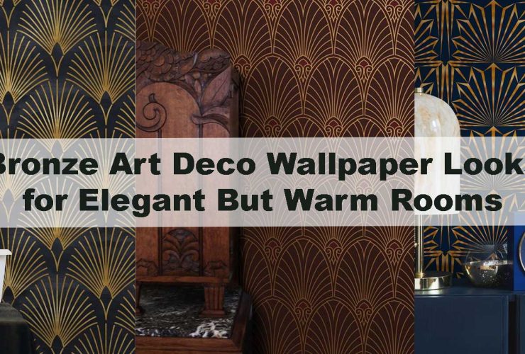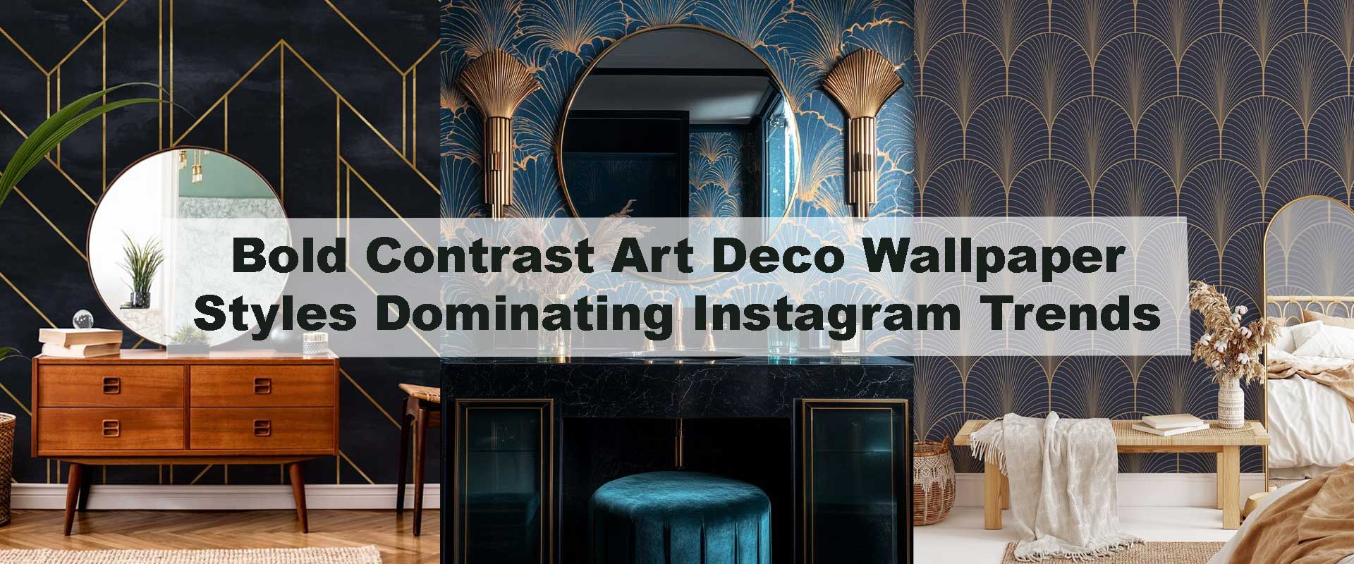
Bold Contrast Art Deco Wallpaper Styles Dominating Instagram Trends
High-contrast interiors are everywhere right now—and Art Deco wallpaper is leading the visual shift. Scroll through Instagram’s most saved interior posts and you’ll notice bold geometry, deep colors, and striking metallic accents defining modern luxury spaces. Bold contrast Art Deco wallpaper has become the backdrop of choice for designers and homeowners who want instant drama without clutter, blending vintage glamour with contemporary confidence.
What makes these designs trend so strongly online is their ability to photograph beautifully while still feeling timeless in real interiors. Strong contrast creates visual rhythm, sharpens architectural lines, and adds personality to minimal spaces. As discussed in Why Art Deco Wallpaper Is Returning as the Biggest Luxury Design Trend, this revival isn’t about nostalgia alone—it’s about bold expression paired with balance.
Why Bold Contrast Art Deco Wallpaper Is Trending on Instagram
Instagram favors interiors that stop the scroll instantly, and contrast-driven Art Deco designs do exactly that. Deep hues against light backdrops, metallic lines cutting through matte color fields, and dramatic symmetry all translate well on screen. These patterns feel intentional, graphic, and polished, making them ideal for social-first interior inspiration.
Beyond visuals, bold contrast also aligns with current lifestyle aesthetics. Many homes now feature neutral furniture, open layouts, and clean silhouettes, creating the perfect canvas for statement walls. When paired with bold contrast Art Deco wallpaper, these spaces gain character without sacrificing elegance, echoing the principles highlighted in Minimal Art Deco Geometry Walls for Calm and Sophisticated Interiors.
The Psychology Behind High-Contrast Art Deco Walls
Contrast holds a powerful psychological presence in interior design, shaping how a space is perceived and experienced. The interplay between dark and light tones sharpens visual focus, naturally guiding the eye and establishing a sense of order within a room. When applied through Art Deco geometry, this contrast feels purposeful rather than overwhelming, as repetition and symmetry introduce rhythm and balance.
Social-media-driven interiors have shifted toward spaces that feel confident, intentional, and instantly legible. High-contrast Art Deco walls convey clarity and decisiveness, creating environments that feel curated rather than improvised. This controlled drama explains why designers often favor Art Deco patterns over abstract murals when aiming for interiors that are bold, memorable, and refined at the same time.
Black and Gold Art Deco Wallpaper: The Iconic Power Duo
Few color combinations command attention as effortlessly as black and gold. Black establishes depth and visual authority, while gold introduces warmth and reflective highlights that bring movement and luminosity to the surface. Together, they create a striking statement wall that communicates luxury without visual excess.
In lived-in spaces, black-and-gold Art Deco wallpaper works best when supported by soft, layered lighting and restrained furnishings. This approach allows the geometry and metallic detailing to take center stage while preserving comfort and elegance. Designers often draw on the principles behind The Reason Black Art Deco Wallpaper Works So Well With Brass Decor to achieve interiors that feel dramatic yet highly livable.
Emerald Green and Ivory: A Sophisticated Contrast Trend
Emerald green has emerged as a standout tone across Instagram interiors, particularly when balanced with ivory or soft cream hues. This contrast delivers richness and depth without heaviness, making it especially appealing for living spaces and bedrooms that prioritize calm sophistication over overt drama.
Art Deco patterns in emerald and ivory frequently incorporate fan motifs or stepped geometry, adding visual rhythm while maintaining composure. The combination responds beautifully to both daylight and ambient lighting, which helps explain its popularity in influencer-styled spaces where elegance, warmth, and photographic appeal need to coexist seamlessly.
Navy Blue and Warm Metallics for Cinematic Interiors
Navy blue delivers depth and richness without the intensity of black, making it an ideal foundation for high-contrast Art Deco interiors. When paired with brass or champagne-toned metallic detailing, navy Art Deco wallpaper creates a cinematic atmosphere that feels layered, intimate, and quietly luxurious rather than overpowering.
Across Instagram, this combination appears most often in bedrooms and dining spaces, where darker tones naturally enhance evening ambiance and mood lighting. As reflected in Navy Art Deco Wallpaper Designs That Create Rich, Cinematic Bedrooms, this palette succeeds because it balances visual drama with comfort, offering spaces that photograph beautifully while remaining deeply livable.
High-Contrast Geometry: Why Patterns Matter More Than Color Alone
Bold color contrast alone does not define a successful Art Deco wall—geometry determines how that contrast behaves within a space. Structured lines, repeated arches, and symmetrical motifs guide the eye deliberately, ensuring bold tones feel organized and visually calming rather than chaotic.
Instagram-favored interiors consistently lean toward large-scale geometric patterns instead of intricate detailing. This clarity allows contrast to read instantly, even in wide-angle imagery, which explains why simplified Art Deco geometry continues to outperform more ornate alternatives across digital design trends.
Matte vs Metallic Finishes in Bold Art Deco Walls
Finish dramatically influences how contrast is perceived both on camera and in everyday lighting. Matte backgrounds absorb light, softening darker tones and creating a grounded surface that allows metallic line work to stand out with precision and elegance rather than glare.
When metallic accents are used thoughtfully, they introduce subtle movement and reflectivity, bringing energy to otherwise structured compositions. This balance between matte restraint and metallic glow ensures bold contrast feels deliberate and refined, echoing the design principles outlined in Should You Choose Matte or Gloss Finish for Art Deco Geometry Walls?.
Where Bold Contrast Art Deco Wallpaper Works Best
Bold contrast Art Deco wallpaper performs strongest in spaces designed to make a visual statement. Living rooms, entryways, and dining areas naturally benefit from a defined focal point, and high-contrast patterns help anchor these spaces with confidence and clarity. Instead of blending into the background, the wallpaper establishes a strong visual rhythm that immediately sets the tone of the interior.
Instagram-favorite interiors often demonstrate restraint by limiting bold wallpaper to a single feature wall. This approach allows dramatic geometry and color contrast to stand out while surrounding furnishings remain calm and supportive. When thoughtfully balanced, curated options from the core Art Deco Wallpaper range adapt seamlessly to bold styling, delivering impact without overwhelming the room’s overall harmony.
Popular Bold Contrast Art Deco Styles on Instagram
Geometric Line Patterns
Sharp lines, stepped angles, and symmetrical layouts dominate Instagram trend feeds because they translate cleanly on camera while maintaining structure in real spaces. These patterns feel intentional and modern, making them ideal for interiors with minimalist furniture and open layouts. Designers frequently turn to Geometric Art Deco Wallpaper for its ability to create strong visual presence while preserving balance and sophistication.
Marble-Inspired Art Deco Designs
Marble-inspired Art Deco styles soften contrast through organic veining layered with metallic geometry. This blend introduces depth and movement, preventing bold color pairings from feeling too rigid or stark. The richness of Marble Art Deco Wallpaper makes it especially popular in luxury interiors where elegance and drama need to coexist effortlessly.
Textured Contrast Art Deco Walls
Texture adds an understated layer of complexity to high-contrast designs. Subtle surface variation catches light differently throughout the day, giving bold patterns a warmer, more tactile presence. Interiors featuring Textured Art Deco Wallpaper often feel inviting and dimensional, proving that strong contrast can still support comfort and visual depth.
How Influencers Style Bold Art Deco Wallpaper for Instagram
Influencers consistently rely on restraint when styling bold Art Deco walls. Rather than competing with the wallpaper, they choose sculptural furniture forms, neutral upholstery, and clean silhouettes that allow the pattern to remain the visual anchor. This styling method ensures the space feels intentional rather than overstimulated.
Lighting plays a defining role in these interiors. Warm, indirect illumination softens dark tones and enhances metallic detailing, adding glow and movement without harsh reflections. By mimicking professional interior shoots, this approach ensures bold contrast Art Deco wallpaper feels polished, welcoming, and highly adaptable to everyday living—not just the camera lens.
Bold Contrast vs Subtle Art Deco: A Visual Comparison
| Design Aspect | Bold Contrast Art Deco | Subtle Art Deco |
|---|---|---|
| Visual Impact | High, dramatic, striking | Soft, refined |
| Instagram Appeal | Very strong | Moderate |
| Best Room Use | Living rooms, entryways | Bedrooms, offices |
| Styling Needs | Minimal décor | Flexible layering |
| Longevity | Timeless when balanced | Quietly enduring |
This comparison shows why bold contrast dominates social platforms while subtle styles remain popular for private, calming spaces.
Common Mistakes to Avoid With High-Contrast Art Deco Wallpaper
One of the most frequent missteps is extending bold Art Deco patterns across too many walls. High-contrast designs thrive when given space to command attention, and Instagram-inspired interiors almost always rely on a single statement wall that allows the geometry and color contrast to breathe without overwhelming the room.
Another common issue is visual competition. Pairing striking wallpaper with equally bold furniture, heavy patterns, or strong colors can dilute the impact of the wall itself. Instead, successful spaces use sculptural silhouettes, muted upholstery, and restrained décor so the wallpaper remains the focal point rather than part of visual noise.
Scale also plays a critical role in achieving balance. Larger rooms can support wider geometric repeats and bolder line work, while smaller spaces benefit from finer patterns that maintain clarity and openness. When contrast, scale, and surrounding elements are thoughtfully aligned, bold Art Deco wallpaper feels curated, confident, and intentional rather than chaotic.
FAQ: Bold Contrast Art Deco Wallpaper Trends
Do bold contrast Art Deco wallpapers suit modern interiors?
Yes. Clean geometry and structured contrast complement modern layouts beautifully, adding character without clutter.
Are dark Art Deco wallpapers suitable for smaller rooms?
They can be, when used on a single wall with balanced lighting and light furnishings to maintain openness.
Will high-contrast Art Deco wallpaper go out of trend quickly?
No. Art Deco’s emphasis on symmetry and geometry keeps bold designs timeless rather than trend-dependent.
How do I soften bold contrast walls?
Use neutral furniture, warm lighting, and minimal accessories to balance visual intensity.
Final Thoughts on Instagram’s Bold Art Deco Movement
Bold contrast Art Deco wallpaper has earned its place at the center of Instagram’s interior design movement because it delivers instant impact with lasting elegance. These designs celebrate confidence, structure, and visual clarity—qualities that resonate both online and in real homes.
By choosing the right colors, geometry, and finishes, bold contrast becomes a timeless design statement rather than a passing trend. For homeowners and designers alike, this style offers the perfect balance between dramatic expression and refined living, making bold contrast Art Deco wallpaper a defining feature of today’s most admired interiors.