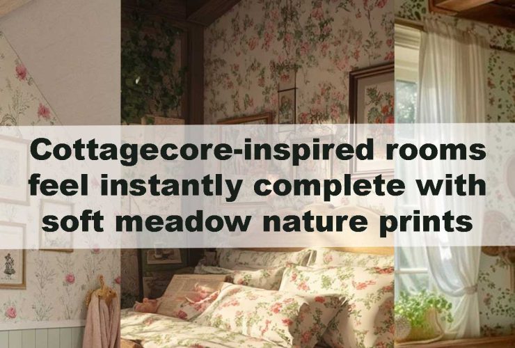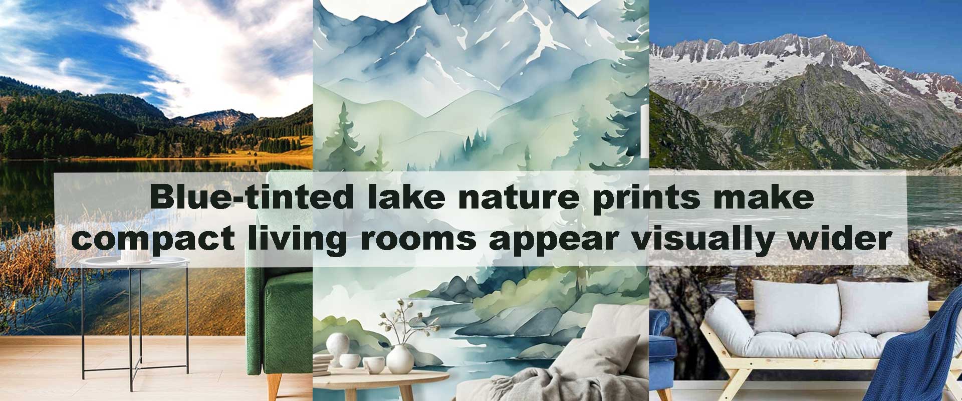
Blue-tinted lake nature prints make compact living rooms appear visually wider
What if a single wall choice could make a small living room feel calmer, wider, and more open—without moving a single piece of furniture? Blue-tinted lake nature prints quietly achieve exactly that. By blending cool color psychology with horizontal waterlines and soft atmospheric depth, these nature-led walls subtly reshape how compact living rooms are perceived. Almost instantly, the eye slows down, boundaries soften, and the space begins to feel less confined.
In compact interiors, every visual decision carries extra weight. Blue-tinted lake scenes work because they draw on natural cues the human brain already associates with openness, distance, and calm. When selected with intention, they move beyond decoration and act as visual tools, gently stretching perceived width while keeping the room relaxed, balanced, and comfortably lived-in.
The Psychological Role of Lakes in Interior Perception
Lakes are closely linked with feelings of stillness, balance, and gentle openness. Unlike oceans, which suggest constant movement and vast scale, lakes feel calm yet expansive—an ideal emotional balance for compact living rooms that need visual width without becoming overwhelming. This sense of contained openness helps walls feel broader while keeping the room grounded and comfortable.
When blue-tinted lake nature prints are introduced, the overall energy of the space softens. The eye naturally slows as it follows calm water surfaces and distant horizons, reducing visual tension and allowing the room to feel larger than its physical dimensions. Without sharp contrasts or busy detail, compact living rooms gain a composed, airy presence that feels intentional rather than restricted.
These spatial and emotional effects align naturally with thoughtfully selected Nature wallpaper styles that prioritize depth, tonal layering, and atmospheric calm over bold visual contrast, making them especially effective in smaller living environments.
How Horizontal Lake Compositions Stretch Wall Width
Not all nature imagery creates the same spatial response. Blue-tinted lake compositions are particularly effective because they rely on horizontal shoreline lines, elongated reflections, and gradual water gradients. These elements guide the gaze laterally, encouraging the eye to travel across the wall rather than stopping abruptly.
In smaller living rooms, vertical emphasis can unintentionally highlight narrowness. Horizontal lake scenes counteract this by visually anchoring the space from side to side, making walls feel broader and more continuous. The effect becomes even more refined when paired with low-profile seating and pared-back décor, where nothing interrupts the horizontal flow.
This is why wide, landscape-led lake visuals—especially those softened by mist or distance—are often favored over close-up or highly detailed botanical imagery in compact interiors. They work quietly in the background, reshaping perception without adding visual weight.
Blue Tint Variations and Their Spatial Impact
Not all blues create the same spatial effect. Understanding subtle tone differences helps refine the widening illusion:
| Blue Tone | Visual Effect | Best For |
|---|---|---|
| Pale sky blue | Maximum light reflection | Very small living rooms |
| Muted steel blue | Calm depth without darkness | Modern compact layouts |
| Grey-blue | Softens boundaries | Neutral interiors |
| Teal-leaning blue | Adds richness without closing space | Warm minimal spaces |
Choosing lighter, mist-infused blues ensures the wall recedes gently rather than dominating the room. This approach complements interiors that already rely on restraint and balance.
Blue Lake Prints vs Other Nature Styles in Small Rooms
While many nature-inspired designs are beautiful, not all support visual expansion equally. Here’s how blue-tinted lake prints compare:
| Nature Style | Perceived Width | Visual Calm | Suitability for Small Rooms |
|---|---|---|---|
| Blue lake scenes | High | Very high | Excellent |
| Dense forest prints | Medium | Medium | Moderate |
| Mountain close-ups | Low to medium | High | Limited |
| Abstract botanicals | Variable | Medium | Context-dependent |
Lake imagery excels because it combines horizontal flow with tonal restraint—two essentials for compact living spaces.
FAQ: Blue-Tinted Lake Nature Prints in Compact Living Rooms
Do blue lake prints make living rooms feel cold?
No. When balanced with warm lighting and natural textures, blue lake scenes feel calming rather than chilly.
Are lake prints better than abstract designs for small spaces?
Yes. Lake imagery provides recognizable depth cues that abstract designs often lack.
Can this style work in rental apartments?
Absolutely. Blue-tinted lake visuals create impact without relying on structural changes.
Should furniture be light or dark with blue lake walls?
Lighter furniture enhances the widening effect, while mid-tones can work if kept simple.
Do these prints age well over time?
They do. Their appeal is rooted in natural calm rather than short-lived trends.
Final Thoughts
Blue-tinted lake nature prints offer more than visual beauty—they subtly reshape how compact living rooms are experienced. Through cool tonal recession, horizontal flow, and psychological calm, they create width where none physically exists. When paired with thoughtful lighting and restrained styling, these walls transform small spaces into open-feeling, balanced interiors that invite relaxation.
For living rooms that crave space without sacrificing warmth, this nature-led approach delivers lasting impact with quiet confidence.