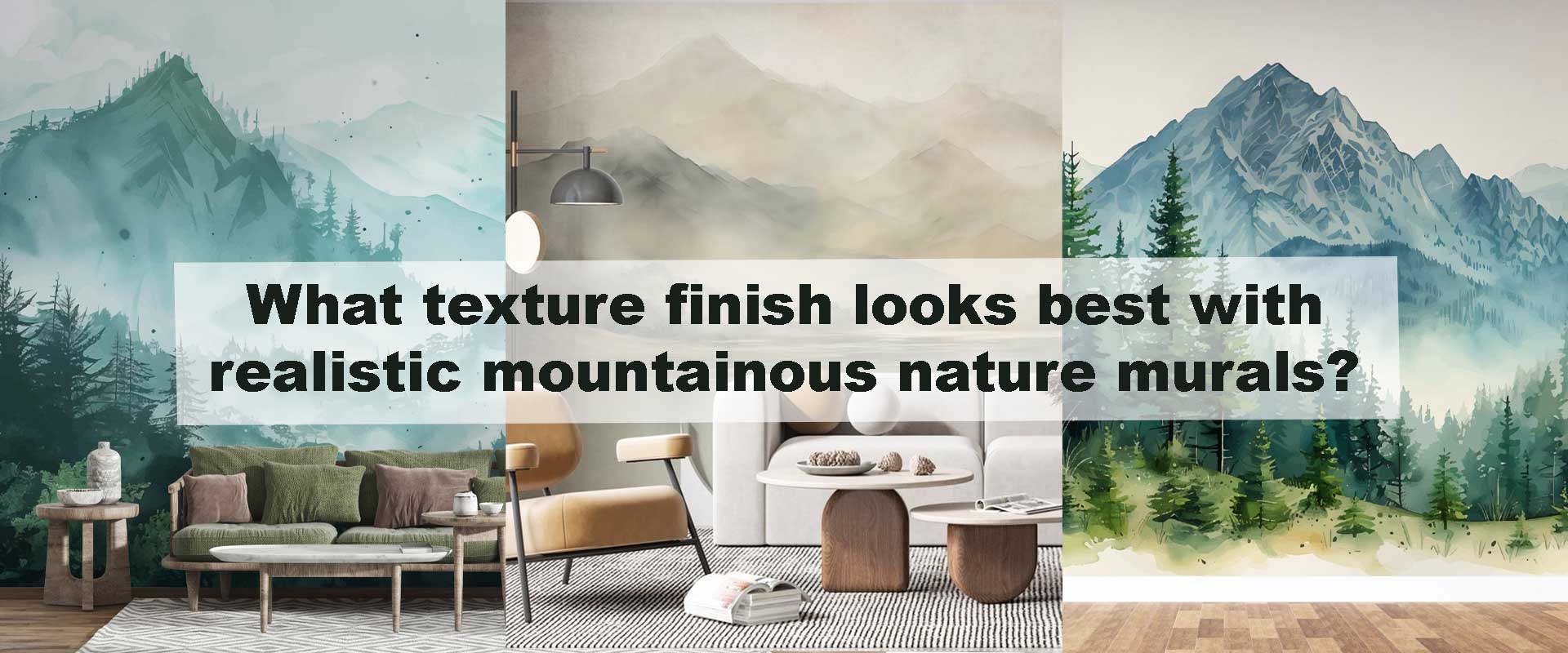
What texture finish looks best with realistic mountainous nature murals?
A realistic mountainous nature mural can either feel breathtakingly immersive—or visually flat—depending on the texture finish beneath it. The right surface treatment doesn’t compete with the scenery; it quietly supports depth, scale, and atmospheric realism. When peaks, mist, and layered horizons are rendered with photographic clarity, texture becomes a design tool rather than a background decision.
Designers increasingly treat wall finish as part of the mural itself. Light absorption, shadow softness, and tactile restraint all influence how believable a mountain landscape feels once installed. When paired thoughtfully, a realistic mural can transform a wall into a window, especially when integrated with tonal finishes found across curated Nature wallpaper selections that prioritise calm, spatial depth, and visual continuity.
Why Texture Finish Matters for Mountain Murals
Mountain imagery depends on nuance rather than contrast. Snow lines melt gently into fog, ridges soften as they recede, and forests dissolve into distant blue-grey layers. When the surface beneath the mural reflects light unevenly or introduces coarse texture, this delicate progression is interrupted, breaking the illusion of depth and turning a scenic wall into a flat graphic.
Texture finish governs how light travels across the mural. Soft, low-reflective surfaces allow tones to blend naturally, preserving atmospheric distance, while shine or heavy grain fractures the image into highlights and shadows. This is why interiors that successfully anchor expansive mountain visuals consistently rely on restrained finishes that support visual continuity and let the landscape breathe rather than compete for attention.
Subtle finishes also mirror how real landscapes are experienced outdoors—without glare, polish, or artificial sheen. That sensory familiarity is what allows mountain murals to feel grounding and immersive instead of decorative, supporting calm rather than visual stimulation.
Matte Finishes: The Gold Standard for Realism
A matte or flat finish remains the most dependable partner for realistic mountainous scenes. By absorbing ambient light evenly, it prevents hotspots that can flatten perspective or bleach distant layers. Fine details—rock striations, treelines, snow gradients—stay legible and balanced from multiple viewpoints, maintaining the mural’s depth throughout the room.
Matte surfaces also respond beautifully to shifting daylight. As light moves from morning softness to evening warmth, the mural evolves subtly, much like a real landscape does over time. This living quality is especially effective with layered alpine scenes commonly found in Mountain nature wallpaper designs, where depth and distance define the visual experience.
In bedrooms and other quiet interiors, matte walls encourage visual rest by reducing contrast and reflection. This supports the calming role mountain imagery often plays, a dynamic reflected in Bedrooms transform instantly when mountain-inspired nature wallpaper sets the mood, where muted finishes enhance emotional ease and spatial softness.
Light Canvas Texture: Adding Depth Without Distraction
For interiors that lean slightly rustic or artistic, a light canvas-style texture introduces a gentle tactile layer without overwhelming the mural itself. Resembling stretched fabric or softly painted plaster, this finish subtly enriches cloud movement, fog transitions, and stone contours, giving the wall a handcrafted, atmospheric quality.
Restraint is essential. The texture must remain shallow enough to avoid disrupting fine lines or photographic clarity. When applied thoughtfully, it adds warmth and dimensionality that complements nature-led interiors, particularly those balancing timber, linen, and mineral surfaces.
Light canvas textures are especially effective with misty alpine scenes and painterly mountain interpretations, where softness enhances mood more than sharp detail. These finishes often pair naturally with forest-edge compositions similar to Forest nature wallpaper palettes, where visual calm and tonal blending take precedence over precision.
Texture Finish Comparison Table
| Texture Finish | Light Interaction | Best Room Types | Visual Effect |
|---|---|---|---|
| Matte / Flat | Absorbs evenly | Bedrooms, living rooms | Maximum realism, low glare |
| Light Canvas | Soft diffusion | Rustic lounges, studios | Gentle depth, artistic warmth |
| Suede / Velvet | Deep absorption | Retreat spaces | Rich tone, intimate mood |
| Gloss / Semi-Gloss | High reflection | Not recommended | Breaks depth, causes glare |
| Heavy Textured Plaster | Shadow casting | Not recommended | Distorts fine detail |
How Lighting Influences Texture Choice
Lighting temperature and direction quietly determine whether a mountainous mural feels immersive or visually fragmented. Cooler daylight sharpens contrasts and makes even minor surface irregularities more noticeable, which can interrupt the soft recession that mountain scenes rely on. Warmer evening light, by contrast, smooths tonal transitions and deepens shadows, allowing ridgelines and misty layers to feel more continuous and natural. This balance is why matte finishes remain the most dependable choice across changing conditions, preserving realism from morning brightness to night-time calm.
Layered lighting further refines how texture behaves. Wall washers and indirect LEDs graze the surface gently, revealing depth without glare, while soft pendants prevent harsh highlights that flatten perspective. Low-reflective finishes respond best to this approach, supporting mountain murals that are meant to guide the eye slowly and encourage visual rest, a principle closely aligned with Which style of nature wallpaper works best in dim-lit living rooms. When lighting and texture are aligned, the mural doesn’t just decorate the wall—it evolves with the day, much like a real landscape.
FAQ
Does texture affect how large a mountain mural feels?
Yes. Matte and soft finishes preserve depth cues, making landscapes feel expansive, while reflective surfaces compress distance.
Can canvas texture work with highly detailed photographic murals?
Only if the texture is very fine. Heavy canvas can blur detail and reduce realism.
Is suede finish practical for everyday interiors?
In low-traffic areas, yes. It offers unmatched depth but benefits from careful placement.
Should the entire room match the mural’s texture finish?
Not necessarily. Feature walls often carry the mural while surrounding walls remain smooth matte for balance.
Do mountain murals need special preparation for textured walls?
Yes. The base surface must be even and consistent so the finish enhances rather than distorts the image.
Conclusion
The best texture finish for realistic mountainous nature murals is one that disappears visually, allowing the landscape to take centre stage. Matte remains the most versatile and authentic option, while light canvas and suede finishes offer nuanced alternatives when warmth or intimacy is desired. By aligning texture, lighting, and mural style, mountain imagery becomes immersive rather than ornamental—transforming walls into quiet, grounded horizons that elevate the entire space.