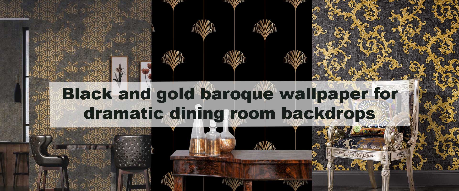
Black and gold baroque wallpaper for dramatic dining room backdrops
Bold dining interiors rarely rely on subtlety, and black and gold baroque wallpaper delivers impact through contrast, ornament, and depth. The richness of dark backgrounds combined with gilded detailing creates an immediate sense of ceremony, making dining spaces feel intentional and emotionally engaging from the moment you step inside. Rather than acting as simple decoration, these walls establish atmosphere, framing gatherings with visual weight and timeless elegance.
Dining rooms benefit especially from this pairing because they are spaces designed for focus and connection. The dark base absorbs excess visual noise, while gold accents respond beautifully to warm lighting, creating a balanced environment that feels intimate without becoming heavy or closed in.
Why Baroque Ornament Feels Right for Dining Rooms
Dining rooms are spaces designed for presence, rhythm, and shared moments, which is why baroque ornament feels so instinctively suited to them. Baroque patterns rely on repetition and symmetry that slow the eye rather than scatter it, encouraging a sense of continuity that supports long meals and unhurried conversation. Instead of competing for attention, the layered scrolls and structured motifs create visual order, allowing the room to feel composed even when filled with movement and activity.
This architectural quality explains why baroque detailing aligns so seamlessly with other heritage-led interiors commonly found within Vintage Wallpaper, where ornamentation adds depth without disrupting balance. In dining rooms, that balance translates into warmth and gravitas, giving the space a ceremonial quality that feels welcoming rather than formal, and expressive without excess.
The Visual Psychology of Black and Gold Walls
Black walls naturally draw people inward by softening edges and reducing visual noise, creating an atmosphere where diners feel more connected and grounded. Rather than closing the space in, black establishes a backdrop that allows furnishings, table settings, and faces to stand out with greater clarity. Gold detailing introduces contrast in a controlled way, catching light gently and preventing the surface from feeling dense or static.
This dynamic between absorption and reflection creates depth that evolves throughout the day, shifting subtly as light changes. The effect follows the same principles found in classic patterned interiors, where structured repetition—such as that explored in Timeless damask motifs bringing heritage elegance to modern interiors—brings calm through order rather than simplicity. In black and gold baroque wallpaper, this balance results in walls that feel rich and atmospheric without overwhelming the dining experience.
Selecting the Right Baroque Pattern Scale
Choosing the correct baroque scale is essential to achieving drama without imbalance. Pattern size determines whether the wallpaper feels architectural, textural, or atmospheric, making it one of the most important decisions when working with black and gold designs in dining rooms.
Large-Scale Baroque for Statement Dining Walls
Large-scale baroque motifs are most effective in dining rooms with generous wall expanses or elevated ceilings, where the pattern has room to breathe. Oversized scrolls and ornamental forms read clearly from across the table, allowing the wall to function almost like architectural detailing rather than surface decoration. This scale gives the wallpaper presence, turning it into a defining structural element within the room.
Placed behind the dining table, large motifs naturally frame seating arrangements and reinforce spatial hierarchy. Because the pattern already carries visual authority, surrounding furniture can remain simple, allowing the wallpaper to anchor the room without the need for additional ornamentation or layered décor.
Medium-Scale Patterns for Balanced Elegance
Medium-scale baroque designs offer a refined middle ground, particularly well suited to dining rooms that connect visually with adjacent spaces. At a distance, the pattern reads as depth and texture, maintaining calm visual flow, while closer viewing reveals ornate detailing that rewards attention without demanding it.
This balance makes medium-scale patterns ideal for homes with transitional interiors, where classic elegance meets contemporary restraint. When paired with warm wood furniture and softly finished metallic accents, the wallpaper feels sophisticated, cohesive, and comfortably integrated rather than overly dramatic.
Fine Detailing for Compact Dining Spaces
In smaller dining rooms, fine baroque detailing introduces richness while preserving a sense of openness. The tighter pattern scale blends seamlessly into the wall plane, creating a fabric-like effect that enhances mood without drawing focus away from the room’s proportions.
Here, black and gold act less as bold statements and more as atmospheric elements. The intricate detailing softens contrast, allowing the dining area to feel intentional, layered, and refined despite limited square footage. This approach ensures elegance without visual crowding, making compact spaces feel composed rather than constrained.
Lighting That Enhances Baroque Wallpaper
Lighting determines whether black and gold baroque wallpaper feels brooding or beautifully radiant. Warm pendant lighting positioned above the dining table softens the contrast between dark backgrounds and gilded detailing, allowing gold elements to glow rather than glare. Wall sconces placed at eye level introduce a gentle lateral wash of light, revealing the rhythm of baroque motifs gradually instead of flattening them.
Indirect lighting adds another layer of refinement. When light grazes the wallpaper surface, metallic inks and subtle texture come forward, creating movement that evolves from afternoon into evening. This controlled illumination prevents the pattern from feeling static, ensuring the walls remain visually engaging throughout changing light conditions.
Furniture and Finishes That Work in Harmony
Furniture selection should reinforce the wallpaper’s richness without competing for attention. Dining tables crafted from walnut, oak, or deep-stained wood echo the depth of black walls while grounding the room visually. Upholstered seating introduces softness and comfort, balancing the ornate backdrop with tactile warmth and preventing the space from feeling overly formal or rigid.
Clean-lined furniture silhouettes are essential. Simplicity in form allows baroque detailing to remain the dominant visual language, while subtle metallic finishes such as brushed brass or antique gold quietly mirror the wallpaper’s accents. Used sparingly on lighting fixtures or table details, these finishes unify the space without tipping into excess.
Feature Wall Versus Full-Wall Application
Feature Wall for Controlled Drama
A single black and gold baroque wall delivers impact with restraint. This approach works especially well in dining areas connected to adjacent spaces, where visual flow is important. The wallpaper naturally defines the dining zone, anchoring the table and lighting while preserving openness and balance throughout the surrounding interior.
Feature walls also offer flexibility. They allow homeowners to experiment with dramatic pattern and color while keeping the overall space adaptable as furnishings or layouts evolve over time.
Full-Wall Treatment for Formal Dining Rooms
In dedicated dining rooms, full-wall baroque applications create an enveloping sense of occasion. The repetition of ornate pattern across all surfaces builds cohesion, transforming the room into a unified, immersive environment. When paired with lighter ceilings and restrained décor, the effect feels deliberate and refined rather than overwhelming.
This approach suits dining rooms intended for evening gatherings and formal occasions, where atmosphere and presence matter as much as function. With thoughtful lighting and balanced finishes, full-wall baroque treatments deliver depth, elegance, and lasting visual drama.
Comparing Baroque With Other Ornate Wall Styles
| Wall Style | Visual Presence | Overall Mood | Best Use |
|---|---|---|---|
| Black and gold baroque wallpaper | High | Dramatic, ceremonial | Formal dining rooms |
| Neutral damask patterns | Medium | Soft, classic | Transitional interiors |
| Vintage floral designs | Medium | Warm, romantic | Traditional homes |
| Minimal textured finishes | Low | Calm, modern | Contemporary spaces |
This comparison highlights why baroque remains the preferred choice when the goal is expressive depth rather than subtle background texture.
Styling the Space Without Overcrowding
When working with black and gold baroque wallpaper, restraint becomes the most powerful styling tool. Table settings feel most effective when they lean understated, using matte ceramics, softly textured linens, and muted finishes that allow the ornate walls to remain visually dominant. These quieter surfaces create contrast, preventing the space from feeling visually dense while reinforcing the wallpaper’s sense of importance.
Mirrors placed strategically across from light sources help extend the glow of gold detailing, subtly increasing brightness and depth without introducing additional décor. In many cases, artwork becomes unnecessary, as the wallpaper itself carries narrative, movement, and historic character, allowing the dining room to feel complete without layering competing focal points.
Connecting Baroque Drama With Vintage Collections
Black and gold baroque designs naturally connect with richly detailed selections like Ornamental Vintage Wallpaper, where scrolling motifs and classical structure bring depth and heritage into refined interiors. This relationship allows dining rooms to feel cohesive within homes that favor layered historic influence rather than isolated statement features.
For balance, especially in homes where dramatic walls are limited to select areas, contrast-driven elements inspired by Black and White Vintage Wallpaper help temper intensity elsewhere, ensuring the baroque dining space feels intentional rather than overwhelming within the broader interior flow.
Longevity and Practical Considerations
The lasting appeal of black and gold baroque wallpaper depends largely on refinement rather than boldness alone. Designs with balanced contrast and thoughtfully spaced detailing maintain their elegance far longer than overly sharp or high-gloss interpretations. Matte and softly lustrous finishes reduce glare under evening lighting, allowing gold accents to glow gently rather than reflect harshly.
Because gold tones can shift dramatically depending on light temperature, viewing samples under actual dining room conditions ensures the final effect aligns with the intended atmosphere. This careful evaluation supports a space that continues to feel rich, composed, and visually rewarding long after installation.
Frequently Asked Questions
Does black and gold baroque wallpaper make dining rooms feel too dark?
When paired with warm, layered lighting, it adds depth and intimacy rather than darkness.
Can this wallpaper work with modern furniture?
Yes, clean-lined furniture creates contrast that makes ornate walls feel contemporary.
Is a feature wall enough for impact?
A single wall provides strong presence while keeping the space visually open.
What ceiling color works best with baroque walls?
Lighter ceilings help balance dark walls and maintain a sense of height.
Does this style suit open-plan homes?
A feature wall approach defines the dining area while preserving overall flow.
Conclusion
Black and gold baroque wallpaper brings drama, rhythm, and timeless elegance to dining room backdrops. Through thoughtful pattern scale, layered lighting, and restrained furnishings, these ornate walls create spaces that feel ceremonial yet inviting. For dining rooms designed to host memorable moments, this wallpaper choice delivers depth, warmth, and lasting visual presence.