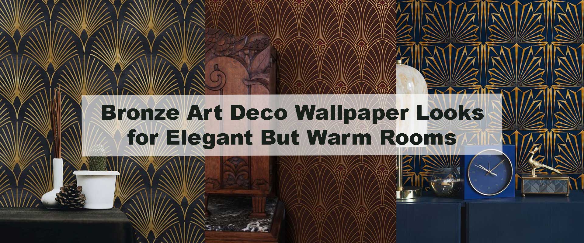
Bronze Art Deco Wallpaper Looks for Elegant But Warm Rooms
Bronze Art Deco wallpaper brings a refined glow that feels welcoming rather than formal. Its metallic warmth softens structured geometry, allowing interiors to feel elegant while remaining emotionally comfortable. When bronze finishes are layered into thoughtfully styled rooms, the result is a balance of visual drama and everyday ease that few other tones can achieve.
Unlike cooler metallic palettes, bronze reflects light gently and creates depth without sharp contrast. This makes it ideal for interiors that aim to feel luxurious but lived-in, especially when paired with balanced furnishings and tactile materials.
Why Bronze Art Deco Feels Naturally Inviting
Bronze occupies a rare middle ground between richness and subtlety, which is why it feels so instinctively welcoming in Art Deco interiors. Its softened metallic tone gently rounds out strong lines and stepped forms, allowing architectural patterns to feel expressive without becoming dominant. Even when geometry is bold, the warmth of bronze keeps the walls visually approachable rather than formal or austere.
What truly elevates bronze is its sensitivity to light. Throughout the day, its surface shifts quietly—appearing soft and muted in natural daylight, then deepening into a warm glow as lighting becomes more intimate. This layered visual rhythm creates spaces that feel alive yet calm, reinforcing the growing appeal highlighted in Why Art Deco Wallpaper Is Returning as the Biggest Luxury Design Trend.
Elevating Warm Rooms With Art Deco Geometry
Art Deco geometry brings order and rhythm to a room, while bronze ensures that structure never feels rigid. Curved fans, arches, and elongated linear motifs gain fluidity through the metallic warmth, introducing movement without sharp contrast. This makes bronze-based designs especially suited to interiors that prioritize comfort alongside visual clarity.
When paired with softer furnishings and layered textures, bronze patterns naturally anchor the space. They provide definition without overpowering surrounding elements, allowing elegance to feel effortless rather than styled. This balance becomes even more refined when the wallpaper sits alongside Luxury Metallic Art Deco Wallpaper finishes that emphasize depth and restraint instead of overt shine, preserving warmth across the entire room.
Subtle Versus Statement Bronze Patterns
Bronze Art Deco patterns offer two distinct design directions, each shaping the room’s mood in a different way. Fine linear designs and softened repeats bring understated sophistication, ideal for interiors that value calm flow and visual continuity. These patterns quietly enrich the walls, allowing furniture, lighting, and texture to build the atmosphere without visual tension.
More expressive motifs introduce rhythm and architectural presence while remaining warm and inviting through the bronze palette. When balanced carefully—especially when paired with Geometric Art Deco Wallpaper—these designs create definition without heaviness. They work particularly well on focal surfaces or in expansive layouts where structure helps guide the eye and ground the space.
Bronze Art Deco in Contemporary Interiors
Bronze Art Deco wallpaper integrates effortlessly into contemporary interiors by adding depth without visual clutter. Clean silhouettes, open layouts, and restrained styling allow the metallic geometry to become a subtle statement rather than a decorative overlay. Bronze acts as a connector, merging classic Art Deco influence with modern simplicity in a way that feels intentional and current.
Keeping accessories minimal ensures the wallpaper remains the central design element. When bronze is given visual breathing room, the space feels curated and confident rather than styled for effect. This controlled use of metallic geometry supports lasting appeal, a principle echoed in The Science Behind Why Gold Geometry Walls Feel Luxurious, where balance plays a key role in creating interiors that feel both elevated and comfortable.
Comparing Bronze With Other Art Deco Metallics
| Metallic Tone | Visual Feel | Warmth Level | Interior Impact |
|---|---|---|---|
| Bronze | Refined and inviting | High | Balanced, elegant comfort |
| Gold | Bold and expressive | Medium | Dramatic statement effect |
| Silver | Crisp and modern | Low | Cool, structured mood |
| Copper | Deep and rustic | High | Cozy, artisanal warmth |
This comparison shows why bronze remains a preferred choice for interiors seeking elegance without emotional distance.
Styling for Longevity
To ensure bronze Art Deco wallpaper remains timeless rather than trend-led, the key lies in thoughtful contrast. Matte surfaces, softly woven textiles, and natural elements such as wood or stone gently temper the metallic finish, allowing the warmth of bronze to feel refined instead of reflective. This balance prevents the space from feeling overly polished and helps the wallpaper age gracefully as tastes evolve.
Keeping surrounding décor understated is equally important. Limiting competing metallic accents allows the wallpaper to hold visual authority without overwhelming the room. When bronze designs are treated as part of a cohesive story—anchored by the enduring character of Art Deco Wallpaper—they provide continuity across changing furniture styles and seasonal updates, ensuring long-term elegance with minimal effort.
Final Thoughts
Bronze Art Deco wallpaper creates rooms that feel elegant without sacrificing warmth. Its ability to soften geometry, respond to light, and harmonize with varied furnishings makes it a lasting choice for refined interiors. For spaces that value comfort as much as visual impact, bronze delivers timeless sophistication with an inviting edge.
FAQs
Does bronze Art Deco wallpaper work in compact spaces?
Yes. Its light-absorbing qualities add depth without making rooms feel heavy.
Will bronze wallpaper overpower neutral interiors?
No. When paired with soft textures, it enhances warmth while maintaining balance.
Is bronze suitable for modern interior styling?
Absolutely. Clean lines and minimal décor allow bronze patterns to shine naturally.
How can I keep bronze designs from feeling formal?
Layer textiles, natural finishes, and warm lighting to maintain a relaxed mood.
Does bronze Art Deco wallpaper remain stylish long term?
Yes. Its muted metallic tone avoids trends, making it a durable design choice.