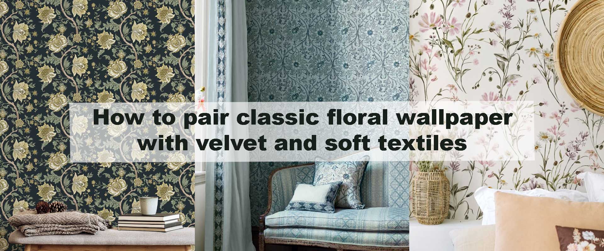
How to pair classic floral wallpaper with velvet and soft textiles
Classic floral wallpaper has a natural ability to bring warmth, heritage, and visual storytelling into an interior. When paired with velvet and soft textiles, the effect becomes richer and more immersive, blending pattern with touch in a way that feels intentional rather than decorative. This pairing works because florals provide movement and history, while velvet and layered fabrics soften the space, absorbing light and creating depth.
When thoughtfully balanced, floral walls and tactile furnishings feel timeless rather than nostalgic. The goal is not to match everything perfectly, but to allow each element to support the other, creating a composed interior that feels calm, layered, and quietly luxurious.
Understanding the Role of Floral Wallpaper First
Before introducing velvet or additional fabrics, it’s essential to fully read the floral wallpaper and understand the story it tells. Large-scale blooms feel expressive and emotive, often setting a romantic or dramatic tone that naturally draws attention. Smaller, repeated florals feel more composed and heritage-led, establishing a steady visual rhythm that supports the room rather than commanding it.
Colour depth is just as influential as pattern scale. Muted florals with softened, aged tones blend seamlessly with layered textiles, allowing fabrics to enrich the space without friction. In contrast, high-contrast or saturated florals demand greater restraint, as their visual energy can quickly dominate if paired with equally assertive materials. When floral wallpaper already carries presence, surrounding textures should act as a quiet framework—enhancing the design without competing for attention.
Many interiors begin this balance by grounding the space with Vintage Wallpaper that features classic motifs and controlled contrast, creating a stable foundation where warmth and texture can be introduced gradually and with confidence.
Why Velvet Complements Floral Walls So Well
Velvet introduces visual stillness that naturally counterbalances the organic movement of floral patterns. Its dense pile absorbs light rather than reflecting it, softening contrast and giving the walls space to breathe. This quality helps floral wallpaper feel intentional and composed, preventing it from appearing overly decorative or visually restless.
Used selectively, velvet becomes a grounding force within the room. Instead of appearing across multiple elements, it works best as a singular focal material—a sofa, accent chair, or upholstered headboard that anchors the space. Deeper, complex tones such as moss, olive, plum, or muted navy harmonise especially well with floral walls, adding depth without overpowering the pattern.
This relationship is particularly effective in interiors styled with Floral Vintage Wallpaper, where intricate motifs benefit from one strong tactile contrast that steadies the composition and enhances the room’s overall sense of balance and refinement.
Managing Colour for a Balanced Look
A restrained colour palette is what allows floral wallpaper and velvet to feel intentional rather than overwhelming. Limiting the space to three or four core tones across walls, upholstery, and textiles creates visual cohesion, giving the eye clear points of rest. Because florals already introduce variation and movement, fabrics should respond quietly—supporting the palette instead of multiplying it.
The most natural results often come from pulling softened, secondary shades directly from the wallpaper rather than matching its dominant colour. Warm florals pair beautifully with muted velvets, creamy linens, and softly aged neutrals, creating a sense of continuity and warmth. Cooler floral schemes feel most balanced when echoed with dusty blues, gentle greys, or subdued greens that reinforce calm rather than contrast sharply.
This disciplined approach to colour allows texture to take centre stage. When the palette is controlled, the richness of velvet, the softness of woven fabrics, and the subtle depth of layered textiles become more noticeable, giving the room quiet sophistication without visual clutter.
Pattern Through Texture, Not Repetition
Once florals establish the primary pattern on the walls, additional interest should come through texture rather than competing prints. Velvet’s dense pile, loosely woven throws, ribbed or quilted cushions, and subtly textured rugs introduce variation that feels tactile instead of visual. This approach keeps the space layered while preserving clarity.
Texture-based patterning also helps prevent fatigue. The eye reads these elements as depth and softness rather than decoration, allowing the wallpaper to remain the focal point. If another pattern is introduced, it should remain almost incidental—fine stripes, tone-on-tone jacquards, or barely perceptible weaves that add rhythm without drawing attention away from the walls.
This restraint reflects the balance often highlighted in Vintage floral wallpaper ideas that transform classic living rooms, where thoughtful layering creates richness through contrast, not excess.
Lighting That Enhances Texture and Pattern
Lighting quietly determines whether floral wallpaper and velvet feel rich or flat. Soft, warm illumination enhances the depth of fabric and brings out the layered detail in wallpaper patterns, allowing both to feel dimensional rather than decorative. Lamps with fabric shades, wall sconces, and diffused floor lighting create gentle pools of light that move across surfaces instead of washing them out.
Direct overhead lighting often works against this pairing. It can flatten velvet’s texture and exaggerate the contrast within floral patterns, making the space feel busier than intended. A layered lighting approach—combining ambient, accent, and low-level light—creates a sense of enclosure and calm, especially in the evening.
When light is controlled and thoughtfully placed, the room feels softer, more atmospheric, and more connected, allowing floral walls and tactile textiles to work together in a way that feels effortless and composed.
Fabric Choices with Floral Wallpaper
| Textile Element | Visual Effect with Florals | Best Placement | Overall Atmosphere |
|---|---|---|---|
| Velvet upholstery | Grounds busy patterns | Sofa, armchair, headboard | Rich and composed |
| Linen cushions | Softens contrast | Seating areas | Relaxed elegance |
| Wool or tufted rugs | Adds warmth underfoot | Living rooms, bedrooms | Balanced and cosy |
| Light cotton throws | Gentle layering | Chairs, beds | Casual refinement |
| Solid drapery | Frames wall patterns | Windows | Structured calm |
Frequently Asked Questions
Does floral wallpaper with velvet feel too traditional?
Not when balanced correctly. Using controlled colours and limiting velvet to one or two pieces keeps the look timeless rather than dated.
Can this pairing work in smaller rooms?
Yes. Choosing muted florals and deeper velvet tones can actually add depth, making compact spaces feel more layered and intentional.
Should velvet always match the wallpaper colours?
Exact matches aren’t necessary. Pulling secondary or softened tones from the wallpaper usually feels more natural and refined.
Are light florals compatible with dark velvet?
They often work beautifully together. The contrast adds drama while maintaining balance, especially when supported by soft neutral textiles.
Is one floral wall enough?
In many cases, yes. A single feature wall paired with velvet furnishings delivers impact without overwhelming the room.
Final Thoughts
Pairing classic floral wallpaper with velvet and soft textiles is an exercise in balance rather than abundance. Florals provide narrative and movement, velvet introduces depth and stability, and gentle fabrics soften the entire composition. When each element is given space to breathe, the result is an interior that feels layered, inviting, and effortlessly timeless.