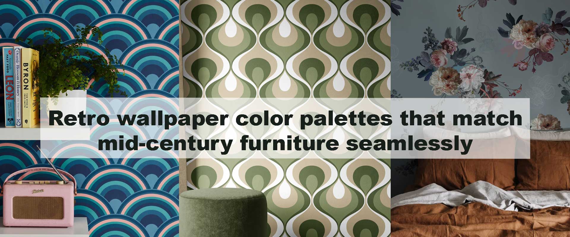
Retro wallpaper color palettes that match mid-century furniture seamlessly
Mid-century interiors have a timeless pull—but choosing the wrong wall color can disrupt their harmony. Retro wallpaper color palettes offer a smarter way to echo the warmth, geometry, and optimism of mid-century furniture without overpowering it. When tones, patterns, and materials align, the space feels intentional rather than themed. This guide explores how retro wallpaper palettes naturally complement mid-century silhouettes, wood finishes, and iconic furniture forms, helping interiors feel cohesive, layered, and quietly expressive.
Retro wallpaper color palettes that match mid-century furniture seamlessly rely on balance—between warmth and restraint, pattern and calm, nostalgia and modern clarity. Once you understand how these palettes work, pairing walls with vintage furnishings becomes intuitive rather than intimidating.
Why Retro Wallpaper Works So Well With Mid-Century Furniture
Mid-century furniture is defined by clean lines, organic curves, and honest materials like teak, walnut, and molded plywood. Retro wallpaper palettes share that same design language, often drawing from the same decades of visual experimentation. Instead of clashing, they reinforce each other.
Unlike stark modern backdrops, retro wallpaper introduces subtle movement and color variation that prevents mid-century furniture from feeling flat. The right palette enhances wood tones, frames sculptural silhouettes, and supports the era’s relaxed sophistication. This is why many designers reach for Vintage Wallpaper when styling authentic or inspired mid-century interiors—it provides atmosphere without visual noise.
Core Principles of Matching Retro Palettes With Mid-Century Pieces
Before diving into specific color families, it’s essential to understand the design principles that keep retro wallpaper and mid-century furniture working in harmony. These rules aren’t about strict aesthetics—they’re about balance, material awareness, and visual hierarchy. When followed, they ensure the space feels intentional rather than themed.
Respect the Wood Tones
Warm wood finishes are the emotional foundation of mid-century furniture. Teak, walnut, and rosewood carry rich undertones that should guide wallpaper selection rather than be ignored. Retro wallpaper palettes work best when they either echo this warmth or create a softened contrast using muted cool shades that don’t overpower the grain.
Palettes that skew too bright, icy, or overly gray often disrupt this relationship, making furniture feel visually detached from its surroundings. By honoring wood undertones, wallpaper becomes a natural extension of the furniture instead of a competing surface.
Keep Saturation Soft, Not Loud
Retro color is expressive, but it’s rarely aggressive. The most successful mid-century-inspired palettes rely on softened saturation—tones that feel slightly weathered, dusty, or sun-faded rather than freshly vivid. This subtle aging effect gives wallpaper depth without stealing focus.
When saturation is restrained, furniture silhouettes remain visually dominant. The wallpaper supports the room’s atmosphere, allowing iconic forms, upholstery textures, and wood finishes to take center stage instead of being visually crowded.
Let Pattern Scale Do the Heavy Lifting
Mid-century furniture is already sculptural, which means wallpaper patterns should prioritize rhythm over complexity. Larger, well-spaced motifs and repeating geometric structures complement furniture forms without competing for attention. The eye reads the space smoothly rather than jumping between focal points.
Intricate or overly ornate patterns can interrupt this balance, creating visual noise that diminishes the clarity of furniture design. When pattern scale is intentional and proportionate, wallpaper enhances cohesion, reinforcing the architectural flow of the room rather than distracting from it.
Earthy Retro Palettes That Highlight Warm Wood Furniture
Earth-toned retro wallpaper palettes are among the most intuitive pairings for mid-century furniture because they share the same material-first philosophy. Rooted in nature and warmth, these hues echo the organic quality of wood rather than competing with it. When applied thoughtfully, earthy palettes create interiors that feel grounded, cohesive, and effortlessly timeless.
Olive Green, Moss, and Muted Avocado
Olive-based greens were a cornerstone of mid-century interiors, valued for their ability to bridge warmth and coolness with ease. Sitting comfortably between yellow and blue undertones, these hues enhance walnut and teak finishes without dulling their richness. In retro wallpaper, olive, moss, and muted avocado introduce depth that feels calm rather than heavy.
Against these green backdrops, mid-century furniture silhouettes become more pronounced. Tapered legs, sculptural arms, and low-profile frames read with greater clarity, while upholstery in camel, tan, or soft cream feels grounded instead of stark. The overall effect is relaxed and lived-in, capturing the era’s balance between comfort and sophistication.
Burnt Sienna, Clay, and Soft Rust
Clay-driven tones such as burnt sienna and soft rust reflect the optimistic, nature-inspired spirit of mid-century design. These hues carry warmth without brightness, making them ideal for retro wallpaper that aims to enrich rather than dominate a space. Their sun-baked quality pairs naturally with wood furniture, enhancing grain and tone through subtle contrast.
These palettes excel in dining and lounge spaces, where warmth encourages ease and connection. Low-profile sofas, credenzas, and iconic lounge chairs feel visually anchored against these colors. When layered with brass or matte black accents, the space gains quiet definition, resulting in an interior that feels intentional, cohesive, and rooted in material harmony rather than surface decoration.
Cool Retro Palettes That Balance Sculptural Furniture
While warmth often anchors mid-century interiors, cool-toned retro wallpaper palettes introduce contrast that feels intentional rather than disruptive. When handled with softness and restraint, cooler hues sharpen furniture silhouettes, add visual clarity, and prevent spaces from feeling overly nostalgic. The key lies in choosing tones that feel atmospheric, not stark.
Teal, Blue-Green, and Muted Turquoise
Teal-based palettes sit at a rare intersection between retro character and modern refinement. These hues carry enough depth to feel grounded, yet enough coolness to refresh a space dominated by warm woods. In retro wallpaper, teal and blue-green tones subtly frame mid-century furniture, allowing sculptural curves and tapered profiles to read more clearly.
Against a blue-green backdrop, lighter woods gain dimensional contrast, while darker woods appear richer and more intentional. This pairing is especially effective in rooms with generous natural light, where subtle shifts in tone throughout the day add movement without visual clutter. For interiors seeking a slightly graphic edge, geometric motifs layered in these shades echo furniture lines beautifully, maintaining visual calm while reinforcing structure—much like the disciplined rhythm found in Geometric Vintage Wallpaper.
Smoky Blue and Soft Slate
Smoky blue and soft slate palettes introduce coolness with restraint, avoiding the sharpness often associated with contemporary minimalism. These tones feel gently aged and atmospheric, creating retro wallpaper backdrops that support furniture rather than compete with it. The effect is serene, composed, and quietly confident.
This palette excels in spaces where mid-century furniture leans more sculptural than decorative—reading corners, intimate sitting areas, or thoughtfully styled lounges. Against smoky blues, furniture forms feel more deliberate and architectural, encouraging slower visual engagement. The result is an interior that feels reflective and balanced, where cool tones enhance sophistication without erasing warmth or character.
Neutral Retro Palettes That Let Furniture Lead
Neutral retro wallpaper palettes are often overlooked, yet they are among the most powerful tools for showcasing mid-century furniture authentically. Rather than fading into the background, well-chosen neutrals create a composed visual field that allows furniture form, wood grain, and craftsmanship to take center stage. The result feels intentional, timeless, and quietly confident.
Warm Beige, Oat, and Mushroom
Warm beige, oat, and mushroom tones provide a gentle foundation that enhances the tactile quality of mid-century furniture. These hues soften light without dulling it, creating a calm backdrop that highlights curved silhouettes, tapered legs, and natural wood finishes. Unlike stark whites, they carry warmth that feels lived-in rather than gallery-like.
Retro wallpaper in beige-based palettes introduces subtle texture and movement, preventing walls from feeling flat or static. This quiet complexity helps furniture arrangements feel curated instead of staged, especially when upholstery or accessories bring in restrained color through cushions, ceramics, or textiles. The space remains visually calm, yet layered and expressive.
Taupe and Soft Greige With Pattern
Taupe and soft greige palettes strike a careful balance between warmth and modern restraint. When expressed through abstract or linear retro patterns, these tones echo the architectural logic of mid-century design—orderly, rhythmic, and purposeful. The wallpaper feels connected to the furniture rather than applied on top of it.
This approach is especially effective in open-plan interiors, where walls must support multiple furniture styles and sightlines without dominating the space. Subtle patterning adds cohesion across zones while allowing individual pieces to stand out. This enduring appeal aligns closely with ideas explored in Why retro wallpaper is making a dramatic comeback in contemporary homes, where longevity is driven by softness, adaptability, and design restraint.
Bold Retro Palettes That Still Feel Balanced
Bold color has always been part of mid-century expression, but its success lies in restraint rather than excess. When retro wallpaper palettes are grounded through tone, spacing, and material contrast, they bring energy to a space without overpowering iconic furniture forms. The goal is visual confidence, not visual noise.
Mustard Yellow and Ochre
Mustard and ochre tones are deeply rooted in mid-century interiors, celebrated for their warmth and optimistic character. When translated into retro wallpaper, these hues work best through controlled pattern scale and generous breathing room. Subtle repetition or softened geometry allows the color to read as rich rather than loud.
Paired with walnut or teak furniture, mustard tones feel vibrant yet composed. The warmth of the wood tempers the intensity of the color, while clean furniture lines provide structure. When furniture silhouettes are allowed to anchor the palette, the result feels curated and expressive—not theatrical or overpowering.
Terracotta and Dusty Coral
Terracotta-inspired palettes introduce warmth with an added layer of softness, making them particularly versatile in mid-century interiors. Dusty coral and clay-adjacent tones feel sun-warmed and tactile, lending walls a sense of depth without heaviness. In wallpaper form, these hues gently energize a room while remaining approachable.
Mid-century furniture upholstered in neutrals or supple leathers pairs effortlessly with these shades, allowing color to enrich the atmosphere without competing for attention. This palette thrives in social spaces, where warmth enhances comfort and flow. The overall effect feels grounded yet expressive, echoing mid-century ideals of functional beauty balanced with emotional warmth.
Pattern Styles That Enhance Mid-Century Furniture
Color sets the mood, but pattern determines how seamlessly retro wallpaper integrates with mid-century furniture. The most successful patterns echo the era’s optimism, structure, and rhythm without overpowering iconic silhouettes. When scale, repetition, and movement are carefully balanced, wallpaper becomes an extension of the furniture rather than a competing feature.
Abstract and Atomic-Inspired Motifs
Abstract and atomic-inspired motifs reflect the experimental spirit that defined mid-century design. These patterns introduce energy through movement and geometry, subtly reinforcing the sculptural quality of furniture rather than distracting from it. Their appeal lies in suggestion rather than precision—forms feel expressive but never literal.
Moderate contrast is essential. When color shifts are softened and spacing feels intentional, abstract patterns provide visual interest while maintaining cohesion. This allows curved lounge chairs, tapered legs, and low-profile sofas to remain visually dominant within the space.
Organic Florals With Restraint
Florals can work beautifully with mid-century furniture when their execution is restrained and graphic. Simplified botanical forms with rhythmic repetition soften angular layouts without introducing ornamentation that feels historically mismatched. These patterns bring a natural counterbalance to clean furniture lines.
Designers often gravitate toward understated interpretations found in Botanical Vintage Wallpaper, where foliage feels stylized rather than decorative. This approach preserves the clarity of mid-century forms while adding warmth and visual flow, ensuring furniture remains the focal point.
Linear and Architectural Patterns
Linear and architectural patterns align naturally with mid-century design principles rooted in structure and proportion. Vertical lines, grids, and repeated geometric frameworks reinforce furniture silhouettes while guiding the eye through the space with calm precision.
These patterns are particularly effective in narrow or low-ceilinged rooms, where directional rhythm subtly influences spatial perception. Rather than relying on visual tricks, linear retro wallpaper enhances balance and scale, allowing mid-century furniture to feel grounded, intentional, and architecturally connected to its surroundings.
Room-by-Room Palette Pairing Ideas
Successful retro wallpaper color palettes do more than look beautiful — they respond to how a space is used and experienced. By thinking about light, scale, and activity in each room, you can choose a palette that not only complements mid-century furniture but also enhances the daily rhythms of life. When color, pattern, and furniture work together, interiors feel intentional, cohesive, and timeless.
Living Rooms: Balance Warmth and Calm
Living rooms are social centers that benefit from palettes that feel welcoming without distracting from conversation or furniture comfort. Earthy greens, warm neutrals, and softened blues create an inviting, comforting backdrop that highlights sculptural mid-century lounge chairs, tapered-leg sofas, and walnut-toned consoles. These hues help the space feel grounded and anchored while keeping furniture forms visually prominent.
Retro wallpaper should act as a supportive stage rather than the main act — unifying seating groupings and architectural lines without overwhelming them. When color and pattern are thoughtfully balanced, the living room becomes a warm retreat that feels as relaxed as it is stylish.
Dining Spaces: Embrace Depth and Warmth
Dining areas can confidently take on palettes with greater depth and richness. Rusty siennas, golden mustards, and deep olivine tones in retro wallpaper infuse dining spaces with warmth and a sense of intimacy, making meals feel more deliberate and connected. These hues naturally complement classic mid-century dining sets and wood finishes, helping gatherings feel cozy and elevated at once.
This approach echoes principles seen in how timeless detailed motifs add elegance without excess — where thoughtful depth fosters a refined atmosphere rather than visual heaviness. With the right balance of color saturation and pattern restraint, dining rooms feel inviting and intentional, enhancing both form and function.
Bedrooms: Softened Retro Neutrals
Bedrooms benefit most from retro wallpaper color palettes interpreted through a calm, restful lens. Muted taupes, warm beiges, and dusty blues create serene environments that support rest and quietude while still reflecting mid-century style. These gentle hues act as a soothing backdrop that allows bed frames, dressers, and seating silhouettes to read with quiet clarity.
Against these softened palettes, furniture feels more pronounced and elegant without feeling overly theme-driven. The result is a bedroom that feels serene, curated, and timeless — a sanctuary rather than a set. Whether through warm neutrals or quiet color shifts, this approach elevates mid-century design while keeping relaxation at the forefront.
Comparing Retro Palette Choices for Mid-Century Interiors
| Palette Type | Best Wood Match | Visual Mood | Ideal Spaces |
|---|---|---|---|
| Earthy Greens & Clays | Walnut, Teak | Warm, grounded | Living, dining |
| Teals & Blue-Greens | Light to medium woods | Refined contrast | Living rooms |
| Warm Neutrals | All wood tones | Calm, timeless | Bedrooms, open-plan |
| Mustard & Ochre | Dark woods | Energetic balance | Dining, accent walls |
This comparison highlights how palette selection directly influences the way mid-century furniture is perceived within a space.
Common Mistakes to Avoid When Pairing Retro Wallpaper and Mid-Century Furniture
One of the most frequent missteps is layering too many bold elements at once. When expressive furniture silhouettes are paired with highly saturated colors or busy wallpaper patterns, the room can feel visually crowded rather than curated. Mid-century design thrives on balance, so allowing either the furniture or the wallpaper to lead—never both simultaneously—keeps the space visually legible.
Another common error is overlooking existing wood tones. Mid-century furniture relies heavily on warm woods for its character, and palettes that skew too cool or overly bright can disrupt that warmth. Cool grays, stark whites, or high-contrast hues often flatten the natural depth of teak or walnut, making the furniture feel disconnected from its surroundings.
Finally, mixing eras too literally can undermine cohesion. Ornate or highly decorative retro patterns may clash with the clean geometry of mid-century forms, creating a sense of stylistic confusion. Successful pairings focus on shared principles—rhythm, proportion, and restraint—rather than strict historical references, resulting in interiors that feel seamless rather than staged.
How Retro Wallpaper Elevates Mid-Century Spaces Long-Term
Beyond immediate visual appeal, retro wallpaper color palettes offer long-term design resilience. Their softened tones and thoughtful patterns age gracefully, avoiding the sharp trend curves that often date interiors quickly. As furnishings evolve over time, these palettes continue to support new additions without requiring constant reworking of the space.
Mid-century furniture is often chosen as a lasting investment, prized for both craftsmanship and design integrity. When paired with wallpaper that respects its proportions, materials, and visual weight, the overall interior remains relevant rather than trend-dependent. This harmony between character and restraint allows retro wallpaper to enhance mid-century spaces not just for a season, but for decades.
FAQs
Do retro wallpaper color palettes overpower mid-century furniture?
Not when chosen carefully. Soft saturation and balanced patterns allow furniture to remain the focal point.
Are bold retro colors suitable for small spaces?
Yes, if grounded with warm woods and limited pattern contrast. Bold doesn’t have to mean overwhelming.
Can neutral retro wallpaper still feel authentic?
Absolutely. Warm neutrals with subtle patterning align closely with mid-century design principles.
Should wallpaper cover all walls or just one?
Both approaches work. Full coverage feels immersive, while a single wall highlights furniture silhouettes.
Do retro palettes work with modern lighting?
They do, especially when lighting is warm-toned. This enhances color depth and material richness.
Conclusion
Retro wallpaper color palettes that match mid-century furniture seamlessly succeed because they share the same design philosophy—balance, warmth, and purposeful expression. By respecting wood tones, softening saturation, and choosing patterns that echo furniture forms, walls become an extension of the furnishings rather than a backdrop. Whether you lean toward earthy greens, refined teals, or warm neutrals, the right retro palette elevates mid-century interiors into spaces that feel cohesive, timeless, and thoughtfully composed.