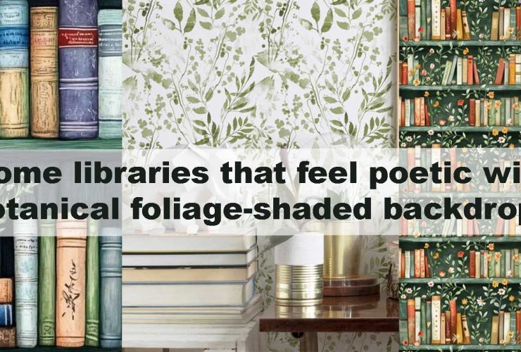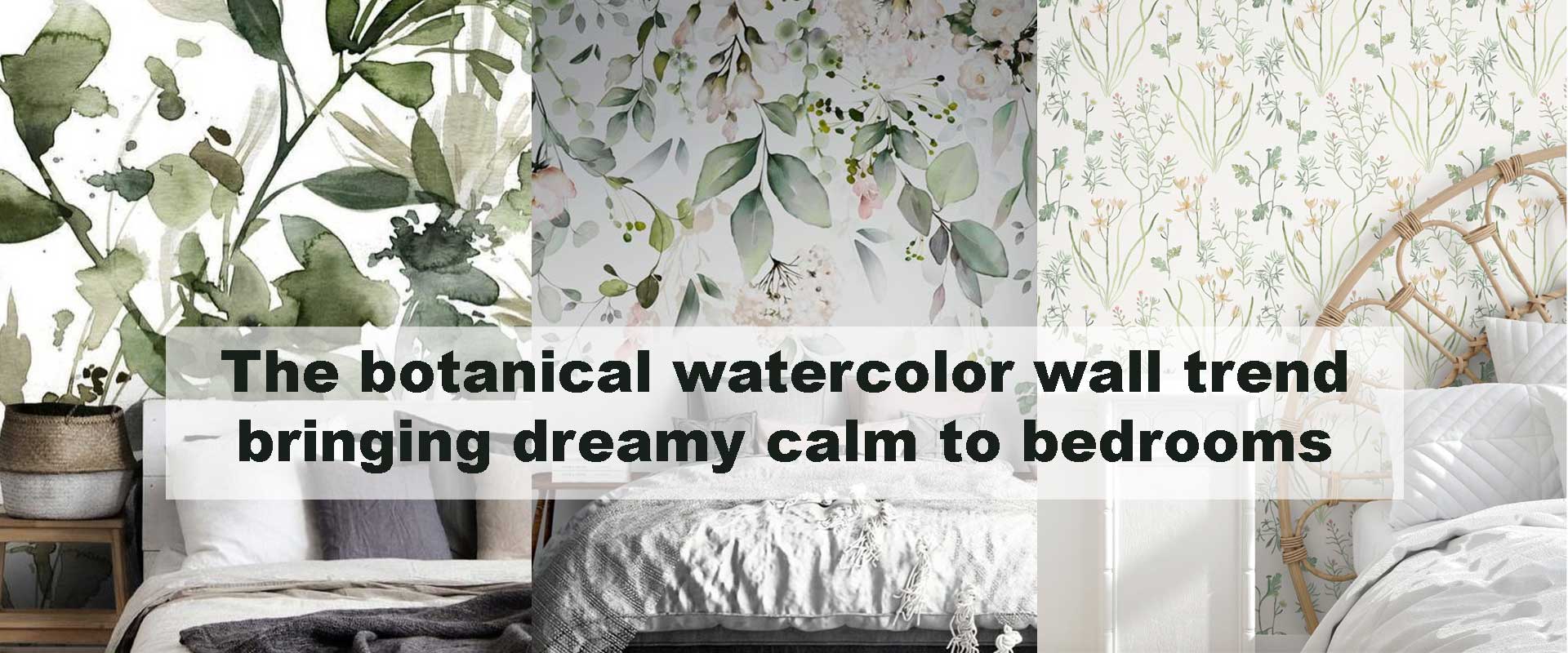
The botanical watercolor wall trend bringing dreamy calm to bedrooms
Soft gradients, delicately washed leaves, and gentle botanical silhouettes are reshaping how bedrooms feel today. The botanical watercolor wall trend is bringing a dreamy calm that feels effortless yet deeply atmospheric, letting homeowners create spaces that support rest, comfort, and emotional ease. With watercolor botanicals, you gain fluid movement, airy layering, and natural serenity all in one design language, making it a natural choice for bedrooms focused on tranquility. Many homeowners first encounter this shift while exploring Botanical Wallpaper, discovering how its layered softness reshapes a room’s mood.
Watercolor botanicals work beautifully in bedrooms because they blend structure with flow. Leaves don’t appear rigid; instead, they feel brushed by light, softened by pigment, and shaped by quiet movement. This unique visual rhythm supports the body’s desire to unwind at the end of the day. And unlike bold florals or graphic prints, watercolor styles never overpower the senses—they bring presence without pressure. This is why the trend continues to rise in modern interiors, echoing many principles mentioned in Bringing calm to modern homes with soft botanical wallpaper themes.
Why Watercolor Botanicals Work So Well in Bedrooms
Softened Edges That Relax the Eyes
Watercolor botanicals avoid sharp lines, making them ideal for rooms meant for deep rest. As the pigment flows organically, the edges appear blurred, similar to natural light filtering through leaves. This effect encourages the eyes to travel slowly across the wall, creating a naturally soothing response. In bedrooms where gentle visual flow is essential, soft watercolor transitions maintain relaxation without introducing visual noise. A touch of Watercolor Botanical Wallpaper brings this calm fluidity instantly.
Biophilic Comfort Through Natural Themes
Watercolor botanicals connect directly to nature’s quiet energy. They incorporate organic shapes, natural symmetry, and gentle familiarity, which together help reduce tension in the mind and body. Bedroom environments benefit from these natural cues, as they promote feelings of grounding and emotional openness. When combined with soft lighting and natural textures like linen, rattan, or oak, watercolor botanicals create immersive biophilic comfort.
Dreamy Color Palettes for Evening Wind-Down
Many watercolor patterns lean into muted greens, soft olives, powdery terracottas, misty blues, and neutral taupe washes. These colors mimic dawn or dusk, encouraging the nervous system to settle. Bedrooms thrive on this palette because it communicates peace without monotony. And for homeowners seeking a stronger nature connection, the gentle presence of Green Botanical Wallpaper pairs beautifully with watercolor textures.
How Watercolor Botanicals Shape Bedroom Atmosphere
A Floating, Airy Visual Effect
One of the most distinctive features of watercolor botanicals is the feeling of “lift” they give to a room. Because the pigments fade gradually, they seem to float across the wall. This airiness helps bedrooms feel brighter and more spacious without needing intense color contrast. The sense of open space encourages deeper breathing and smoother mental transitions at the end of the day.
A Gentle Rhythm That Improves Sleep Quality
The emotional effect of watercolor botanicals can be surprisingly impactful. Repetitive, soft, and flowing shapes create a visual rhythm that supports sleep preparation. Unlike rigid geometric patterns, which stimulate, watercolor designs promote mental quiet. When paired with dimwarm lighting, the effect becomes even more soothing—a design concept supported in patterns discussed in Designing a home office with botanical wall patterns that support focus where visual gentleness improves concentration and calm.
Depth Without Darkness
Bedrooms often need depth but not heaviness. Watercolor botanicals create dimensionality through overlapping leaves, transparent brushwork, and soft shadow play rather than strong outlines. This avoids the cave-like feeling dense prints can create while still giving the walls sculptural interest. Designs like Floral Botanical Wallpaper achieve this especially well when rendered in watercolor tones.
Choosing Watercolor Botanical Wallpapers for Bedroom Types
Watercolor botanicals bring subtle movement and gentle emotion into bedrooms, but the way they transform a room depends on its size, light, and layout. Each bedroom type benefits from a slightly different watercolor expression, allowing the design to feel purposeful and naturally calming.
For Small Bedrooms
Small bedrooms thrive on designs that create openness without relying on bold contrast. Soft minimalist watercolor botanicals—especially those painted with airy brushwork and generous light space—help expand the visual field. Light greens, breezy blues, and warm neutral washes make the room feel brighter and more breathable, guiding the eye smoothly across the wall without creating weight. Patterns with negative space or sparse foliage silhouettes help small rooms feel restful rather than busy, giving the impression of gentle airflow rather than dense decoration. When combined with soft fabrics and a simple furniture palette, watercolor designs provide a serene foundation that makes compact spaces feel considered and calm.
For Medium Bedrooms
Medium-sized bedrooms can embrace more texture, richer tones, and deeper watercolor layers without losing their airy quality. This is where overlapping leaves, soft vine movement, and gentle floral washes truly shine. The added dimension helps the room feel warm and cocoon-like while still maintaining fluidity. Mid-tone greens, muted terracottas, and diffused blues softly anchor the space, allowing the watercolor gradients to wrap the room in a soothing glow. These designs create just enough depth to make the bedroom feel grounded, while their soft edges prevent visual heaviness. Because medium rooms sit between cozy and spacious, watercolor botanicals can act as a unifying element that makes the space feel cohesive.
For Large Bedrooms
Large bedrooms gain intimacy and elegance when bold watercolor botanicals are used thoughtfully. High-flow pigments, expansive leaf contours, and sweeping branch forms help bring the walls inward just enough to create warmth without reducing the sense of scale. These rooms handle drama well, but watercolor’s gentle transitions keep the look refined rather than overpowering. Large-scale designs help define the bed area, turning it into an inviting focal point that sets the tone for rest. Deep sage, charcoal-light blends, moody olive washes, or layered oceanic blues balance the spaciousness beautifully. This approach makes large bedrooms feel purposeful, grounded, and visually connected.
Popular Watercolor Botanical Styles for Dreamy Bedrooms
Watercolor botanicals come in many expressions, each capable of shaping a different type of calm. Whether you prefer forest whisper tones, coastal softness, or warm neutral serenity, the following styles are among the most beloved for creating dreamy bedroom atmospheres.
1. Misty Green Leaf Washes
Misty green washes capture the quiet essence of nature at dawn. Their soft leaf silhouettes and delicate water pooling feel like fresh morning light settling across foliage. These designs pair beautifully with wooden furniture and neutral fabrics, making the bedroom feel grounded and naturally balanced. For homeowners who love calm earth tones, these patterns offer gentle stability without ever feeling heavy.
2. Blue Botanical Watercolor Themes
Blue watercolor botanicals evoke coastline breezes and open-sky serenity. Misty blues and faded indigos create a refreshing calm that helps bedrooms feel lighter and more restorative. These designs pair effortlessly with white bedding, driftwood accents, brushed metals, and soft greys. They’re especially soothing in rooms that receive cooler natural light, where the hues blend seamlessly into the overall atmosphere.
3. Neutral Taupe Botanical Washes
Neutral taupe watercolor botanicals bring understated refinement. Their subtle gradients complement modern, minimalist, and transitional interiors effortlessly, adding warmth while keeping visual noise low. These patterns are ideal for bedrooms seeking calm elegance—spaces where tones remain soft, natural, and timeless. Taupe washes also pair well with matte textures and monochrome décor, creating quiet sophistication.
4. Soft Floral Watercolor Patterns
Soft floral watercolor designs introduce romance without sharp contours or intense color shifts. Blurred petals, gentle blooms, and diffused shading create a slow, calming rhythm that suits bedrooms with warm undertones. These patterns complement dusky rose accents, creams, beiges, and brushed gold hardware beautifully. The overall effect feels tender and tranquil—perfect for spaces designed to soothe and comfort.
5. Tropical Watercolor Botanicals
Tropical watercolor botanicals bring freshness through flowing palm shapes, softened banana leaves, and diffused monstera contours. The pigments blend in a breezy, coastal rhythm that adds vibrancy without intensity. Their gentle tropical energy pairs wonderfully with natural textures like rattan, bamboo, raw wood, and sandy linens. This style is ideal for bedrooms seeking a more rejuvenating calm—a softness that feels alive, breezy, and warm.
How Watercolor Botanicals Compare to Other Botanical Styles
Below is a comparison designed to help homeowners choose between soft watercolor botanicals and alternative bedroom-friendly botanical styles.
Botanical Bedroom Style Comparison
| Style | Visual Mood | Impact Level | Best For | Color Direction |
|---|---|---|---|---|
| Watercolor Botanicals | Dreamy, fluid, soft | Low–medium | Calm bedrooms, airy spaces | Muted greens, taupe, soft blues |
| Vintage Botanicals | Timeless, detailed | Medium | Classic bedrooms | Cream, forest green, sepia |
| Dark Botanicals | Moody, dramatic | High | Luxe or atmospheric spaces | Deep green, navy, charcoal |
| Abstract Botanicals | Artistic, modern | Medium | Contemporary bedrooms | Neutral washes, muted brights |
| Line-Art Botanicals | Minimal, structured | Low | Clean, modern bedrooms | Black, olive, graphite |
For those who prefer understated calm with gentle color, watercolor botanicals remain unmatched.
Styling Tips to Enhance Watercolor Botanical Bedroom Walls
Use Warm Lighting to Amplify Softness
Warm lighting turns watercolor botanicals into a living backdrop. Soft-glow bedside lamps, amber-toned sconces, or diffused pendant lights help the pigment bloom gently across the wall, creating pockets of radiance that mimic dusk light filtering through leaves. This warm illumination adds a dreamy haze that makes the bedroom feel instantly calmer. When the light meets the watercolor transitions, the wall appears to breathe—ideal for winding down after a long day.
Choose Textures That Reflect Nature
Bedrooms decorated with watercolor botanicals feel even more serene when natural textures echo the wall’s softness. Linen bedding introduces a relaxed, airy drape that mirrors the watercolor flow, while rattan headboards, woven baskets, and matte ceramic accents build a tactile connection to nature. Even a wooden side table or a simple jute rug can anchor the room with organic warmth. Layering textures this way enhances the biophilic comfort that watercolor designs already provide.
Keep Bedding Colors Muted
Watercolor designs thrive when they’re surrounded by calm palettes. Bedding in soft greens, warm whites, muted taupe, or dusty blues helps maintain harmony across the room. These shades allow the watercolor patterns to glow without competing for attention. If you prefer bolder accents, keep them minimal—perhaps a single terracotta throw or a subtle botanical cushion—so the dreamy watercolor wall remains the star.
Balance With Minimal Artwork
Watercolor botanical walls already bring gentle movement and visual softness, so artwork should be chosen carefully. Minimal line drawings, airy watercolor prints, or monochrome botanical sketches maintain balance without crowding the space. Select pieces with plenty of breathing room around them to support the restful atmosphere. When your wallpaper is this serene, even a single oversized artwork with soft contours can complete the look.
Where Watercolor Botanicals Fit Best in Bedroom Layouts
• The Main Feature Wall Behind the Bed
A watercolor botanical feature wall behind the bed becomes a natural focal point while enveloping the room in softness. It frames the headboard beautifully, giving the space a sense of gentle structure without sharp outlines. This placement works especially well with designs from the Floral Botanical Wallpaper family, where flowing petals or leafy silhouettes echo the bedroom’s sense of rest.
• All Four Walls for a Fully Cocooned Effect
Coating all four bedroom walls in watercolor botanicals creates a deeply immersive cocoon of calm. The diffused pigments wrap the room in visual softness, making large bedrooms feel intimate and small bedrooms feel quietly spacious. This approach is perfect for homeowners who want a transformative, sanctuary-like mood.
• A Partial Wall or Niche
Partial coverage or accent niches can softly guide the eye through the room. A watercolor botanical design in a reading corner, dressing nook, or alcove creates pockets of gentle visual interest without overwhelming the entire layout. This selective placement works wonderfully in minimalist bedrooms that still crave a touch of nature-inspired serenity.
• Ceilings for a Dreamy Overhead Effect
Although less common, watercolor botanicals on the ceiling create an ethereal canopy effect—as if soft leaves drift above while you rest. This dreamy overhead placement works beautifully in calm, low-lit bedrooms where the ceiling becomes part of the relaxation experience. It’s a bold but magical choice for those wanting a bedroom that feels like a watercolor sky.
Moody Watercolor Botanicals: A Rising Micro-Trend
Moody watercolor botanicals are redefining what calming bedrooms can look like. Instead of bright pastels or airy greens, these designs lean into softened charcoal, deep olive, muted indigo, and midnight blue washes. The pigments blend in a velvety gradient, offering depth without heaviness. Subtle leaf contours hide within the shadows, giving the wall a painterly, cloud-like quality that feels both intimate and atmospheric.
This micro-trend suits bedrooms seeking a dramatic yet soothing presence. When paired with walnut furniture, warm lighting, or matte textured fabrics, dark watercolor botanicals create a restful mood that’s sophisticated rather than somber. Homeowners drawn to richer palettes often find these designs resonate with the same emotional comfort expressed in Dark Botanical Wallpaper, but with a gentler, more artistic veil.
Whether you prefer airy watercolor leaves or velvety deep washes, both approaches bring a level of tranquility that makes bedrooms feel intentionally peaceful—an atmosphere that only watercolor can create.
Frequently Asked Questions
1. Are watercolor botanical wallpapers difficult to maintain?
Not at all. High-quality wallpapers are wipe-friendly and retain pigment softness over time, making them ideal for calm, low-traffic rooms like bedrooms.
2. Will watercolor botanicals fade in sunlight?
Quality wallpapers are designed to resist fading, especially when used in rooms with soft, diffused natural light.
3. Do watercolor botanicals work with bold furniture?
Yes. Their softness balances stronger shapes or saturated tones, preventing visual overwhelm.
4. Are watercolor botanicals suitable for kids’ bedrooms?
Absolutely. Their dreamy softness creates a peaceful environment that supports restful sleep.
5. Can watercolor patterns fit modern interior themes?
They can. Their minimal strokes and organic gradients integrate beautifully with modern, Scandinavian, and contemporary interiors.
Conclusion
The botanical watercolor wall trend is transforming bedrooms into sanctuaries of dreamy calm, offering a soothing blend of nature, movement, and softness. With fluid pigments and gentle botanical shapes, these wallpapers carry a quiet emotional power that supports rest, clarity, and comfort—qualities every bedroom deserves. Whether you choose subtle greens, airy blues, or warm neutrals, watercolor botanicals offer timeless serenity that grows more beautiful with every passing day. For bedrooms that feel naturally restful, this trend is more than a passing style—it’s a peaceful design philosophy waiting to unfold.