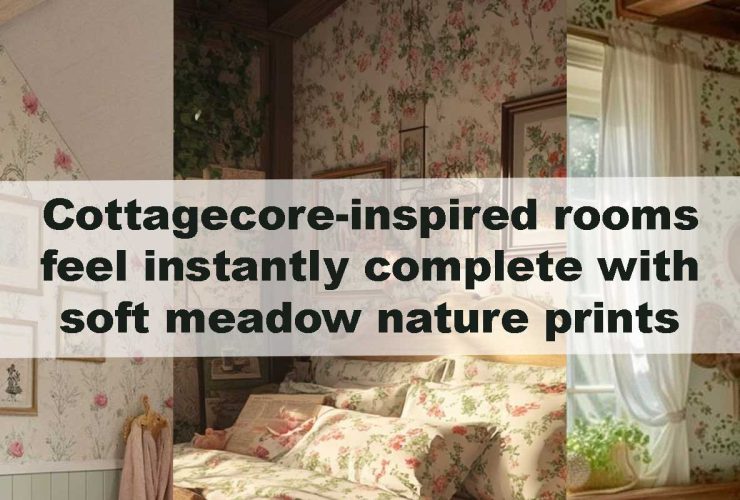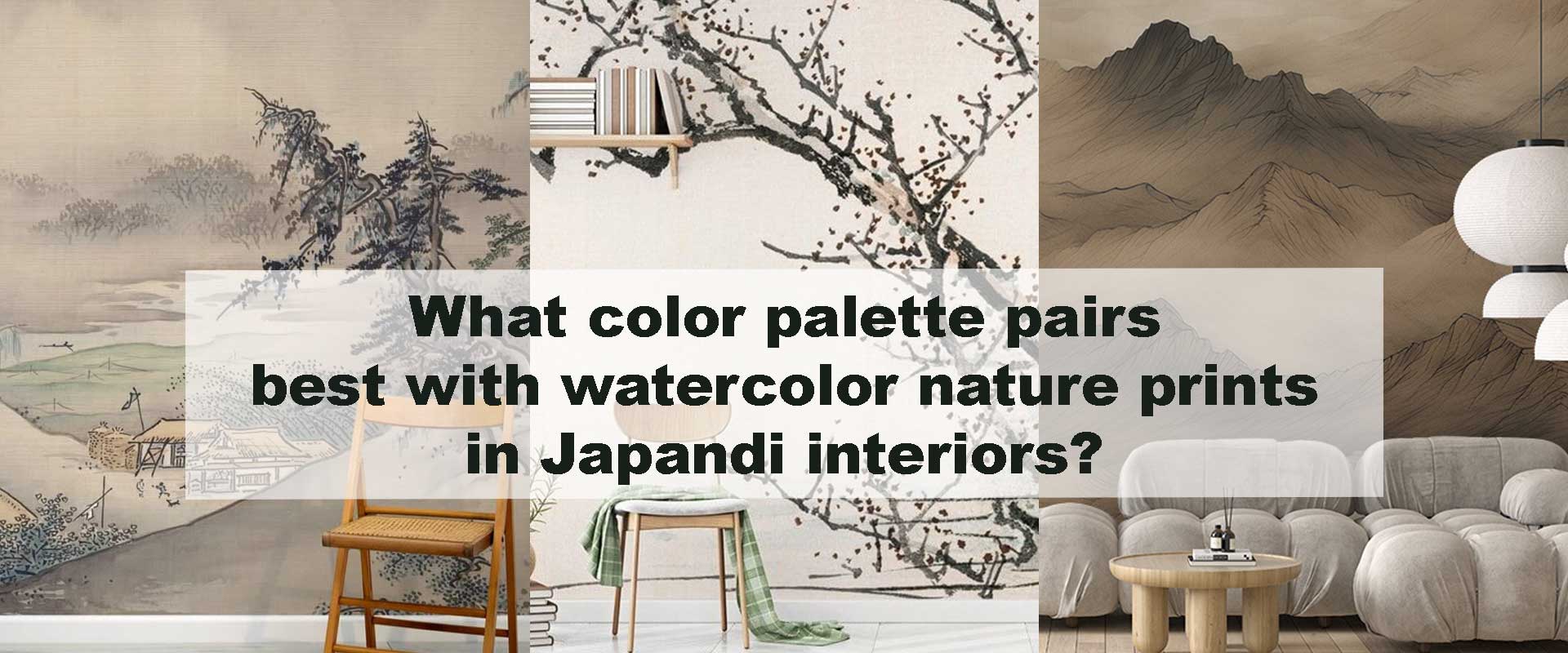
What color palette pairs best with watercolor nature prints in Japandi interiors?
Watercolor nature prints have a natural synergy with Japandi interiors because both aesthetics prioritize calm expression, organic softness, and a mood of effortless balance. When gentle washes of color flow across the wall—similar to the atmospheric gradients in Nature wallpaper—the room feels like it’s breathing quietly. Japandi design thrives on simplicity and warmth, so selecting the right palette becomes essential to let watercolor motifs blend seamlessly into the space without overpowering its restrained elegance. Homeowners often realize how profoundly wall imagery shapes mood when exploring insights like Bedrooms transform instantly when mountain-inspired nature wallpaper sets the mood, where color and landscape themes become emotional anchors.
Why Watercolor Works So Well in Japandi Interiors
Watercolor art slips naturally into Japandi interiors because its very essence echoes the design philosophy both cultures admire: softness, intention, and quiet restraint. The diffused edges, translucent layers, and gentle tonal shifts found in watercolor mimic the fluidity of nature—rolling mist, drifting petals, distant mountains softened by light. Japandi spaces thrive on this sense of calm movement. Instead of rigid outlines and sharp contrast, watercolor brings atmosphere. It introduces depth without weight, detail without noise, and expression without overwhelming the eye.
Its layered transparency resonates with the Japanese principle of ma—the beauty of intentional emptiness—while its softness aligns with Scandinavian warmth and functionality. Together, these qualities create a home that feels grounded yet airy, minimal yet emotionally rich. Watercolor’s organic flow enhances the slow-living ethos central to Japandi design, making rooms feel like peaceful extensions of the natural world.
Choosing the Ideal Color Palette
Because watercolor art carries its own gentle rhythm, the supporting palette should feel like an extension of that flow. Every hue in a Japandi room must carry purpose—reinforcing the artwork’s softness, anchoring the space with warmth, or offering subtle contrast that sharpens the mural’s atmospheric quality. Below are the tones that elevate watercolor nature murals most effectively in Japandi homes.
Soft Greige & Warm Neutrals
Greige, oat-linen, mushroom, almond, and soft wheat tones form the quiet backbone of Japandi interiors. These hues sit between warm and cool, creating a soft, enveloping glow that feels both natural and understated. When paired with watercolor botanicals or gentle landscape washes, they provide a serene visual foundation that allows the artwork’s gradients to read clearly without competing for attention.
Their muted warmth beautifully complements designs from the Watercolor nature wallpaper collection, where the interplay of fading edges and organic shapes thrives against neutral backdrops. In open-plan Japandi spaces, these shades help walls, furniture, and artwork blend into a seamless whole, making the room feel lighter, calmer, and more cohesive.
Benefits of Warm Neutrals
- They echo Japandi’s core natural materials—linen, birch, raw clay, river stone—creating harmony between the artwork and the room’s texture.
- They prevent visual sterility, adding warmth that keeps minimal interiors from feeling cold or under-furnished.
- They enhance watercolor transitions, allowing soft shifts in tone to appear more fluid and expressive.
- They unify larger spaces, allowing walls and furnishings to merge into a calm, uninterrupted landscape that supports slow-living sensibilities.
Misty Blues & Cool Grey Greens
These cool, desaturated hues—eucalyptus green, soft slate blue, mist-grey, and delicate fog green—carry the tranquil mood of early morning landscapes. They echo the quiet stillness of dawn, where light diffuses gently across mountains and water. When paired with watercolor murals, these tones reinforce every soft brush transition, making landscapes feel more immersive and emotionally resonant. Their understated coolness aligns with both Japanese serenity and Scandinavian subtlety, strengthening Japandi’s meditative essence. Watercolor scenes similar to those in the Landscape nature wallpaper category benefit profoundly, as cool palettes heighten spatial depth and extend the mural’s horizon into the room.
When Cool Tones Shine
- Rooms filled with soft natural daylight, where misty hues reflect incoming light and create a quiet glow that enhances watercolor gradients.
- Spaces grounded in linen upholstery and pale-toned furniture, allowing cool tones to breathe and subtly uplift the calming palette.
- Interiors where the mural is the emotional anchor, letting cool colors amplify the sense of open air, distance, and visual expansion.
- Watercolor compositions with layered peaks, distant valleys, or horizon lines, where cool tones deepen the sense of atmospheric perspective.
Soft Charcoal Anchors
Japandi interiors rarely rely on heavy contrast, yet they embrace subtle grounding elements that add clarity to the space. Soft charcoal, warm graphite, or ink-black functions like the delicate outline in a watercolor sketch—never dominant, always enhancing. These shades define form with quiet confidence, framing watercolor artwork so its fluid transitions stand out more clearly. They are especially compelling in murals featuring tree silhouettes, ridge formations, or layered mountain peaks such as those in the Mountain nature wallpaper collection. Used thoughtfully, charcoal becomes a whisper of structure within an otherwise serene palette.
Best Uses of Charcoal in Japandi Rooms
- Slim, linear window frames surrounding nature murals, adding architectural refinement without overshadowing the artwork.
- Minimalist lighting with matte black stems, which grounds the softness of watercolor while preserving Japandi’s sleek, unobtrusive aesthetic.
- Ceramics, bowls, or vases with soft charcoal glazing, introducing gentle depth through handcrafted texture.
- Clean-lined timber furniture paired with charcoal hardware, blending natural warmth with modern restraint to support watercolor themes subtly and elegantly.
Pale Woods for Organic Grounding
Light oak, ash, and birch are foundational to Japandi interiors because they embody the philosophy of calm natural honesty. Their pale, honeyed undertones introduce warmth without heaviness, allowing watercolor compositions to feel brighter, softer, and more connected to the room’s architecture. Watercolor’s fluid transitions—its diffused edges, gentle gradients, and organic drift—become more expressive when framed by pale wood, as if the artwork flows naturally into the textures of its surroundings. The grain patterns of these woods add a quiet rhythm that mirrors watercolor’s movement, reinforcing the emotional stillness and grounded comfort at the core of Japandi design.
Most Harmonious Pairings
- Pale-wood slatted partitions beside botanical murals, allowing light to slip through the slats and cast a soft pattern that echoes the movement of watercolor leaves.
- Floating shelves framing scenic watercolor walls, where the clean lines of wood lend structure without diminishing the mural’s gentle atmosphere.
- Minimalist light-wood bed frames grounding mountain murals, giving visual stability to broad horizon lines and misty watercolor peaks.
- Scandinavian-style dining tables beneath hand-wash landscape murals, creating a tranquil dining environment where the natural grain of the wood harmonizes with the mural’s calm gradients.
Muted Earth Pigments for Natural Depth
Foggy terracotta, dusty clay, stone-brown, and muted taupe introduce soft grounded energy to Japandi spaces, acting as quiet stabilizers that balance watercolor’s lightness. These earth pigments enrich watercolor botanicals, valley silhouettes, or autumn-inspired motifs by adding depth without overwhelming them. Their restrained warmth nods to wabi-sabi philosophy, celebrating the beauty found in natural imperfections—weathered clay, aged timber, sun-softened soil. When layered thoughtfully, these tones create a cocooning sense of comfort that deepens the emotional impact of watercolor art.
Where Earth Tones Work Best
- Spaces featuring handcrafted ceramics or textured linen, where organic materials deepen the relationship between color, texture, and natural form.
- Rooms with warm morning light, which enhances the gentle warmth of clay-toned accents and brings watercolor hues to life with a soft, golden glow.
- Areas dominated by natural fibers—jute, cane, rattan, woven grasses, where the palette feels connected, humble, and intentionally raw.
- Watercolor murals with fall, meadow, or valley inspiration, allowing earthy tones to echo the warmth of natural landscapes, reinforcing a grounded, meditative mood.
Best Palettes for Watercolor Nature Prints in Japandi Interiors
| Palette Type | Visual Mood | Best Watercolor Style | Works Best In | Why It Fits Japandi |
|---|---|---|---|---|
| Warm Neutrals (Greige, Mushroom, Almond) | Calm, grounding, luminous | Botanical washes, soft abstract foliage | Living rooms, bedrooms | Creates softness, supports natural textures, keeps space warm without clutter |
| Cool Tones (Misty Blues, Grey Greens) | Meditative, airy, quiet | Mountain silhouettes, misty lakes, horizon washes | Reading corners, minimalist layouts | Enhances watercolor gradients and echoes natural landscapes |
| Soft Charcoal Accents | Defined, subtle structure | Ink-inspired peaks, layered ridgelines | Entryways, modern Japandi rooms | Adds quiet contrast without disrupting minimalism |
| Pale Wood Tones (Birch, Ash) | Organic, warm, grounded | Botanical or landscape themes | Dining areas, serene bedrooms | Builds natural warmth and reflects core Japandi principles |
| Muted Earth Pigments (Clay, Dusty Brown) | Cosy, earthy, textured | Meadow scenes, autumn foliage | Soft-lit corners, wabi-sabi interiors | Adds gentle depth and reflects nature through subdued tones |
Balancing a Full Japandi Palette Around Watercolor Art
Achieving harmony in Japandi interiors begins with intentional restraint. Rather than layering multiple calming colors for the sake of visual variety, Japandi emphasizes curation, allowing every shade to feel purposeful. Watercolor murals thrive under this philosophy because their beauty lies in subtlety—soft transitions, delicate gradients, and expressive natural forms. The surrounding palette should feel like an echo of the mural, supporting its presence instead of competing with it.
To build the perfect balance:
- Start with one foundational neutral—a warm greige, soft oat, or mushroom beige—to establish the room’s emotional temperature. This anchors the space gently while leaving enough room for the watercolor artwork to shine.
- Introduce a single supporting tone, either a cool hue like eucalyptus or mist-blue or a warm earth pigment like dusty clay. This secondary shade should feel like an extension of the watercolor’s softer shadows or highlights, reinforcing coherence.
- Add a restrained anchor shade such as soft charcoal, ink-grey, or muted black. Use it sparingly in linear elements—slender furniture legs, minimalist metal trims, or refined lighting—so the room feels defined but never harsh.
- Keep major surfaces calm and unified. Walls, floors, and key furniture should remain in pale wood or warm neutrals. This prevents visual noise and ensures the watercolor wall retains its expressive role.
- Use contrast only where necessary, and always with intention. Soft black ceramics, matte frames, or small charcoal décor pieces introduce gentle tension that highlights the watercolor’s subtler details without breaking Japandi’s tranquillity.
- Prioritize tactile natural fibers—linen, wool, rattan, cotton, and raw wood grain—to echo watercolor’s fluid softness in a sensory, physical way. These textures translate watercolor’s visual calm into a full-room feeling of warmth and comfort.
When these elements work together, the palette becomes a quiet framework that elevates the mural. Watercolor art transforms from an image on the wall into an atmospheric presence, shaping the room’s tone with grace and intention.
Final Thought
When the elegance of warm neutrals meets the calm depth of cool tones, the grounding beauty of pale woods, and the subtle discipline of charcoal accents, watercolor nature prints become more than decoration—they become the emotional heart of a Japandi room. Their gentle gradients and nature-led storytelling enrich the space with stillness and poetic softness. The result is a home that invites slower living, thoughtful connection, and a sense of natural harmony that unfolds quietly with every glance.