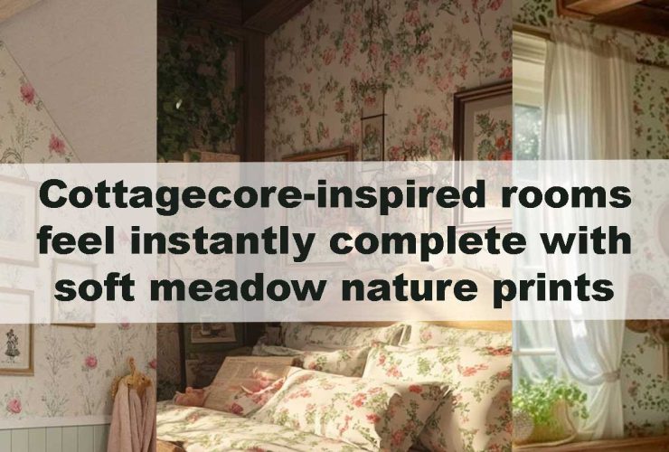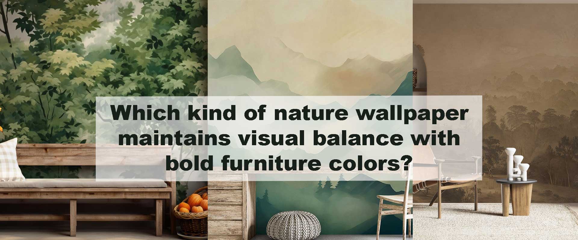
Which kind of nature wallpaper maintains visual balance with bold furniture colors?
Bold furniture—whether emerald upholstery, cobalt cabinetry, or terracotta seating—creates instant personality in a room. Yet when these high-impact tones dominate, the wall behind them becomes crucial. A calming scene such as Nature wallpaper often restores equilibrium by softening intense colors and giving the eye a place to rest. Many homeowners notice how effortlessly this balance works after engaging with ideas from pieces like Bedrooms transform instantly when mountain-inspired nature wallpaper sets the mood, where scenic backdrops help strong décor feel grounded.
Nature-inspired prints stabilize interiors because they introduce soft gradients, organic shapes, and natural tones. These elements prevent bold color pieces from overwhelming the room, creating harmony rather than color chaos. When chosen thoughtfully, nature wallpapers allow vivid furniture to shine without overpowering the space.
1. Soft-Neutral Nature Wallpapers: Quiet Foundations for Loud Color
Rooms filled with bold seating or vivid cabinetry naturally benefit from a backdrop that steadies the eye, and soft-neutral wallpapers deliver this with effortless grace. Designs inspired by wind-smoothed sand dunes, parchment-washed forests, pale botanical silhouettes, or weathered stone textures create a gentle, grounding canvas. Cream-toned or taupe woodland themes—especially those reflected in forest nature wallpaper collections—settle emerald sofas, mustard lounge chairs, berry-tinted consoles, and other saturated pieces into a calm visual rhythm. Instead of battling for dominance, the furniture appears refined, intentional, and beautifully framed.
Soft neutrals give the room a serene terrain where bold color can rest without losing character. They act like a quiet breath beneath vibrant elements, supporting strong accents rather than absorbing or diminishing their personality.
2. Monochrome and Charcoal Nature Prints Bring Structure
Spaces energized by saturated furnishings often require a stabilizing counterpoint, and monochrome nature prints provide exactly that. Black-and-white foliage, charcoal-toned mountains, and grayscale woodland sketches introduce clean structure that reins in visual intensity. These pared-back palettes prevent color overload by keeping the wall disciplined and steady, allowing brighter hues to shine without visual conflict.
Rich jewel-tone interiors, in particular, gain clarity when paired with the crisp lines and tonal restraint found in monochrome nature wallpaper ranges. Instead of competing for attention, the furniture becomes a focal expression against a backdrop that organizes the entire scene with modern elegance.
3. Minimalist Botanical Motifs Offer Breathing Space
Some rooms thrive on bold color but still require a sense of openness, and minimalist botanical motifs excel at providing that breathing space. Delicate leaf outlines, airy branch tracings, and simplified organic forms introduce generous negative space—a vital ingredient when saturated tones dominate the palette. Burgundy seating surrounded by fine eucalyptus sketches or teal furniture set against feather-light fern silhouettes creates a refined contrast that feels calm yet sculptural.
This aesthetic aligns seamlessly with modern, Japandi, and Scandinavian sensibilities, where clarity and softness shape the overall mood. Minimal botanical themes allow bold décor to express itself without overwhelming the environment, giving the entire room a balanced, effortless sense of calm.
4. Muted Large-Scale Murals Expand the Room
Scale becomes a powerful design tool when bold furniture anchors the room. A sweeping scenic mural—mountain silhouettes, open meadows, lakeside horizons, or softly layered skies—redistributes visual weight so the eye travels outward rather than resting solely on saturated décor. Soft greys, weathered greens, and subdued pastels within mountain nature wallpaper collections introduce atmospheric distance, giving the wall a gentle, receding quality that instantly enlarges the space.
Emerald seating settles gracefully when paired with misty peaks, while mustard or terracotta furnishings feel more refined against the glow of a subtle sunrise or dusk gradient. These murals act almost like a built-in horizon line, guiding the room toward calm balance and allowing bold pieces in the foreground to feel thoughtfully framed rather than visually heavy.
5. Textured Nature Wallpapers Add Organic Calm
Texture carries an emotional softness that pattern alone often cannot achieve. Wallpapers inspired by grasscloth, handwoven fibers, bark detailing, or sandy terrains introduce a natural irregularity that diffuses the intensity of saturated furniture. Terracotta chairs gain depth and warmth when placed against sand-textured surfaces, while jewel-toned velvet pieces feel grounded near stone-like finishes that echo the quiet strength of natural materials.
These tactile impressions subtly blur the boundaries between furniture and wall, creating a gentle, cohesive atmosphere. Instead of competing with bold décor, textured wallpapers act as calming anchors, adding organic richness that makes the entire room feel more composed and inviting.
6. Watercolor and Soft-Gradient Nature Themes Create Fluid Harmony
Watercolor murals bring a sense of movement that softens the visual tension bold colors can create. Designs within watercolor nature wallpaper offer drifting horizons, diffused shadows, and feathered transitions that help saturated furnishings blend seamlessly into the environment. Grey-blue washes calm cooler tones, sage-cream gradients support earthy palettes, and pink-taupe skies add a gentle glow that harmonizes with deeper jewel shades.
This fluidity transforms the wall into an atmospheric backdrop that connects each piece of furniture through subtle color echoes. The room feels unified because the gradients guide the eye gently from one tone to the next, turning bold décor into part of a serene, continuous visual story. Watercolor becomes the emotional bridge between saturation and softness, helping the space breathe with effortless elegance.
Color-Matching Guide for Designers
| Furniture Color | Recommended Nature Wallpaper | Reason It Works |
|---|---|---|
| Emerald | Taupe forests, cream botanicals | Grounds rich green intensity |
| Cobalt | Grey mountains, blue-grey watercolor | Softens saturation through atmospheric depth |
| Mustard | Monochrome leaves, charcoal trees | Controls warmth and reduces visual heat |
| Terracotta | Sand dunes, stone scenes | Creates harmonious earthy layering |
| Burgundy | Minimalist botanicals | Adds clarity and airiness |
| Ruby | Charcoal mountains | Provides necessary grounding structure |
| Teal | Cloudy gradients, soft botanicals | Refreshes while adding calm |
| Deep Green | Stone textures, soft landscapes | Softens weight while preserving richness |
This pairing system ensures even the boldest décor feels intentional and well-balanced.
How Nature Wallpapers Influence Emotional Perception
Vivid furniture injects energy into a room, but without a counterbalancing element, that intensity can quickly overwhelm the senses. Nature wallpapers restore harmony by creating visual pauses—places where the mind can settle. The gentle veil of fog, the drifting motion of clouds, and the quiet structure of distant peaks all introduce cues that instinctively calm the viewer. These natural patterns diffuse bold color pressure, letting the eye move comfortably rather than confronting saturation head-on.
Designs drawn from landscape nature wallpaper collections amplify this effect through their sense of depth and horizon. These scenes guide attention outward in a slow, steady sweep, creating a feeling of openness that counteracts the weight of intense furnishings. Instead of competing with strong tones, the wall offers a serene visual pathway that helps the room breathe.
The result is a space that feels grounded yet expressive—vibrant in personality but gently moderated by nature’s rhythm. The furniture retains its bold identity, but the wallpaper shapes the emotional tone, turning vivid interiors into environments that feel both uplifting and deeply restful.
Room-Specific Suggestions
Living Rooms
Living rooms often carry a mix of bold seating, sculptural accents, and vibrant cabinetry, making balance essential. Wide scenic murals or soft botanical spreads help unify these elements by stretching visual space and calming saturated tones. A gentle mountain horizon or an airy foliage composition allows colorful sofas and chairs to feel intentional rather than overpowering, while also guiding the eye through the room in a relaxed flow.
Bedrooms
Bedrooms benefit from soft atmospheric backdrops that support rather than compete with intense headboards or bold bedding. Misty forests, muted pastels, and delicate dusk gradients from sunset nature wallpaper introduce a quiet warmth that settles strong colors into a restorative environment. These scenes create a sense of depth behind the furniture, making even the most vibrant palettes feel soothing at the end of the day.
Dining Areas
Dining spaces work best when they maintain a sense of visual structure, especially if the chairs or sideboard lean toward bright or saturated hues. Monochrome botanicals add this refinement through clean lines and disciplined tones, allowing color-forward furniture to stand out with sophistication. The simplicity of grayscale nature patterns brings definition to the room and elevates the dining setup without adding heaviness.
Workspaces
Home offices require clarity and comfort, both of which can be disrupted by dominant furniture colors. Minimalist botanicals or soft texture-inspired prints restore this balance by introducing subtle organic motion that supports focus. These understated patterns keep colorful desks and cabinetry from feeling overwhelming, creating an environment that encourages productivity while still feeling visually calm and thoughtfully designed.
Conclusion
Interiors featuring bold furniture colors thrive when partnered with nature wallpapers that introduce calm, depth, and grounding structure. Soft neutrals, monochrome sketches, minimalist botanicals, large muted murals, textured surfaces, and watercolor gradients all help stabilize strong hues without muting personality. These pairings elevate bold décor into something refined, cohesive, and visually comfortable.