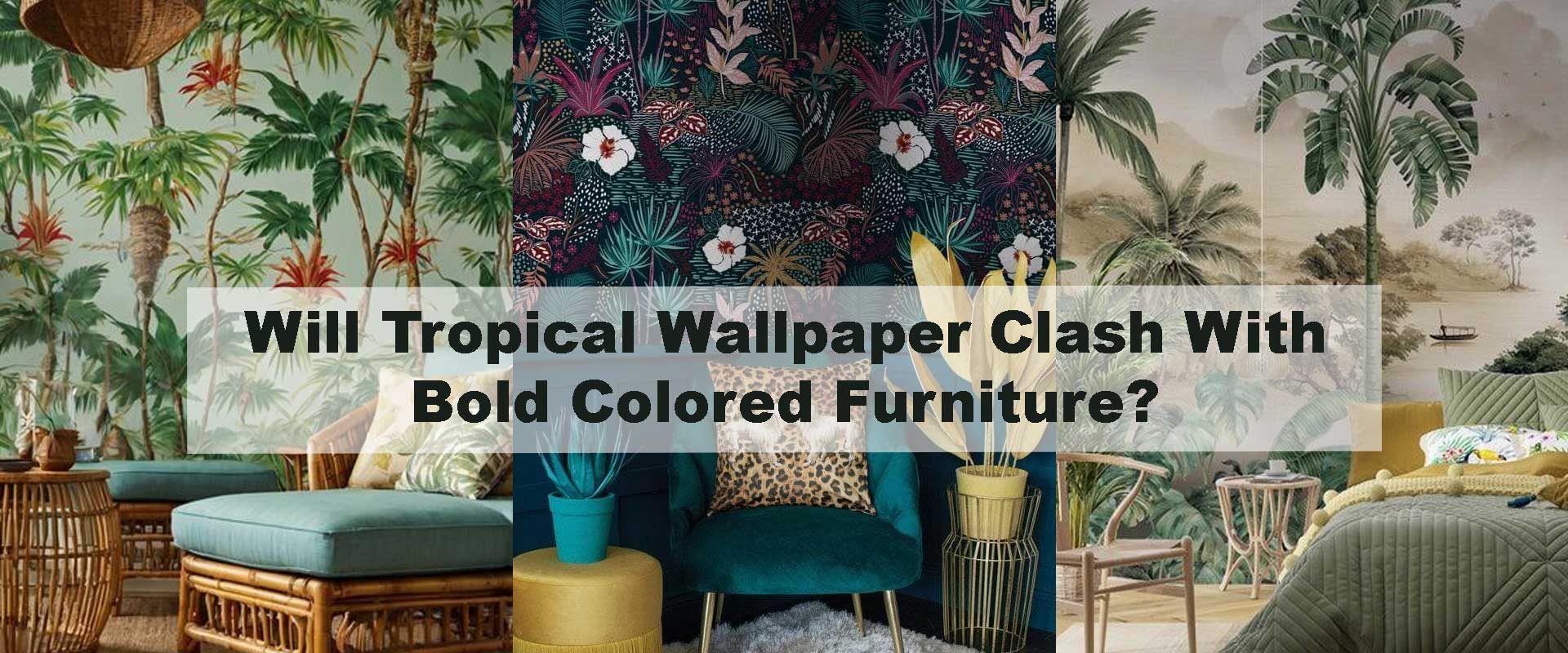
Will Tropical Wallpaper Clash With Bold Colored Furniture?
Tropical wallpaper is known for its leafy vibrance, warm gradients, and rhythmic patterns, but many homeowners hesitate when pairing it with bold furniture. The fear of clashing tones or overly expressive palettes often complicates décor decisions. Yet, tropical themes are far more adaptable than they appear, especially when you understand how hue, scale, and visual balance work together. By learning how color saturation, undertones, and pattern density coordinate with vivid furniture choices, you can create interiors that feel intentional, energetic, and beautifully layered.
Bold furniture doesn’t automatically overpower tropical wallpaper. In fact, the right combination can look elevated and harmoniously expressive. The key is to ground patterns with cohesive tones while ensuring the overall palette flows across the room. As homeowners increasingly explore adventurous styles described in How Can Tropical Wallpaper Make Small Rooms Feel Larger? —where lush designs open up compact rooms—many are discovering that bold décor is not a barrier but a companion to tropical themes. When done thoughtfully, the pairing becomes a design asset that looks curated, modern, and immersive.
Pairing vibrant furniture with nature-inspired walls also mirrors the interior mood shifts seen in Jungle Tropical Wallpapers, where deep greens, layered foliage, and subtle gradients already encourage a rich, expressive palette. Bold furnishings simply become another intentional layer in this mix. Whether you use cobalt sofas, coral chairs, mustard consoles, or emerald dining sets, the right approach will keep the space cohesive while strengthening the tropical story.
Understanding the Role of Color in Tropical Wallpaper
Tropical wallpaper typically draws from a nature-forward palette—greens, teals, browns, citrus tones, muted sunset shades, and occasional bright pops. Even dense designs maintain an organic softness, making them surprisingly compatible with strong furniture colors.
When bold furniture enters the room, the dynamic shifts from soft organic movement to energetic contrast. However, tropical patterns have a deep advantage: they’re built around naturally occurring color families. This means they can interact gently with saturated hues without feeling forced. For example, a wallpaper with washed sage leaves pairs effortlessly with vibrant rust furniture because the palette echoes earthy undertones.
This natural adaptability echoes the atmospheric insights explored in How Does Jungle Wallpaper Change the Feel of a Living Room?, where room mood is guided by the balance between bold and quiet elements. The same principle applies here: bold furniture supports contrast, depth, and brightness, while the wallpaper provides movement and structure.
Do Bold Colors Overpower Tropical Themes?
Bold colors only become overpowering when their undertones directly oppose the natural hues within the wallpaper. Tropical wallpaper—by nature—draws from lush organic palettes, allowing it to welcome saturated furniture colors far more easily than most people expect. Because these designs already blend greens, teals, rusts, sunset tones, and soft botanical washes, they inherently share a relationship with bold furniture shades. When tones align, the combination feels expressive, layered, and captivating rather than chaotic.
Bold furniture can actually elevate tropical themes by adding intentional contrast. Think of the way deep ruby chairs echo the richness of dark forest greens, or how bright coral accents mirror soft sunset strokes within warm botanical designs. The vibrancy becomes an extension of the wallpaper’s natural energy instead of something that competes with it. When the colors speak the same “emotional language,” bold furniture enhances the tropical story rather than interrupting it.
Deep Green Palettes
The rich, grounded tones found in the forest collection pair effortlessly with bold, jewel-toned furniture. Sapphire blues, garnet reds, and emerald seating blend into these wallpapers almost instinctively because both share earthy depth and natural saturation. The visual weight feels evenly distributed, creating rooms that feel immersive, dramatic, and confidently designed.
Warm Botanical Concepts
Warm botanicals—soft florals, sandy beiges, peach washes, and sunset gradients—harmonize beautifully with bold colors in the mustard, cinnamon, coral, or terracotta families. These combinations feel sun-warmed and inviting, echoing natural transitions found in tropical landscapes at dusk. The furniture becomes an accent within the overall warmth, adding emotion without disturbing balance.
Vibrant Rainforest Looks
Rainforest-inspired prints, like those in the rainforest styles, are inherently dynamic. Their wide tonal range embraces vibrant furniture such as turquoise chairs, hot pink ottomans, or bold green shelving. Because the wallpapers often contain multiple chromatic layers, they support high-saturation furnishings with ease. The result is an energetic, expressive interior that feels harmonious rather than loud.
In short, tropical wallpaper almost never clashes with bold furniture—problems arise only when undertones are mismatched. When undertones align, the room transforms into a cohesive, confident environment full of depth and personality.
How Undertones Dictate Harmony
Undertones are the subtle color temperatures beneath every shade. They determine whether two colors feel naturally related or visually disconnected. Even the most dramatic bold furniture can sit beautifully against tropical wallpaper when the undertones align.
Matching undertones is the secret to ensuring the room feels intentional. Instead of thinking of colors as separate entities, think of them as part of the same energy spectrum—warm with warm, cool with cool, neutral with almost anything. This approach creates visual flow, enhances depth, and keeps boldness from tipping into chaos.
Cool Undertones
Furniture in cool families—navy, emerald, charcoal-blue, electric teal—pairs best with wallpapers rooted in cool greens, misty blues, foggy neutrals, or nighttime jungle gradients. These pairings feel crisp, serene, and sophisticated, adding a refreshing clarity to tropical themes without sacrificing warmth or movement.
Examples of harmonious pairings:
- Navy sofa + cool green palm wallpaper
- Teal chairs + watercolor mist botanical design
- Emerald armchair + shadowed rainforest murals
Warm Undertones
Warm furniture tones—gold, mustard, rust, coral, maroon—blend beautifully with wallpapers carrying warm greens, dusty taupes, peach foliage, or dusk-toned botanical strokes. These combinations create an inviting ambiance, reminiscent of golden-hour light filtering through tropical leaves.
Examples of cohesive warm pairings:
- Mustard dining chairs + peach-washed botanical mural
- Rust velvet sofa + sunset tropical gradients
- Coral bench + warm forest foliage
Neutral Undertones
Neutral bold furniture—black, cream, stone, espresso, charcoal—acts as a stabilizer. These tones anchor any tropical wallpaper, offering structure without competing for attention. Neutral boldness works especially well in rooms where the wallpaper carries the primary visual narrative.
Examples of effective neutrals:
- Charcoal cabinet + dense jungle mural
- Cream headboard + light botanical sketches
- Espresso dining chairs + rainforest depth wallpapers
Does Furniture Size Affect How It Pairs With Wallpaper?
Scale plays just as important a role as color when pairing tropical wallpaper with bold furniture. Large, saturated pieces carry significant visual weight, and the wallpaper around them either balances that weight or amplifies it. Tropical designs—ranging from soft botanical sketches to deep forest murals—interact differently depending on how dominant the furniture is. When scale and pattern density work together, the room feels intentional and layered instead of busy or top-heavy.
Large Furniture + Dense Wallpaper
Dense tropical wallpapers with overlapping leaves, shadowed layers, or deep tonal gradients distribute visual activity across the wall. This diffuses the heaviness of oversized bold furniture, allowing both elements to share the spotlight. Furniture like wide velvet sofas, large wooden credenzas, or deep-toned loungers feels especially grounded with dense wallpapers similar to those in the deep jungle designs category. The visual richness becomes immersive rather than overwhelming, creating a bold, moody, and luxurious environment.
Large Furniture + Light Wallpaper
When large furniture is placed against light botanical sketch wallpapers, watercolor spreads, or airy leaf outlines, the furniture becomes the primary anchor that grounds the room. The wallpaper adds softness and movement without competing for attention. This pairing works beautifully in modern spaces where you want bold furniture—such as a cobalt sectional or a mustard cabinet—to feel sculptural and intentional. The light wallpaper provides just enough rhythm to prevent stark contrast while keeping the room visually light and breathable.
Small or Minimal Furniture
Small bold pieces—like accent stools, slim chairs, and compact metallic tables—introduce energizing pops of color without dominating the theme. These smaller elements excel when paired with either intricate or simple wallpaper designs because they offer contrast without adding weight. In small spaces, this combination creates visual texture and personality while maintaining openness—a principle echoed frequently in tropical interiors that prioritize airy flow and balanced spatial breathing room.
Balancing Pattern Density With Vibrant Furniture
Tropical wallpaper spans a wide spectrum—from soft linework botanicals to immersive rainforest panoramas. The boldness and saturation level of your furniture directly influence which pattern density delivers the most harmonious effect. Instead of thinking about whether bold furniture “matches” the wallpaper, consider how the two negotiate visual rhythm.
When Furniture Is Very Bold
Furniture with intensely saturated colors—cobalt, chartreuse, fuchsia, bright emerald—has a commanding presence. Pairing these vibrant pieces with medium- or light-density tropical wallpaper ensures the room doesn’t feel visually aggressive. Watercolor textures, misty gradients, or lightly sketched foliage calm the intensity and let the furniture shine without crowding the eye. This approach keeps the palette expressive but controlled.
When Furniture Is Bold but Deeply Colored
Bold doesn’t always mean bright. Deep jewel tones—emerald, plum, espresso, burgundy—interact beautifully with dense tropical murals. When the wallpaper has shadowed leaves, layered greens, or rich botanical textures, these deeper colors blend seamlessly, creating a warm, cohesive, and dramatic environment. The visual weight becomes evenly distributed, producing a luxurious atmosphere reminiscent of upscale tropical lodges and botanical retreats.
When Furniture Has Mixed Bold Colors
Multi-colored bold furniture—whether in patchwork upholstery, patterned cushions, or clustered accent pieces—needs a wallpaper that unifies the palette rather than competes with it. Tropical wallpapers with muted, neutral, or dusk-toned bases act as a steadying backdrop. They tie the bold elements together while allowing the furniture to bring energy into the space. This method creates intentional vibrance without overwhelming the senses.
How Lighting Affects the Balance
Lighting plays a defining role in how bold furniture and tropical wallpaper interact. The same colors can feel soft and welcoming or sharp and high-contrast depending on the temperature and direction of the light. Thoughtful lighting enhances undertones, harmonizes contrasts, and shapes the room’s emotional tone.
Warm Lighting
Warm lighting—golden, amber, or soft white—adds a gentle glow that smoothens the contrast between bold furniture and tropical wallpaper. Bold colors appear richer and more cohesive, while tropical gradients blend seamlessly into the room’s glow. This lighting is ideal for living rooms, bedrooms, and relaxation zones where warmth and calmness are desired. Under warm lighting, tropical greens feel earthy, corals feel sunset-like, and bold furniture becomes inviting rather than intense.
Cool Lighting
Cool lighting—bright white or faintly blue—sharpens every edge and intensifies contrast. Bold furniture appears more saturated, and the details of tropical wallpaper stand out with greater clarity. This environment feels crisp, modern, and dynamic, making it excellent for dining rooms, offices, studios, and contemporary interiors. With cool lighting, leaf veins, watercolor textures, and botanical outlines look more defined, creating a visually exciting interplay with strong furniture colors.
Which Tropical Wallpaper Styles Pair Best With Bold Furniture?
1. Botanical Tropical Wallpapers
Botanical tropical wallpapers with delicate leaf contours, soft shading, and gentle organic motion are some of the easiest to pair with bold furniture. Their refined linework and airy negative space prevent heavy visual competition, allowing vibrant furniture—teal velvet sofas, coral sideboards, ruby armchairs—to stand out while still blending with the natural rhythm of the walls. These botanical styles add a quiet sophistication that stabilizes saturated colors, making the room feel curated rather than chaotic.
2. Watercolor Tropical Murals
Watercolor tropical murals thrive on subtle transitions—faded edges, blended greens, soft washes, and dream-like gradients. This fluidity acts as a natural diffuser for bold furniture, letting bright pieces glow without looking loud. Whether you’re working with mustard chairs, cobalt benches, or emerald cabinetry, the softness of watercolor designs reduces visual competition and creates a calm, artistic flow. These murals excel in modern homes that want bold personality without overpowering drama.
3. Tropical Forest Themes
Forest-inspired wallpapers introduce layered foliage, depth, and shadow—elements that naturally harmonize with bold, earthy furniture. Deep green sofas, walnut-toned cabinets, terracotta chairs, or chocolate leather seats feel grounded when paired with forest themes because both share a connection to nature’s deeper palette. The interplay of shadowed leaves and rich furniture tones adds dimension and warmth, making the room feel timeless, inviting, and grounded in organic richness.
4. Sunset-Toned Tropical Wallpapers
Sunset tropical wallpapers infused with peach, rose gold, coral, citrus, or warm golden gradients are ideal for spaces with bold furniture in similarly warm families. Maroon headboards, mustard dining chairs, burnt sienna consoles, or warm caramel benches feel cohesive when layered with sunset backdrops. These wallpapers radiate a soft, ambient glow that enhances bold warm tones, creating interiors filled with warmth, comfort, and effortless sophistication.
5. Safari or Wilderness Themes
Safari and wilderness-inspired wallpapers often feature earthy neutrals, soft shadows, and structured silhouettes—ideal for bold furniture in monochromatic or deeply saturated tones. Black metal frames, espresso leather, charcoal upholstery, or deep amber pieces look refined against these designs. The wallpaper’s subdued palette acts as a stabilizer, grounding the bold furniture while adding subtle drama that feels cultured and contemporary.
How Bold Should Furniture Be?
“Bold” is not limited to bright colors—it can also come from volume, form, texture, or contrast. Oversized velvet sofas, angular accent chairs, sculptural side tables, or high-saturation fabrics all count as bold statements. The key is matching the wallpaper’s emotional intensity. If the wallpaper has strong motion or dense foliage, choose bold furniture with deeper hues rather than bright ones. If the wallpaper is airy and watercolor-like, vibrant bold pieces can energize the space without overwhelming it. Balance comes from giving each element room to breathe and ensuring at least one common color connection, even if subtle.
Using Contrast Intentionally
Contrast Works Best When
- Wallpaper is detailed, and furniture is solid: This keeps the eye focused and prevents pattern overload.
- Wallpaper is soft, and furniture adds structure: Bright or sharply shaped furniture provides modern definition.
- Undertones align: Matching warm-to-warm or cool-to-cool ensures contrast looks deliberate rather than accidental.
Contrast Fails When
- Undertones conflict: For example, pairing a cool teal sofa with a strongly warm olive wallpaper disrupts cohesion.
- Room lighting is poor: Colors shift unpredictably, dulling contrast or amplifying clashing tones.
- Patterns compete: Bold patterned furniture against dense tropical wallpaper overwhelms the visual field.
- Too many bold colors collide: Two or three bold tones can be expressive; beyond that, the palette loses direction.
Choosing the Right Bold Furniture Material
Velvet or Plush Fabric
Velvet intensifies color through its rich texture and works beautifully with lush, layered tropical wallpapers. It enhances deep greens, jewel tones, and warm botanical palettes, making the furniture feel luxurious and immersive.
Smooth Leather
Smooth leather introduces sleekness that pairs elegantly with botanical and forest wallpapers. Its subtle shine and clean surface help bold colors look refined rather than loud, especially in earthy or neutral tones.
Matte Wood Finishes
Matte wood balances the organic qualities of tropical wallpaper, amplifying grounding elements like bark tones, muted greens, and soft browns. Bold furniture in matte wood provides contrast through form rather than shine, making the room feel warm and cohesive.
Metal Frames
Metal-framed furniture—brushed brass, matte black, chrome—adds sculptural clarity that complements minimal, watercolor, or softly patterned tropical designs. The metallic edges introduce crisp contrast without overwhelming the palette, especially when paired with bold upholstery.
Bold Furniture & Tropical Wallpaper: Compatibility Table
| Furniture Color | Wallpaper Style | Best Undertones | Outcome |
|---|---|---|---|
| Emerald Green | Deep jungle foliage | Cool/neutral | Rich, calming, expressive |
| Mustard Yellow | Sunset botanical | Warm | Energetic, modern, inviting |
| Coral | Watercolor tropical | Warm-neutral | Bright, soft, artistic |
| Cobalt Blue | Minimal leaf sketches | Cool | Sharp, sophisticated |
| Ruby Red | Dense rainforest | Warm | Dramatic, luxurious |
| Turquoise | Botanical outlines | Cool | Fresh, uplifting |
| Charcoal | Any tropical print | Neutral | Balanced, grounded |
| Hot Pink | Light gradient | Warm | Playful, cohesive |
Room-by-Room Recommendations
Living Rooms
Living rooms benefit the most from bold furniture and tropical wallpaper pairings because they offer generous space for contrast. A vibrant sofa or statement armchair becomes a focal point when set against medium-density tropical wallpaper—think layered greens, watercolor leaves, or soft botanicals. This combination builds a warm, welcoming rhythm, especially when the wallpaper includes shared undertones with the furniture. Add natural textures like cane, linen, or matte woods to bring depth without overwhelming the palette.
Bedrooms
Bedrooms thrive on calmness, so the key is choosing softer, more fluid tropical wallpapers—misty greens, pale botanicals, or airy leaf outlines. Pair them with just one bold furniture element, such as a deep teal bedframe, a plum dresser, or a mustard velvet bench. This single anchor piece adds personality without disrupting serenity. Complementary linen bedding and subtle lighting help blend the bold accent into a soothing, restful mood.
Dining Rooms
Dining rooms work beautifully with contrast because structured furniture offsets fluid wallpaper patterns. Bold dining chairs—ruby, cobalt, emerald, or burnt orange—look striking when placed against watercolor tropical murals or light botanical spreads. The fluidity of the wallpaper enhances the geometric repetition of the chairs, creating a stylish, restaurant-inspired atmosphere. Metallic accents, such as brushed brass or matte black table legs, help define the palette without adding visual noise.
Entryways & Hallways
These transitional zones are ideal for dramatic combinations because even small doses of boldness make a strong impression. Dense tropical wallpaper with shadowed leaves, rainforest depth, or moody tonal gradients pairs well with a single bold console table or accent bench. This approach frames the space with intention and prevents visual clutter. Good lighting—wall sconces, pendant glow, or directional spotlights—further enhances the interplay between wallpaper texture and furniture shape.
Common Mistakes to Avoid
- Using too many bold furniture colors at once
A room should have intentional direction. Multiple bold tones without shared undertones create visual chaos instead of vibrance. - Ignoring undertones entirely
Even when colors appear different, matching undertones (warm, cool, neutral) keeps the palette cohesive and prevents clashing. - Letting patterns compete
Bold patterned furniture next to dense tropical wallpaper overwhelms the room. Choose one hero pattern and let the other elements support it. - Choosing lighting that contradicts the palette
Warm lighting softens contrasts, while cool lighting sharpens them. Mismatched lighting can make colors appear harsher than intended. - Overcrowding small rooms with oversized furniture
Bold pieces need breathing room. When placed in tight spaces, they appear heavier and disrupt the flow of tropical patterns.
Conclusion
Tropical wallpaper rarely clashes with bold furniture—in fact, it often elevates it. When undertones align, lighting enhances harmony, and pattern density is chosen thoughtfully, the result is expressive, modern, and balanced. Whether working with emerald sofas, coral chairs, cobalt cabinetry, or botanical backdrops, your space can feel vibrant yet grounded. With a clear understanding of contrast, color, and composition, tropical themes and bold décor thrive beautifully together.