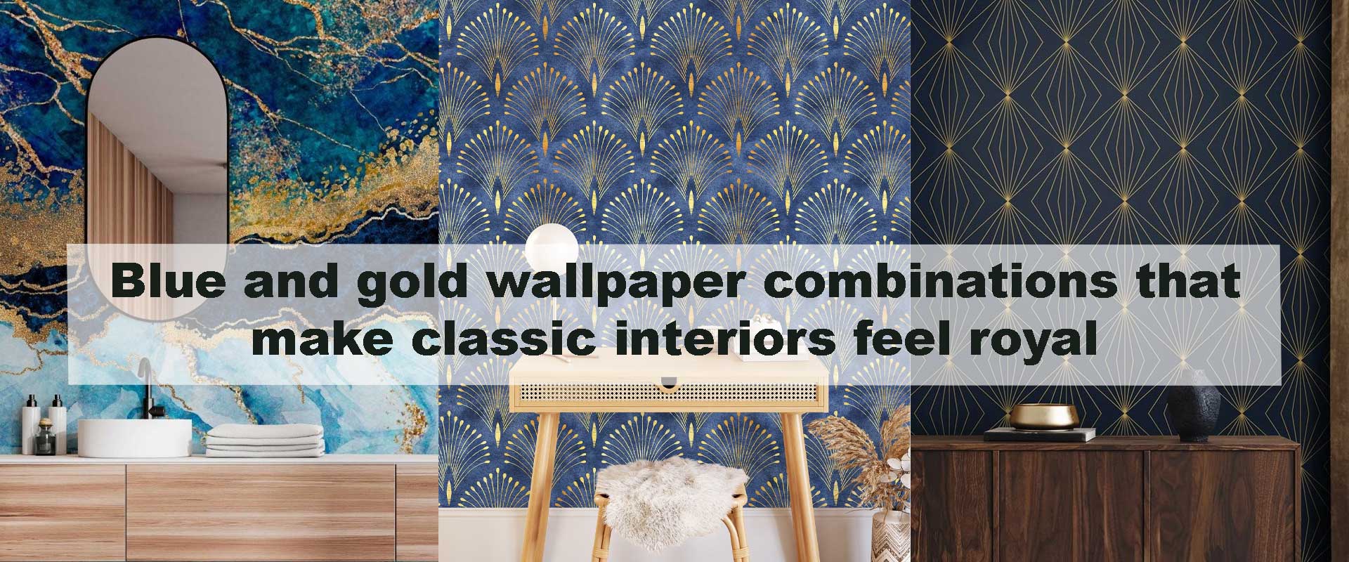
Blue and gold wallpaper combinations that make classic interiors feel royal
There’s something undeniably commanding about blue and gold wallpaper when used in classic interiors. This pairing has long been associated with palaces, heritage estates, and formal European rooms where elegance was meant to be felt the moment you entered. When handled thoughtfully, blue and gold wallpaper combinations bring that same sense of royalty into modern homes without feeling heavy or theatrical.
Blue introduces calm, depth, and architectural stability, while gold adds warmth, light, and refined ornamentation. Together, they create interiors that feel composed, dignified, and richly layered rather than overly ornate. Much like the visual richness explored in Timeless damask motifs bringing heritage elegance to modern interiors, this color pairing relies on balance rather than excess to achieve its regal presence.
Why Blue and Gold Have Always Signaled Royalty
Blue and gold are not a modern trend; they are deeply rooted in design history. From French salons to British manor libraries, these colors were chosen deliberately to communicate status, permanence, and cultural refinement.
The Symbolism Behind the Colors
Blue historically symbolized authority, stability, and intellect. Deep blues were expensive to produce centuries ago, making them a natural marker of wealth and importance. Gold, meanwhile, represented power, divinity, and craftsmanship, often appearing in gilded moldings, textiles, and wall treatments.
When these two colors are paired in wallpaper, the result feels intentional rather than decorative. The room gains visual hierarchy, where walls feel like architectural elements rather than background surfaces, a principle often echoed in classic hallway concepts that rely on depth and tonal contrast to elevate narrow spaces.
Emotional Impact in Classic Interiors
Blue and gold wallpaper combinations create interiors that feel grounded yet luminous. Blue anchors the space emotionally, preventing it from feeling overstated, while gold introduces highlights that lift the room visually. This balance is essential in classic interiors, where elegance depends on restraint rather than excess, much like the refined symmetry discussed in How traditional striped wallpaper adds refined symmetry to bedroom walls.
Choosing the Right Shade of Blue for a Royal Effect
Not all blues communicate the same sense of grandeur. The specific shade you choose determines whether a classic interior feels commanding and ceremonial, quietly luxurious, or softly refined. When paired with gold, blue becomes more than a color choice—it becomes a mood-setting foundation that shapes how the entire room is experienced.
Deep Navy and Midnight Blue
Navy and midnight blue remain the most traditional and authoritative options for regal interiors. These darker blues create a sense of enclosure and permanence, allowing gold detailing to appear luminous rather than excessive. The contrast feels intentional and architectural, echoing the visual weight found in historic libraries, salons, and formal reception rooms.
When used in wallpaper, deep blue backgrounds with gold patterning add dimension without visual noise. They pair naturally with antique furniture, carved wood details, and classic moldings, while also enhancing the richness of darker wood tones. This combination creates interiors that feel layered, intimate, and unmistakably stately.
Royal Blue and Sapphire Tones
Royal blue introduces a more expressive interpretation of classic elegance. Brighter than navy yet still grounded, it brings a sense of ceremony and confidence to a space without tipping into heaviness. Gold motifs against royal blue feel celebratory rather than restrained, making this pairing ideal for rooms designed to impress.
Sapphire tones offer a refined middle ground—luxurious but slightly more modern in character. These blues work beautifully in classic interiors that lean transitional, especially when natural light is present to reveal their clarity and depth throughout the day.
Soft Blue-Grey and Dusty Blue
For a more understated approach to royal design, blue-grey and dusty blue shades provide quiet sophistication. These softer blues create a gentle backdrop that allows gold detailing to shimmer subtly rather than command attention. The result feels elegant, calm, and enduring rather than formal or imposing.
Gold accents within lighter blue palettes function as refined highlights, adding warmth and definition without overpowering the space. This makes them especially well-suited to living rooms and dining areas where comfort, conversation, and visual ease are just as important as classic character.
How Gold Details Elevate Blue Wallpaper Designs
In classic interiors, gold should never compete with blue—it should refine it. The true elegance of blue and gold wallpaper lies in restraint, where gold functions as a supporting element that sharpens outlines, adds warmth, and introduces light without overwhelming the composition. When applied thoughtfully, gold transforms blue wallpaper from stately to truly regal.
Rather than acting as a dominant color, gold works best as a visual accent that guides the eye across the wall. It highlights pattern structure, enhances texture, and brings subtle luminosity to deeper blue tones, ensuring the room feels rich rather than heavy.
Matte Gold vs Metallic Gold Finishes
Matte gold finishes lend a sense of age and authenticity to classic interiors. Their softly muted appearance recalls hand-applied gilding, worn metal details, and the quiet elegance of historic craftsmanship. Matte gold blends seamlessly into traditional spaces, allowing wallpaper patterns to feel established and timeless rather than decorative or trend-driven.
Metallic or lightly reflective gold introduces a different kind of refinement. When used sparingly, it catches ambient light and adds gentle movement across blue backgrounds. This subtle shimmer prevents deeper blues from feeling flat, especially in evening light, and mirrors the approach used in Gold traditional wallpaper ideas that add warmth and subtle luxury to living rooms, where reflective accents soften richness rather than amplify drama.
Pattern Placement and Scale
The way gold appears within a pattern is just as important as its finish. Fine gold linework embedded within damask, floral, or ornamental motifs creates a refined rhythm that feels balanced and intentional. These small accents allow the wallpaper to read as layered and detailed without becoming visually busy.
Larger gold motifs can introduce boldness, but they require careful consideration. In classic interiors, oversized gold elements should be offset by restrained furnishings and thoughtful lighting to avoid overpowering the room. For most spaces, medium-scale patterns remain the most enduring choice, offering enough presence to feel luxurious while maintaining harmony with traditional furniture proportions.
Classic Wallpaper Patterns That Shine in Blue and Gold
Pattern selection plays a defining role in how royal a blue and gold interior ultimately feels. Certain motifs have endured for generations because they naturally support symmetry, craftsmanship, and visual order—qualities central to classic design.
Damask Patterns for Formal Grandeur
Damask wallpapers are the cornerstone of classic elegance. Their symmetrical structure and flowing ornamentation feel inherently formal, and when rendered in blue and gold, they instantly evoke grand historic interiors. These patterns bring depth and dignity to walls, making them ideal for formal living rooms, dining spaces, and stately entryways.
Blue and gold damask designs add richness without clutter, allowing walls to feel textured and dimensional even when the palette remains restrained. The result is an interior that feels composed, ceremonial, and rooted in tradition.
Floral and Botanical Motifs with Heritage Appeal
Traditional floral patterns take on a distinctly regal character when paired with deep blues and softened gold outlines. Rather than feeling playful, these designs feel cultivated and timeless, especially when the florals are stylized and balanced rather than overly detailed.
For those drawn to heritage-inspired warmth, floral motifs bridge formality and comfort beautifully. Designs within Floral Vintage Wallpaper often capture this balance, reflecting the same refined charm discussed in Vintage floral wallpaper ideas that transform classic living rooms.
Ornamental and Scroll Designs
Ornamental wallpapers featuring scrollwork, medallions, and repeating classical forms feel intrinsically royal. Gold accents within these designs emphasize symmetry and structure, giving walls an architectural presence rather than a purely decorative one.
Inspired by European palaces and classical revival interiors, these patterns create visual order and rhythm. Selections such as Ornamental Vintage Wallpaper support this aesthetic naturally, reinforcing a sense of heritage while remaining adaptable to refined modern-classic spaces.
Where Blue and Gold Wallpaper Works Best in the Home
While blue and gold wallpaper can be introduced throughout a home, certain spaces naturally amplify its regal character. These rooms benefit from depth, atmosphere, and visual ceremony, allowing the color pairing to feel intentional rather than ornamental. When placed thoughtfully, blue and gold wallpaper enhances architectural features and elevates everyday moments into refined experiences.
Living Rooms That Command Attention
In classic living rooms, blue and gold wallpaper establishes an immediate sense of poise and sophistication. It creates a visual anchor for seating arrangements, framing sofas and armchairs in a way that highlights traditional silhouettes and craftsmanship. The richness of blue adds depth to the room, while gold detailing introduces warmth that prevents the space from feeling severe.
Balancing these walls with warm, layered lighting and neutral textiles ensures the room feels inviting rather than formal. In many cases, a single feature wall is enough to achieve this effect—particularly in living rooms with fireplaces, built-in shelving, or symmetrical architectural elements that naturally draw the eye.
Dining Rooms with Timeless Sophistication
Dining rooms are especially well suited to blue and gold wallpaper because they thrive on mood and visual depth. These tones enhance evening lighting, allowing the room to feel intimate and ceremonial without becoming heavy. Blue grounds the space, while gold accents subtly elevate the dining experience, reinforcing a sense of occasion around shared meals.
Wallpaper with delicate gold detailing reflects candlelight and ambient fixtures softly, creating a warm glow that complements darker blue backgrounds. This interaction between light and surface makes dining rooms feel layered, composed, and quietly luxurious rather than overtly dramatic.
Bedrooms That Feel Grand Yet Calm
When approached with restraint, blue and gold wallpaper can feel surprisingly serene in bedrooms. Softer blue tones paired with muted gold accents create an atmosphere that is elegant without being stimulating, allowing the space to feel restful as well as refined. The key lies in balance—choosing patterns that feel structured yet gentle in scale.
Pairing these walls with upholstered headboards, layered textiles, and tactile fabrics keeps comfort at the forefront. The result is a bedroom that carries a sense of grandeur while still supporting relaxation and emotional ease.
How Blue and Gold Wallpaper Supports a Heritage Design Narrative
Blue and gold wallpaper does more than enhance a room visually—it carries a narrative of craftsmanship, continuity, and design heritage. This pairing connects contemporary interiors to centuries of decorative tradition, where walls were treated as integral architectural elements rather than passive backdrops.
This enduring appeal explains why many homeowners drawn to Vintage Wallpaper gravitate toward blue and gold palettes. They offer a way to honor classic design language while still allowing for personal expression and modern comfort. For those seeking a softer, more understated interpretation, options within Blue Vintage Wallpaper provide a refined alternative that retains elegance without excess.
Comparing Blue and Gold Wallpaper Styles for Classic Interiors
| Style | Visual Impact | Best For | Overall Mood |
|---|---|---|---|
| Navy with Matte Gold Damask | Deep, stately | Formal living rooms | Regal and composed |
| Royal Blue with Metallic Accents | Bright and confident | Dining spaces | Ceremonial elegance |
| Dusty Blue with Soft Gold Florals | Gentle and refined | Bedrooms | Calm luxury |
| Blue-Grey with Ornamental Gold | Subtle sophistication | Transitional interiors | Timeless balance |
Final Thoughts on Creating Royal Classic Interiors
Blue and gold wallpaper combinations remain one of the most effective ways to bring regal elegance into classic interiors. Their enduring appeal lies in balance: depth paired with warmth, tradition softened by comfort. When chosen thoughtfully and styled with restraint, these wallpapers transform rooms into spaces that feel dignified, welcoming, and timeless.
If you’re looking to elevate your interiors with a sense of history and refinement, blue and gold wallpaper offers a design language that never goes out of style. With careful selection and mindful styling, your home can reflect the quiet grandeur that defines truly classic design.
Frequently Asked Questions
Do blue and gold wallpaper combinations suit all classic interiors?
Yes. Blue and gold wallpaper works across a wide range of classic interiors when the tones and patterns are chosen thoughtfully. Deeper blues with subtle gold detailing suit formal heritage spaces, while softer blues with muted gold accents feel more relaxed and adaptable for everyday living areas.
Will blue and gold wallpaper make a room feel too dark?
Not when balanced correctly. Using gold as a highlighting element helps reflect light, while choosing the right blue depth for the room’s natural lighting prevents heaviness. Layered lighting and warm bulbs further ensure the space feels inviting rather than closed in.
Is blue and gold wallpaper better as a feature wall or full-room coverage?
Both approaches work. Feature walls are ideal for larger patterns or darker blues, allowing the space to feel dramatic without overwhelming the room. Lighter blue-and-gold designs with finer detailing can comfortably wrap an entire room while maintaining elegance.
What furniture colors work best with blue and gold wallpaper?
Warm wood tones, soft neutrals, and upholstered pieces in cream, beige, or taupe complement blue and gold wallpaper beautifully. These materials echo the warmth of gold while allowing blue to remain the dominant visual anchor.
Can blue and gold wallpaper feel modern as well as classic?
Absolutely. Simplified patterns, matte gold finishes, and clean-lined furnishings allow blue and gold wallpaper to sit comfortably within modern classic or transitional interiors while still preserving a regal character.
How do you keep blue and gold interiors from feeling overdecorated?
Restraint is key. Let the wallpaper act as the primary decorative feature, then layer in minimal accessories and subtle metallic accents. This approach preserves sophistication and ensures the space feels curated rather than ornate.