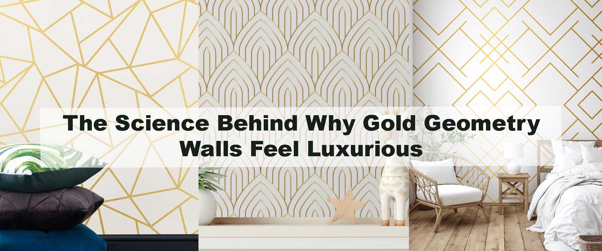
The Science Behind Why Gold Geometry Walls Feel Luxurious
Gold geometry walls instantly signal refinement, balance, and intention the moment you step into a space. Even before furniture or lighting takes over, the structured glow of gold lines sets an emotional tone that feels composed rather than excessive. This response is not accidental—it is deeply rooted in how the human brain processes colour, symmetry, and light. When geometry and gold work together, they quietly activate psychological cues associated with quality, permanence, and architectural control.
Understanding this science helps explain why these walls feel expensive without relying on decoration overload. Instead of demanding attention, gold geometry settles into the background, shaping how the entire space is perceived.
Why the Brain Interprets Gold as a Premium Signal
Gold has been embedded in human perception as a marker of value long before modern interiors existed. Across civilizations, it symbolised permanence, protection, and refinement—qualities the brain still associates with safety and status today. When used in interiors, gold tones trigger feelings of warmth and assurance rather than urgency or stimulation, which is why they feel soothing yet elevated at the same time.
From a perceptual standpoint, gold behaves differently than flat colour pigments. Its surface reflects light in soft layers rather than sharp flashes, creating subtle tonal variation across the wall. The brain interprets this variation as material complexity, a cue often linked to craftsmanship and quality. Even in restrained applications, this layered reflection quietly communicates richness, making gold geometry walls feel luxurious rather than attention-seeking.
How Geometry Creates Comfort Through Order
The human visual system is wired to favour order over randomness. Repetition, symmetry, and alignment reduce cognitive effort, allowing spaces to feel immediately understandable and comfortable. Geometry provides this clarity by establishing predictable visual pathways that guide the eye calmly across a surface.
When gold is confined within geometric structures, its reflective quality becomes disciplined rather than dominant. The lines act as visual anchors, containing the shimmer so it feels intentional and composed. This balance explains why gold geometry walls often feel calmer than freeform metallic designs—they satisfy the brain’s need for structure while still delivering warmth and elegance.
Light Reflection and the Illusion of Depth
True luxury relies on depth rather than surface decoration. Gold geometry walls achieve this by responding dynamically to light throughout the day. Metallic lines shift subtly as lighting changes, creating movement without visual noise.
In low ambient light, gold appears restrained and grounded. Under warm directional lighting, it gains softness and glow. With indirect lighting, gentle shadows form along the geometry, enhancing dimensionality without clutter. This controlled interaction with light keeps the wall visually engaging over time, which the brain interprets as richness, intention, and lasting quality rather than ornamentation.
Why Gold Lines Feel More Refined Than Solid Gold Walls
Large, uninterrupted metallic surfaces often overwhelm the senses because they offer no visual pause. Without structure, the eye struggles to rest, and what is meant to feel luxurious can quickly feel heavy or theatrical. Geometry solves this by introducing discipline—gold appears only where it matters, shaped into lines, arcs, or repeating frameworks that allow surrounding space to breathe.
This restraint directly increases perceived value. In perception psychology, contrast heightens importance, and scarcity enhances desirability. When gold is used selectively, the brain reads it as intentional rather than excessive. The result is a surface that feels composed and architectural, where elegance comes from control instead of saturation. Gold geometry walls succeed because they imply craftsmanship rather than display abundance.
Architectural Influence and Art Deco Design Logic
The visual language behind gold geometry is deeply rooted in early twentieth-century architecture, particularly the Art Deco movement. This period embraced symmetry, precision, and forward-looking craftsmanship, translating optimism into disciplined forms and metallic accents. Gold was never applied randomly—it was structured, measured, and aligned with architectural rhythm.
Contemporary interiors still respond strongly to these principles. Gold geometry walls feel integrated rather than applied because they echo architectural detailing such as paneling, framing, and structural lines. This is why they pair so naturally with streamlined furniture and modern layouts. The same logic is reflected in Why Art Deco Wallpaper Is Returning as the Biggest Luxury Design Trend, where structure replaces ornament as the defining mark of luxury.
Designers often rely on Art Deco Wallpaper to achieve this balance—expressive yet disciplined, decorative yet enduring.
Texture Contrast Enhances Perceived Quality
Gold geometry reaches its full potential when set against matte or softly textured backgrounds. The reflective lines gain clarity when contrasted with subdued surfaces, creating visual layering that feels intentional rather than flat. This separation of finishes allows the wall to register depth, making the space feel more dimensional and thoughtfully composed.
From a sensory standpoint, contrast reduces visual fatigue. The eye can distinguish foreground from background instantly, which creates comfort and calm. Finishes also play a role—brushed or lightly etched gold softens reflection, maintaining warmth without glare. This refined interaction between texture and shine is what transforms gold geometry from decorative detail into a marker of true interior quality.
Scale and Proportion Shape Luxury Perception
Scale has a powerful influence on how gold geometry walls are perceived emotionally and spatially. Larger geometric patterns tend to project calm authority—they slow the eye down, reduce visual noise, and allow the wall to feel confident rather than busy. In contrast, very small or tightly packed motifs often read as decorative, drawing attention to detail instead of atmosphere.
Luxury interiors prioritise proportion over intricacy. When gold lines are oversized and well-spaced, the material has room to breathe, allowing light to travel naturally across the surface. This clarity strengthens the architectural presence of the wall, which is why Geometric Art Deco Wallpaper performs so well on statement walls where scale can be experienced as a whole rather than piecemeal.
Emotional Balance: Glamour Without Overstimulation
Gold is often associated with glamour, but without structure it can quickly become overpowering. Geometry introduces emotional control by giving the eye a predictable route to follow. This visual guidance lowers mental effort, helping the space feel composed instead of stimulating.
Gold contributes warmth and softness, while geometry provides discipline and rhythm. Together, they create an emotional equilibrium that feels indulgent yet grounded. This balance is especially important in spaces designed for extended use—living areas, dining settings, or sleeping zones—where visual excess can disrupt comfort. Gold geometry walls maintain interest without demanding constant attention.
How Gold Geometry Elevates Surrounding Elements
Gold geometry walls don’t just stand on their own—they actively enhance everything placed against them. Furniture silhouettes appear more intentional because the structured backdrop frames their edges, turning simplicity into design clarity rather than minimal absence.
Natural materials benefit most from this relationship. Dark woods feel richer, stone surfaces appear more sculptural, and neutral upholstery gains depth when set against gold-lined geometry. This interaction between structure and simplicity is explored further in How Art Deco Wallpaper Enhances Modern Minimalist Furniture, where disciplined patterns elevate clean-lined interiors without visual overload.
Comparing Gold Geometry With Other Luxury Wall Styles
| Wall Treatment | Visual Impact | Light Interaction | Overall Impression |
|---|---|---|---|
| Gold geometry walls | Structured elegance | Soft reflective depth | Architectural luxury |
| Solid metallic walls | Intense and bold | Strong glare potential | Dramatic but risky |
| Textured neutral walls | Subtle and calming | Light absorbing | Quiet refinement |
| Marble-inspired surfaces | Natural richness | Veined highlights | Timeless and organic |
Gold geometry stands out for balancing presence with restraint.
Where Gold Geometry Feels Most Natural
Gold geometry adapts effortlessly across interior settings because it enhances spatial hierarchy rather than competing with it. In living spaces, structured gold lines subtly frame seating arrangements, creating a visual anchor that feels intentional without enclosing the room. The geometry guides movement and focus, allowing the space to feel organised while still open and inviting.
In dining areas, gold geometry introduces a sense of ceremony that elevates everyday moments. The reflective lines catch warm lighting beautifully, adding depth and rhythm that complements social interaction without becoming distracting. In sleeping spaces, softer gold tones combined with disciplined geometry create a cocooning effect—luxurious yet restrained—encouraging rest rather than visual stimulation.
Designers often rely on Luxury Metallic Art Deco Wallpaper in these settings because it keeps metallic accents refined, balanced, and visually cohesive across different functions within the home.
Why Gold Geometry Ages Gracefully
Trends are driven by novelty, but gold geometry walls are guided by perceptual fundamentals. Balance, proportion, repetition, and light interaction are design principles rooted in how humans naturally experience comfort and quality. Because these elements don’t expire, gold geometry remains visually relevant even as styles evolve.
Rather than acting as surface decoration, gold geometry functions like architectural detailing. It adapts seamlessly to changing furniture silhouettes, new material pairings, and shifting colour palettes without losing its presence. This quiet adaptability is what allows gold geometry walls to feel luxurious over time—never forced, never dated, and always intentional.
Frequently Asked Questions
Do gold geometry walls suit contemporary interiors?
Yes. Their clean structure aligns naturally with modern furniture while adding warmth and visual interest.
Can gold geometry appear subtle instead of bold?
Absolutely. Thin lines, muted gold tones, and layered lighting create a refined, understated effect.
Are these walls suitable for compact rooms?
When applied to a single surface with larger-scale patterns, they add depth without crowding the space.
How important is lighting for gold geometry walls?
Lighting is essential. Warm, indirect sources enhance depth, while harsh lighting can flatten the finish.
Do gold geometry walls work with natural materials?
Yes. Wood, stone, and fabric textures balance metallic elements and enhance overall harmony.
Closing Thoughts
Gold geometry walls feel luxurious because they align with how humans instinctively understand quality. Gold signals warmth and permanence, while geometry provides order and clarity. Together, they create spaces that feel intentional, calm, and enduring.
By enhancing light, framing furnishings, and ageing gracefully beyond trends, gold geometry walls transform interiors without excess. When used thoughtfully, they don’t dominate a space—they quietly elevate it.