Beige botanical garden prints for peaceful transitional home aesthetics
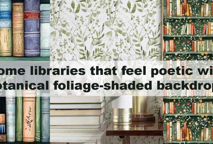
Soft beige botanical garden prints have become a favorite for transitional homes because they deliver calm, grounded beauty that never competes with furnishings. By staying close to nature’s gentlest tones, these prints allow spaces to feel settled, harmonious, and quietly elegant—a quality many homeowners seek when blending classic comfort with modern simplicity. Their botanical detailing provides visual structure without heaviness, while their beige base gives rooms a warm glow throughout the day. This gentle aesthetic also complements the serene moods described in layered rugs and botanical foliage walls the cozy pairing that never fails, where balanced materials create a comforting foundation for everyday living.
Why Beige Botanicals Work Perfectly in Transitional Homes
Transitional interiors rely on restraint, balance, and timeless warmth. Beige botanical garden prints naturally support this formula because they echo the softness of linen, stone, clay, and natural wood—materials that define the style. Their leaf shapes offer subtle rhythm, while their gentle tones ensure the room never feels busy. This cohesion allows homeowners to pair streamlined modern furniture with classic silhouettes effortlessly.
Beige botanicals also excel at catching natural light. Morning sunlight highlights their delicate outlines, while evening lighting adds depth and shadow that create a soothing sense of dimension. This duality makes them ideal for open-plan rooms, quiet reading corners, long hallways, or balanced shared spaces. When used on accent walls, they ground the room with subtle nature-inspired texture while still keeping everything airy.
For those wanting to lean deeper into natural softness, styles from collections like Watercolor Botanical Wallpaper introduce gentle fluidity, while Green Botanical Wallpaper offers refreshing contrast without overwhelming the palette. These curated tones blend seamlessly with beige botanical layouts, adding range to a calm interior story.
The Emotional Calm of Beige Botanical Palettes
Many homeowners gravitate toward beige botanical prints because of the emotional stillness they create. Beige naturally lowers visual noise—a key factor when designing homes that feel relaxing, balanced, and welcoming. The botanical element adds a touch of organic life, but in a restrained form that doesn’t dominate the room.
This effect becomes even more pronounced when paired with transitional materials like woven baskets, matte pottery, hammered metal accents, and textured fabrics. Beige botanicals act as an anchor, setting the stage for layered comfort while still allowing each décor element to breathe. Their plant-inspired shapes add life without bold color, helping interiors feel grounded.
Designers often highlight how beige botanicals soften architectural lines, especially in homes where straight edges or sharp corners create visual tension. These prints wrap the room in warmth and help transitions—between spaces, styles, and eras—feel intentional. Their versatile tone also pairs well with the grounded mood described in olive tone botanical leaf motifs for homes that feel warm and grounded, giving homeowners a palette that stays soothing but never flat.
How Beige Botanicals Support Transitional Color Palettes
Transitional color palettes are built on harmony—quiet shades that work together without sharp contrasts. Beige botanical prints slip effortlessly into this spectrum, acting as the warm connective tissue among mineral greys, earthy taupes, stone neutrals, and soft whites. Their undertones—sand, oat, almond, clay, bleached wood—carry a natural softness that makes every surrounding color feel more intentional. Beige becomes the gentle thread that ties the palette together, adding warmth while preserving clarity.
These prints also have that rare ability to shift their mood depending on light and nearby tones. In morning daylight, they look fresh and airy; under evening lamps, they become mellow and cocoon-like. This flexibility is what makes them so compatible with transitional interiors, which rely heavily on subtle tonal layering to create depth without drama.
Best Pairings for a Balanced Look
- Soft Greys
Soft greys add modern refinement without cooling the room too much. Beige botanicals introduce warmth that softens the grey’s edge, creating a beautifully balanced conversation between warmth and clarity. Together they form a palette that feels quiet, modern, and effortlessly cohesive. - Taupe and Mushroom Tones
Taupe-based neutrals enhance the depth of beige botanicals, allowing the wall’s undertones to come forward gently. Mushroom shades—soft brown-grey hybrids—add a grounded elegance that makes the space feel sophisticated without heaviness. - Off-Whites and Creams
These shades are perfect for achieving the classic transitional brightness. Off-whites keep everything fresh, while creams introduce gentle warmth. Beige botanicals become a graceful focal point here, catching light and giving the room its central sense of calm. - Muted Greens
A whisper of green—sage, olive, moss—extends the natural feel of the wallpaper. These tones enrich the palette without shifting it away from neutrality, reinforcing the garden-inspired calm that beige botanicals create.
Homeowners who want depth without boldness often pair beige botanicals with darker, enveloping tones in nearby rooms. Styles such as Dark Botanical Wallpaper offer quiet contrast, helping each space feel defined yet connected. This interplay creates a home that feels curated, layered, and peacefully cohesive.
Where Beige Botanical Prints Create the Strongest Impact
Living Rooms
In living rooms, beige botanical prints act like a soft visual embrace. They frame seating arrangements with gentle structure, allowing furniture, textiles, and lighting to stand out without competing for attention. Their subtle tone shifts catch natural light beautifully, creating understated movement across the wall. When paired with transitional staples—layered rugs, curved lamps, textured cushions—they help the space feel composed yet inviting.
Bedrooms
Beige botanicals bring a soothing, restorative atmosphere to bedrooms. Their quiet palette harmonizes with plush bedding, upholstered headboards, and warm bedside lamps that glow softly in the evening. The botanical detail introduces just enough visual interest to make the room feel thoughtfully styled, but without disturbing its serenity. This is the type of wallpaper that makes you exhale the moment you walk in.
Dining Areas
In dining areas, beige botanicals encourage calm conversation and slow, lingering meals. Their gentle clarity pairs beautifully with natural wood tables, upholstered dining chairs, and warm metallic accents. Instead of dominating the room, the wallpaper supports an atmosphere of understated hospitality—perfect for transitional homes where social spaces are meant to feel relaxed and intimate.
Hallways & Transitional Spaces
Hallways often struggle to feel intentional, but beige botanicals change that instantly. Their subtle leafwork brings identity to these connecting spaces, carrying visual warmth from one room to another. The wallpaper acts as a soft guide, helping the entire home feel unified and thoughtfully paced. Even narrow corridors benefit, as the beige palette keeps the space feeling open and welcoming.
Beige Botanicals as a Bridge Between Classic and Modern
Transitional design thrives on contrast softened by harmony. Beige botanicals are the perfect mediator because they effortlessly merge the charm of traditional motifs with the restraint of modern styling.
- Their warm tones feel rooted and timeless
- Their delicate detailing feels crisp and contemporary
- Their natural texture adds quiet authenticity
- Their soft forms ensure versatility across decades and décor styles
Unlike patterns that lock a room into a specific era, beige botanicals feel universally compatible. They look equally at home beside modern iron sconces, farmhouse-inspired wooden consoles, or mid-century curved silhouettes. This adaptability means you can evolve your décor over time—switching between minimalist, classic, or rustic—without ever needing to change the walls.
Their bridging ability is the reason designers use beige botanicals in rooms full of contrasts: matte black fixtures beside linen upholstery, clean-lined furniture under traditional molding, or sculptural lighting paired with vintage accessories. The wallpaper softens those edges, blending eras into a peaceful whole. The result is a home that feels refined but relaxed, sophisticated yet welcoming—exactly the essence of transitional design.
Design Techniques to Maximize Beige Botanical Beauty
1. Use Lighting Thoughtfully
Lighting has the power to completely transform the mood of beige botanical prints. Warm illumination—such as golden-hued sconces or soft linen-shaded lamps—brings out the gentle warmth of the beige tones, making the botanical shapes feel velvety and welcoming. Cooler daylight or LED whites, on the other hand, reveal the finer etching and delicate structure of each leaf, giving the pattern clarity and quiet sophistication.
Layering your lighting, rather than relying on a single source, helps the wallpaper feel dimensional rather than static. Wall sconces add soft vertical glow, table lamps build intimate pockets of warmth, pendants offer overhead softness, and concealed LED strips wash the wall in gentle gradients. Together, these layers allow beige botanicals to look immersive—shifting with the time of day and deepening the room’s sense of tranquility.
2. Pair With Natural Materials
Natural materials echo the organic softness of beige botanicals and help the room feel warm, grounded, and intentionally layered. Light oak furniture reinforces the airy quality of the wallpaper, rattan introduces casual texture, and woven textiles add tactile comfort that enhances the botanical calm. Clay ceramics bring earthy authenticity, brushed brass adds quiet elegance, and linen upholstery reinforces the gentle, breathable atmosphere that makes transitional interiors so relaxing.
When these materials come together, they form a cohesive foundation that mirrors the garden-inspired mood of the wallpaper. Each element supports the natural theme without overpowering the space, allowing the print to remain the quiet, grounding presence in the room.
3. Introduce Soft Greens and Browns
Muted greens and earthy browns complement beige botanical prints beautifully without shifting the palette away from its serene roots. A sage throw, olive-toned vase, or moss-colored cushion can subtly deepen the nature connection, while brown leather accents introduce warmth and character. These additions don’t compete with the wallpaper—they enrich it—giving the room a layered, organic story that feels timeless and soothing.
This approach reinforces the garden-inspired theme without adding strong contrast, keeping the transitional balance intact. The room feels warm, natural, and thoughtfully curated, inviting you to slow down and enjoy its quiet rhythm.
4. Add Reflective Accents
Reflective elements heighten the gentle glow of beige botanicals, helping light move fluidly across the wall. Soft metallic finishes—champagne, brushed gold, antique bronze—add delicate highlights that shimmer subtly throughout the day. Mirrors also play a powerful role: they bounce light into shadowed corners and accentuate the airy tone of the wallpaper, making the room feel more expansive.
These accents act like small, refined details in a well-tailored outfit—never loud, always intentional. When paired with the organic softness of botanical shapes, the result is a balanced room that feels both polished and deeply peaceful.
Choosing the Right Scale of Botanical Patterns
Pattern scale dramatically shapes how beige botanicals influence the room. The right choice depends on the space, the light, and the level of presence you want the wallpaper to hold.
Small-Scale Prints
Small-scale beige botanicals are ideal when you want gentle movement without a pronounced statement. Their fine details create a delicate texture that feels almost woven into the wall, making them perfect for compact rooms, small entryways, calm bedrooms, or areas where you prefer the wallpaper to play a supportive, atmospheric role.
Medium-Scale Prints
Medium-scale patterns offer a balanced presence—noticeable but never dominating. They suit transitional homes beautifully because they bring both clarity and softness. These prints work well behind sofas, in dining areas, or across hallways where you want a refined botanical presence that blends effortlessly with décor.
Large-Scale Prints
Large-scale botanicals create an elegant, statement-worthy backdrop that retains tranquillity thanks to the beige palette. Oversized leaves stretch gracefully across the wall, offering dramatic calm rather than bold impact. They mimic the effect of large-format art while keeping the room grounded in natural softness. Designs similar to Large Leaf Botanical Wallpaper achieve this spectacular yet peaceful look, especially as feature walls in open-plan rooms, tall staircases, or light-filled living spaces.
When to Choose Peel-and-Stick Beige Botanical Options
Peel-and-stick beige botanical wallpapers offer the same serene beauty while giving homeowners the flexibility to experiment. They’re ideal for renters, for those who frequently refresh décor, or for anyone wanting an easy way to transform a room without long-term commitment.
These versions are perfect for accent walls, cozy reading corners, guest rooms, small dining nooks, or temporary setups that still deserve thoughtful design. Styles from Peel and Stick Botanical Wallpaper allow you to refine the look over time, adjusting pattern scale, tone, or placement as your transitional home evolves.
In a design style where balance and adaptability are key, peel-and-stick options help maintain continuity while leaving room for creativity. They let you build a calm, cohesive space while still embracing the freedom to evolve.
A Comparison of Beige Botanical Design Styles
Subtle Beige Botanicals vs. Textured Beige Botanicals
| Style Type | Visual Mood | Best For | Strength |
|---|---|---|---|
| Subtle Beige Botanicals | Soft, airy, calm | Bedrooms, living rooms | Enhances light, adds gentle depth |
| Textured Beige Botanicals | Warm, dimensional, grounded | Dining rooms, hallways | Adds tactile richness |
| Minimal Line-Art Botanicals | Clean, modern, structured | Home offices, entryways | Supports transitional minimalism |
| Watercolor Beige Botanicals | Fluid, delicate, dreamy | Bedrooms, quieter zones | Creates a restful atmosphere |
| Large Leaf Beige Botanicals | Bold, elegant presence | Feature walls | Acts as a natural focal point |
Pairing Beige Botanicals With Transitional Furniture
Curved Silhouettes
Curved silhouettes deepen the organic calm that beige botanical prints naturally introduce. Rounded sofas, arched mirrors, sculpted accent chairs, and softly bowed consoles echo the gentle leaf contours on the walls, creating a sense of fluid continuity. These shapes prevent the room from feeling rigid, helping the botanical artwork settle into the space as though it grew there naturally.
Tailored Upholstery
Tailored upholstery adds quiet structure that complements the softness of beige botanicals. Clean piping, refined stitching, and supportive silhouettes act as visual anchors, giving the room a harmonious contrast between crisp edges and organic forms. This interplay keeps transitional spaces balanced—never too formal, never too relaxed—with the wallpaper acting as a graceful backdrop.
Wooden Elements
Wooden pieces bring warmth and authenticity to a beige botanical setting. Light oak enhances the airy quality of the print, walnut adds richness for deeper transitional moods, and ash creates a clean contemporary feel. Grain patterns subtly echo botanical lines, making every wooden piece—whether a console table, bench, or shelving—feel connected to the garden-inspired atmosphere on the walls.
Metallic Touches
Metallic accents introduce refined detail that elevates beige botanicals without disturbing their tranquility. Brushed gold lends warmth, antique bronze adds depth, and muted champagne tones create a soft glow as light plays across the leaf patterns. These touches act like delicate jewelry in the room, bringing sophistication while preserving the overall calm.
How Beige Botanicals Influence Room Layout
Beige botanical garden prints quietly guide visual movement, helping the room feel composed without appearing staged. Their subtle leafwork naturally draws attention toward meaningful focal points—seating arrangements, window views, curated shelving, or layered lighting—giving the space intuitive flow.
In smaller rooms, the airy neutrality of beige prevents the botanical design from overpowering the layout. Instead, it creates depth that makes compact areas feel more open and softly expanded. In larger rooms, beige botanicals offer gentle cohesion, tying distant zones together and preventing the space from feeling sparse or disconnected. This makes them ideal for open-plan homes where smooth transitions between areas are essential.
By shaping the eye’s path without force, beige botanicals help rooms feel purposeful, well-paced, and gracefully arranged.
Complementary Décor Themes
Japandi Warm-Neutral Mood
Beige botanicals harmonize beautifully with Japandi’s restful philosophy. The combination of pale woods, low-slung silhouettes, and simplified textures highlights the wallpaper’s gentle detailing. Together they create an environment that feels uncluttered, meditative, and deeply grounded in natural calm.
Modern Farmhouse Softness
In modern farmhouse settings, beige botanicals soften rustic textures and introduce a refined botanical note that complements handcrafted materials. Stoneware vases, woven baskets, distressed woods, and muted textiles gain a touch of elegance when set against soft botanical patterns, making the space feel both warm and polished.
Classic Modern Hybrids
Classic-meets-modern spaces benefit from the versatility of beige botanicals. Their timeless palette enhances traditional millwork and molding, while their subtle patterning aligns with modern edges and minimalist lighting. This fusion allows the room to feel curated without becoming theme-driven—perfect for transitional homes that blend eras effortlessly.
Natural Serenity Style
For homeowners seeking a sanctuary-like atmosphere, beige botanicals help cultivate a serene rhythm. Their nature-inspired detailing, paired with organic fibers, soft ceramics, and earthy accents, creates an environment that feels slow, steady, and restorative. The room becomes a place where breathing feels easier and movement feels unhurried.
FAQ: Beige Botanical Garden Prints in Transitional Homes
1. Do beige botanical prints make a room feel brighter or more muted?
Beige botanicals naturally brighten a room because their warm, neutral base reflects light gently. Instead of creating sharp highlights, they diffuse illumination across the wall, giving the space a soft radiance. The botanical detailing adds quiet depth, so the room feels open but never washed out.
2. Are beige botanical patterns suitable for smaller rooms?
Yes. The neutral palette and soft contours keep visual weight low, making compact areas feel more open and calming. When paired with light woods or warm off-white furnishings, these prints can subtly expand the sense of space without overwhelming it.
3. How do beige botanical prints complement transitional-style furniture?
Transitional furniture—curved silhouettes, tailored upholstery, warm woods—pairs beautifully with beige botanicals because both prioritize comfort and elegance. The natural patterning softens structured pieces, while the neutral tones complement refined finishes like brushed gold or antique bronze.
4. Can beige botanicals work as a full-room wallpaper, not just a feature wall?
Absolutely. Because the palette is soft and natural, covering all four walls creates a cocoon-like effect that feels peaceful rather than busy. The botanical rhythm adds gentle texture, making fully wrapped rooms feel serene, cohesive, and thoughtfully styled.
5. What décor accents enhance beige botanical wallpaper the most?
Textured elements—linen drapery, woven baskets, ceramic vases, rattan details—layer beautifully over beige botanicals. Soft greens, warm browns, and muted metallic accents reinforce the natural theme while adding subtle contrast. When lighting is layered, the wallpaper becomes even more expressive.
6. Do beige botanicals work well with dark furniture?
Yes. Dark wood, charcoal upholstery, or matte black metals look incredibly sophisticated against beige botanical backgrounds. The contrast feels intentional and elegant, giving transitional rooms a grounded yet airy atmosphere.
7. Which rooms benefit most from beige botanical garden prints?
These prints thrive in living rooms, bedrooms, dining areas, hallways, and entryways—anywhere you want a sense of calm refinement. Their versatility makes them ideal for open-plan homes where visual consistency matters.
8. How do beige botanicals age compared to bolder prints?
Beige botanicals age exceptionally well because they aren’t tied to trends or seasonal colors. Their natural shapes and neutral tones allow them to stay timeless, blending seamlessly with evolving décor over the years.
9. What flooring pairs best with beige botanical wallpaper?
Warm wood floors—oak, hickory, ash—create beautiful harmony with beige botanicals. Light-toned tiles or soft stone also work well, enhancing the room’s tranquility without removing warmth.
10. Are peel-and-stick options available in beige botanicals?
Yes. Peel-and-stick versions offer the same calming look while letting you experiment with placement and scale. They’re perfect for renters, evolving interiors, or anyone wanting flexibility without sacrificing design quality.
Conclusion
Beige botanical garden prints bring peaceful warmth to transitional home aesthetics, making rooms feel calm, balanced, and beautifully connected to nature. Their soft tones blend effortlessly with neutrals, modern silhouettes, classic details, and natural materials—everything that defines the transitional style. By introducing subtle botanical structure without strong color, these prints help create a unified home that feels both refined and comforting. Whether used on an accent wall or wrapped around an entire room, beige botanicals offer the perfect foundation for interiors centered on harmony. For a deeper sense of softness, grounding, and visual flow, homeowners often explore coordinated styles from Botanical Wallpaper, ensuring a cohesive design story that feels serene from room to room.