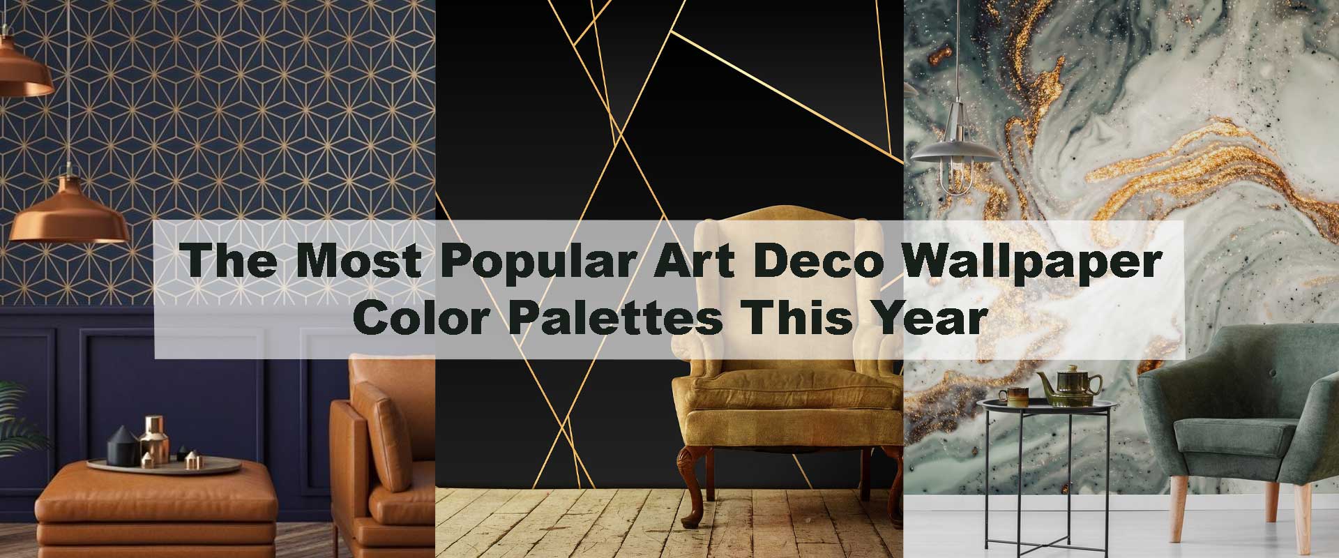
The Most Popular Art Deco Wallpaper Color Palettes This Year
Bold glamour never truly fades—it simply evolves. This year, Art Deco wallpaper color palettes are leaning into richness, contrast, and refined drama, reflecting how modern interiors crave both personality and polish. From jewel-toned walls that feel cinematic to softened metallic neutrals that glow under evening lighting, today’s Art Deco colors balance heritage with contemporary restraint. Designers are moving beyond flat trends, choosing palettes that feel architectural, timeless, and emotionally grounding while still delivering visual impact.
What makes this shift especially interesting is how color is being used to shape mood. Instead of overwhelming spaces, current Art Deco wallpaper colors are curated to enhance depth, rhythm, and spatial flow. Whether used as a statement wall or a full-room wrap, these palettes prove that Art Deco remains one of the most versatile and relevant design languages for modern homes.
Why Color Matters More Than Ever in Art Deco Wallpaper
Art Deco has always relied on geometry, symmetry, and a sense of architectural luxury, but color is what gives these elements emotional depth. In contemporary interiors, wallpaper often acts as the primary visual anchor, meaning its color palette quietly dictates how the entire room comes together. From the warmth of lighting to the finish of furniture and metals, the chosen tones influence how refined or relaxed a space ultimately feels.
Designers today are far more intentional about how Art Deco wallpaper colors behave throughout the day. Rather than choosing palettes for impact alone, they focus on how hues respond to natural light, artificial illumination, and surrounding textures. As discussed in Why Art Deco Wallpaper Is Returning as the Biggest Luxury Design Trend, modern Deco interiors favor balance over excess. This year’s color palettes reflect that shift—luxurious without feeling weighty, expressive without becoming visually restless.
Black and Gold: The Enduring Icon
Few color combinations communicate Art Deco’s identity as clearly as black and gold, and this pairing continues to lead this year’s trends with a more refined sensibility. Instead of high-gloss blacks and mirror-like metallics, designers are embracing matte black foundations layered with brushed, antique, or softly muted gold detailing. This evolution makes the palette feel more livable while preserving its unmistakable elegance.
Black-and-gold Art Deco wallpaper performs especially well in interiors where lighting is carefully considered. Warm LEDs and ambient lighting soften contrasts, allowing metallic lines to glow subtly rather than dominate the space. For this reason, many designers recommend this palette when introducing clients to Art Deco Wallpaper for the first time—it delivers instant sophistication while remaining timeless, adaptable, and visually composed.
Emerald Green with Brass Accents
Emerald green has firmly established itself as one of the most desirable Art Deco wallpaper colors this year. Deep, jewel-toned greens channel classic Deco glamour while offering a surprisingly calming presence. When paired with brass or champagne-gold accents, emerald walls gain a layered richness that feels both dramatic and inviting rather than overpowering.
This palette is particularly favored in interiors that aim for a moody yet refined atmosphere. Emerald tones absorb light gently, helping spaces feel enveloping and balanced as daylight fades into evening. Many homeowners gravitate toward Emerald Green Art Deco Wallpaper when they want a confident color statement that still supports comfort, longevity, and understated luxury.
Navy Blue and Soft Metallics
Navy blue continues to define luxury interiors, and within Art Deco wallpaper, it has evolved into something far more nuanced this year. Rather than sharp, high-contrast pairings, current designs blend deep navy backdrops with softened metallic tones such as champagne gold, brushed silver, or pale brass. This creates an atmosphere that feels elegant and composed, where geometry reads as architectural rather than decorative.
Navy-based Art Deco wallpapers also excel at creating visual calm without sacrificing depth. They work seamlessly alongside warm wood finishes, muted upholstery, and layered lighting, allowing the walls to feel rich yet restful. Designers frequently turn to Navy Blue Art Deco Wallpaper when shaping interiors that feel cinematic and timeless—spaces that hold their presence quietly rather than relying on short-lived trends.
Soft Neutrals with Metallic Geometry
Not every Art Deco interior is driven by bold color, and this year has seen a clear shift toward neutral palettes that prioritize balance and longevity. Warm taupe, ivory, sand, and greige tones form gentle backdrops, while metallic geometry introduces structure and rhythm without overpowering the room. The result is a refined Deco expression that feels airy, modern, and highly adaptable.
These neutral Art Deco wallpapers are especially valued in contemporary apartments and open-plan layouts, where visual continuity plays a major role in overall harmony. Metallic lines catch light subtly throughout the day, adding dimension without creating glare or distraction. This approach aligns with the growing appeal of quiet luxury—spaces that feel elevated through restraint rather than excess.
Marble Whites with Gold Veining
Marble-inspired white palettes are gaining momentum this year, drawing directly from classic Art Deco materials while aligning with modern minimalism. Soft white and cream backgrounds paired with gold veining or geometric framing create walls that feel luminous, structured, and undeniably sophisticated. The effect is elegant without feeling cold, allowing the geometry to stand out through contrast and sheen rather than color saturation.
These palettes integrate beautifully into interiors that already feature stone surfaces, clean-lined furniture, or understated finishes. Instead of competing with the room’s calm aesthetic, the wallpaper enhances it, adding quiet movement and visual interest. Designers often elevate marble-toned Art Deco walls with sculptural lighting, allowing metallic details to glow gently and reinforce the sense of refined luxury.
Charcoal Grey with Champagne Accents
Charcoal grey has emerged as one of the most refined Art Deco wallpaper foundations this year, offering a depth that feels confident without appearing heavy. Sitting comfortably between bold black and softer mid-greys, charcoal creates a grounded backdrop that allows geometric patterns and metallic detailing to feel intentional rather than overpowering. When paired with champagne or muted gold accents, the result is a layered Deco expression that feels contemporary, polished, and quietly luxurious.
This palette is frequently chosen for interiors that value restraint over spectacle. It transitions effortlessly between modern and vintage furnishings, allowing spaces to evolve without clashing with future décor updates. Charcoal-based Art Deco wallpapers also interact beautifully with both natural and artificial light, enhancing texture and contrast—one of the reasons they’ve become a favorite in design-led, visually curated homes.
Blush, Dusty Rose, and Warm Metallics
Blush and dusty rose have become one of the most intriguing Art Deco color developments this year, introducing softness without sacrificing structure. When framed through Deco geometry and finished with metallic detailing, these hues feel refined rather than romantic. Gold, rose gold, and warm brass accents give the palette architectural definition, ensuring it retains the strength and symmetry that Art Deco is known for.
Designers often rely on these tones to soften interiors dominated by strong lines, darker furniture, or rigid layouts. The warmth of blush balances visual weight, creating interiors that feel expressive yet composed. This palette perfectly reflects the modern shift toward emotionally intelligent design—spaces that feel welcoming, layered, and elegant without relying on dramatic contrast.
Deep Teal and Midnight Blue
Deep teal and midnight blue palettes are defining statement Art Deco interiors this year, delivering richness that feels immersive and intentional. Sitting between blue and green, teal offers versatility while maintaining a jewel-toned depth that elevates any wall it occupies. Midnight blue deepens this effect, creating a sense of enclosure and visual drama without tipping into darkness.
Metallic detailing plays a crucial role in these palettes, introducing rhythm and movement that guide the eye across the surface. These tones are most effective when paired with controlled lighting and uncluttered surroundings, allowing the wallpaper to command attention. Designers often favor this approach for spaces where atmosphere takes priority, proving that Art Deco color can be both dramatic and deeply sophisticated.
How Designers Choose the Right Art Deco Palette
Choosing the right Art Deco wallpaper color goes far beyond personal taste. Designers carefully study how color behaves within a space—how it absorbs or reflects light, how it responds to ceiling height, and how it interacts with existing materials like wood, stone, or metal. A deep palette can visually anchor a room, while lighter tones can stretch boundaries and enhance architectural clarity.
As highlighted in How Art Deco Wallpaper Enhances Modern Minimalist Furniture, Art Deco wallpapers are most effective when they lead the visual story rather than compete with it. Designers often select palettes that echo furniture finishes or structural lines, allowing the wallpaper to feel intentional, cohesive, and architecturally integrated rather than decorative alone.
Matching Color Palettes to Room Mood
Every Art Deco color palette carries an emotional undertone. Deep jewel shades such as emerald, navy, or teal naturally create intimacy and visual depth, making rooms feel enveloping and composed. Lighter neutrals, by contrast, encourage openness and calm, offering a softer backdrop that still carries Deco sophistication through pattern and metallic detailing.
Metallic accents play a crucial role in shaping mood. As light shifts throughout the day, these highlights introduce gentle movement, preventing walls from feeling static. For interiors that aim to feel grounded and indulgent, richer palettes tend to deliver greater presence, while neutral-based options offer flexibility for evolving décor. Styles like Geometric Art Deco Wallpaper demonstrate how carefully balanced color and structure can define atmosphere without overwhelming the senses.
Why This Year’s Palettes Feel More Livable
What truly distinguishes this year’s Art Deco wallpaper palettes is their sense of livability. Designers are moving away from high-gloss finishes and extreme contrasts, favoring layered tones, muted bases, and softened metallics that feel comfortable over long periods. These choices allow the wallpaper to maintain visual interest while blending naturally into daily life.
This shift mirrors a broader interior movement toward emotional comfort and lasting appeal. Art Deco, once associated almost exclusively with grandeur and formality, has evolved into a style that supports modern living. Today’s palettes retain Deco’s iconic elegance while adapting gracefully to homes designed for warmth, balance, and longevity.
Final Thoughts on Art Deco Wallpaper Color Trends
This year’s Art Deco wallpaper color palettes prove that luxury doesn’t need to shout. From emerald greens and navy blues to softened neutrals and warm metallics, today’s colors are refined, thoughtful, and deeply versatile. Each palette offers a unique way to introduce structure, rhythm, and elegance into modern interiors.
Whether you’re drawn to classic black-and-gold drama or prefer understated metallic neutrals, Art Deco continues to offer timeless appeal with contemporary relevance. Choosing the right color palette allows the wallpaper to shape atmosphere, enhance architecture, and evolve gracefully with changing interiors—making it a confident investment in lasting design.
Frequently Asked Questions
Which Art Deco wallpaper colors are most popular this year?
This year’s most popular Art Deco wallpaper colors include emerald green, navy blue, charcoal grey, black with gold accents, and soft neutrals layered with metallic geometry. These palettes balance luxury with everyday livability.
Are dark Art Deco wallpaper colors suitable for modern homes?
Yes. Dark Art Deco palettes like navy, teal, and charcoal are widely used in modern homes when paired with warm lighting and balanced furnishings. They add depth without making spaces feel closed in.
Do neutral Art Deco wallpaper palettes still feel luxurious?
Absolutely. Neutral Art Deco wallpapers with gold or champagne detailing deliver a refined, quiet-luxury look. They’re especially popular in contemporary and open-plan interiors where flexibility matters.
Is black and gold Art Deco wallpaper still in trend?
Black and gold remains a leading Art Deco color combination. However, current designs favor softer gold tones and matte blacks for a more modern, livable finish.
How do designers choose the right Art Deco color palette?
Designers consider room size, natural light, ceiling height, and surrounding materials. The goal is to let the wallpaper lead visually while supporting the overall atmosphere of the space.
Will these Art Deco color trends last beyond this year?
Yes. Most of this year’s popular Art Deco wallpaper palettes are rooted in timeless materials and tones, making them suitable for long-term interior styling rather than short-lived trends.