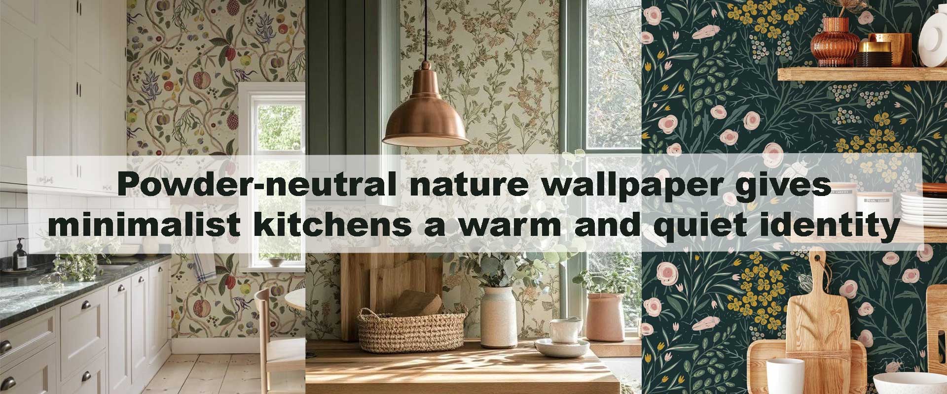
Powder-neutral nature wallpaper gives minimalist kitchens a warm and quiet identity
Minimalist kitchens often look refined, but without the right surface balance they can feel distant or unfinished. Powder-neutral nature wallpaper softens that edge by introducing gentle landscape movement, muted botanical forms, and hushed earth tones that warm the space without disrupting clean lines. When carefully chosen, this approach gives minimalist kitchens a calm identity that feels intentional rather than stark. The result is a kitchen that remains visually light, yet emotionally grounded.
Designers increasingly rely on Nature wallpaper to introduce softness into pared-back kitchens where cabinetry, stone, and metal dominate the visual field. Neutral nature motifs act as a quiet backdrop, adding depth and warmth while preserving the clarity that minimalism demands.
Why Powder-Neutral Nature Palettes Suit Minimalist Kitchens
Powder-neutral palettes—chalked sand, pale clay, misted taupe, and softly washed limestone—work so effortlessly in minimalist kitchens because they extend the visual language of simplicity rather than interrupt it. These tones blur the edges between walls, cabinetry, and worktops, allowing materials to sit together harmoniously instead of competing for attention. The kitchen feels quieter, more cohesive, and thoughtfully composed.
Nature-inspired forms layered within these soft hues introduce just enough variation to avoid visual flatness. Gentle shifts in tone and form create depth without contrast, ensuring the space feels warm and intentional rather than stark. This subtle complexity is especially valuable in kitchens dominated by stone, metal, and smooth surfaces, where softness is often missing.
How Nature Motifs Add Warmth Without Visual Noise
Minimalist kitchens thrive on restraint, and powder-neutral nature wallpaper reinforces that restraint through controlled rhythm and softened contrast. Instead of sharp outlines or bold pattern repetition, these designs unfold gradually—through blurred horizons, faint botanical silhouettes, or layered terrain effects that feel atmospheric rather than decorative. The wall becomes a quiet visual field rather than a focal interruption.
This subtle treatment allows warmth to emerge without disrupting order. Muted nature imagery introduces emotional softness while preserving clarity, helping hard materials feel more balanced and approachable. In minimalist kitchens, nature does not announce itself—it settles gently into the background, shaping mood, easing visual tension, and allowing calm to remain the dominant experience.
Creating Balance Between Clean Lines and Organic Flow
Minimalism places strong emphasis on geometry, but without organic counterbalance it can feel rigid or overly architectural. Powder-neutral nature wallpaper introduces gentle irregularity—subtle curves, softened edges, and slow-moving patterns—that ease the strictness of cabinetry grids and linear countertops. This balance helps the kitchen feel more welcoming while preserving its clean, structured identity.
In interiors that lean toward serene modern aesthetics, Forest nature wallpaper with misted tones and vertical rhythm works particularly well behind dining nooks or open shelving. These designs echo natural movement quietly, adding depth and softness without disrupting visual calm. Nature becomes a silent partner to architecture, enhancing warmth while respecting minimalism’s clarity.
Feature Wall vs Full Coverage in Minimalist Kitchens
Choosing how much wall space to cover is just as important as the pattern itself. Minimalist kitchens often benefit from restraint in placement.
| Application Style | Visual Effect | Best Use Case |
|---|---|---|
| Single nature wall | Adds warmth without distraction | Open-plan kitchens |
| Backdrop to dining area | Defines zone subtly | Kitchen-dining hybrids |
| Full wall run | Creates immersive calm | Narrow galley layouts |
| Upper wall only | Keeps cabinetry dominant | Compact kitchens |
Powder-neutral designs work in all scenarios because they remain visually quiet, allowing flexibility without visual overload.
Light Interaction and Powder-Neutral Surfaces
Light is what allows powder-neutral nature wallpaper to truly come alive in minimalist kitchens. Soft mineral hues and diffused botanical forms absorb and reflect light gently, preventing glare while maintaining a consistent, soothing tone across the day. Instead of sharp highlights or flat shadows, walls appear softly dimensional, allowing the kitchen to feel calm even under strong daylight.
Morning light tends to reveal warmth within beige, clay, and pale stone tones, while evening illumination deepens textures and layered motifs without creating visual heaviness. This measured interaction echoes the thinking behind Why are nature murals replacing framed landscape artwork in contemporary interiors, where expansive nature imagery is valued for atmosphere and continuity rather than attention-grabbing contrast. In minimalist kitchens, the wallpaper supports light rather than competing with it.
Pairing Wallpaper With Minimalist Materials
Powder-neutral nature wallpaper integrates seamlessly with the restrained material palettes typical of minimalist kitchens. Stone countertops, whether pale quartz or softly veined marble, echo the organic undertones found in nature-inspired designs. Matte cabinetry benefits especially from this pairing, as subtle wall movement prevents large flat surfaces from feeling static or severe.
Natural wood finishes—light oak, pale ash, or softly grained walnut—reinforce the grounded quality of the wallpaper without introducing visual clutter. Even metal accents remain understated when chosen thoughtfully; brushed brass, satin nickel, or muted black outlines add quiet definition while preserving overall harmony. For kitchens that lean toward open horizons rather than leafy detail, Landscape nature wallpaper introduces gentle depth that visually expands walls without disturbing minimalist balance.
Subtle Identity Without Trend Dependency
One of the most enduring strengths of powder-neutral nature wallpaper is its ability to transcend short-lived design trends. By avoiding strong contrast and overt pattern drama, these designs remain relevant as cabinetry colors evolve, appliances update, or lighting schemes change. The wallpaper adapts quietly, continuing to support the space rather than demanding reinvention.
Minimalist kitchens benefit from this restrained permanence. Instead of anchoring the room to a specific moment in time, powder-neutral nature walls create a lasting identity rooted in calm, balance, and natural rhythm. The presence of nature becomes subtle but constant—an atmospheric foundation that allows the kitchen to feel composed, warm, and thoughtfully finished for years to come.
FAQ
Does powder-neutral wallpaper make a kitchen feel dull?
No. The natural movement and tonal variation add depth while maintaining softness, preventing flatness.
Is nature wallpaper suitable for small minimalist kitchens?
Yes. Low-contrast designs enhance openness and reduce visual clutter in compact layouts.
Can neutral nature designs work with handle-less cabinetry?
Absolutely. They complement clean surfaces by adding gentle visual texture.
Will these wallpapers overpower stone or concrete finishes?
Not when tones are aligned. Powder neutrals support rather than compete with mineral surfaces.
Conclusion
Powder-neutral nature wallpaper gives minimalist kitchens a warm, quiet identity that feels intentional and enduring. By blending soft natural imagery with restrained color palettes, these designs balance architectural clarity with emotional comfort. Whether applied as a subtle feature or a full wall treatment, nature-inspired neutrals transform minimalist kitchens into spaces that feel calm, cohesive, and quietly inviting—proof that warmth doesn’t require visual excess.