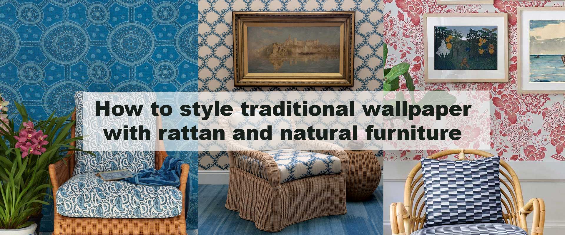
How to style traditional wallpaper with rattan and natural furniture
Traditional wallpaper paired with rattan and natural furniture creates interiors that feel grounded, warm, and quietly refined. This combination blends heritage patterning with organic texture, allowing classic motifs to feel lighter, more relaxed, and deeply livable. When done thoughtfully, the result is neither formal nor rustic, but a balanced space that feels collected over time rather than styled all at once.
Designers increasingly turn to this pairing because it softens ornate wallpaper details while preserving their timeless charm. Rattan, cane, wood, linen, and jute act as visual breathers, preventing traditional patterns from feeling heavy or overwhelming. The key lies in understanding proportion, tone, and rhythm—letting each element enhance the other without competition.
Why Traditional Wallpaper Works So Well with Natural Furniture
Traditional wallpaper is rich in detail, repetition, and historical influence. Florals, damasks, stripes, botanicals, and ornamental motifs bring a sense of narrative to walls, often inspired by European estates, heritage homes, or vintage interiors. While beautiful, these patterns can feel visually dense if paired with equally heavy furnishings.
Natural furniture introduces contrast in the most subtle way. Rattan and wood feature irregular textures, soft curves, and open weaves that visually “rest” the eye. Instead of fighting the wallpaper, these materials create negative space through lightness and tactility.
This balance is why traditional wallpaper remains a cornerstone of curated interiors rooted in history, particularly when drawn from well-chosen Vintage Wallpaper designs that already carry warmth and patina. The wallpaper sets the story; natural furniture makes it feel approachable.
Choosing the Right Traditional Wallpaper for a Natural Look
Not all traditional wallpaper responds the same way when paired with rattan and natural wood. Pattern scale, colour balance, and motif density play a decisive role in how organic furniture interacts with the wall surface. The most successful combinations feel intuitive, as though the wallpaper and furniture evolved together rather than being layered intentionally.
When chosen thoughtfully, traditional wallpaper provides visual depth and story, while natural materials soften its formality. The result is a space that feels composed yet relaxed, decorative yet grounded.
Soft Florals for Airy, Relaxed Rooms
Floral patterns with gentle stems, softened petals, and hand-rendered details pair beautifully with cane chairs and woven benches. These designs reference nature in a poetic way rather than a literal one, allowing the room to feel light and breathable even when patterns are present. Palettes built around sage, powder blue, muted rose, or antique cream further enhance this softness.
In spaces styled with Floral Vintage Wallpaper, rattan furniture feels less like a contrast and more like a continuation of the design language. The organic curves of the furniture echo the movement of floral motifs, while the open weave introduces visual rest, grounding the wallpaper in everyday comfort rather than formality.
Botanical Motifs That Echo Natural Materials
Botanical wallpapers featuring leaves, climbing vines, or garden-inspired compositions form a natural dialogue with wood tones and woven textures. When positioned behind rattan or timber furniture, these designs create depth through layering, making walls feel immersive instead of decorative.
Subtle botanical repeats from Botanical Vintage Wallpaper collections are especially effective in rooms where continuity matters. Rather than setting the walls apart from the furnishings, these patterns allow surfaces and materials to flow together seamlessly. The objective is visual harmony—where wallpaper supports the furniture without demanding attention.
Cottage-Inspired Patterns for Casual Warmth
Cottage-style wallpapers often feature softened linework, relaxed repeats, and a gently timeworn aesthetic. These qualities mirror the natural irregularities found in rattan and lightly finished wood, making the pairing feel instinctive rather than styled.
When combined with pale woods or honey-toned rattan, Cottage Vintage Wallpaper creates interiors that feel welcoming and nostalgic without tipping into excess. The atmosphere is warm and familiar, offering quiet elegance that feels lived-in rather than ornamental.
Understanding Colour Harmony Between Wallpaper and Furniture
Colour acts as the subtle bridge between traditional wallpaper and natural furniture. Even highly detailed patterns feel composed when the palette supports cohesion instead of contrast. Thoughtful colour choices allow ornate designs to settle comfortably into the space rather than dominate it.
Warm neutrals such as ivory, parchment, sand, and soft taupe are particularly forgiving. They highlight rattan’s golden undertones and the grain of natural wood without visual conflict. Wallpapers with aged whites or gently mellowed backgrounds feel especially authentic alongside cane, oak, and other natural finishes.
Earth-inflected hues—olive, clay, muted terracotta, and dusty blue—strengthen the connection between pattern and material. Frequently found in heritage-inspired designs, these tones sit effortlessly alongside organic textures, reinforcing a sense of continuity and calm.
Stark whites or high-contrast black motifs can feel abrupt when paired with light rattan unless balanced by ample texture elsewhere in the room. Traditional wallpaper thrives on softness and depth, and natural furniture supports that narrative best when colour transitions feel gradual, layered, and intentional.
Styling Rattan Furniture Against Patterned Walls
Rattan furniture introduces an airy, sculptural counterpoint to the visual richness of traditional wallpaper. Its lightness—both physical and visual—keeps ornate patterns from feeling dense or overpowering. Placement becomes just as important as material, shaping how wallpaper and furniture communicate across the room.
Let the Furniture Breathe
Open-weave chairs, cane headboards, and rattan side tables work best when given space to stand apart from the wall rather than pressed tightly against it. Leaving areas of wallpaper exposed allows the pattern to remain readable and appreciated as a surface, not just a backdrop. Negative space becomes an active design tool, creating rhythm between solid form and decorative detail.
This measured approach reflects the same visual logic found in symmetry-focused interiors, as explored in How traditional striped wallpaper adds refined symmetry to bedroom walls. Balance isn’t about repetition or mirroring—it’s about allowing each element its own moment while maintaining harmony through spacing and proportion.
Use Curves to Soften Formal Patterns
Traditional wallpapers often rely on structure, repetition, and symmetry to convey elegance. Rattan furniture counters this with gentle curves—rounded chair backs, arched legs, and flowing silhouettes that feel organic rather than rigid. These shapes soften formal patterns, making them feel approachable and lived-in instead of stately.
A curved rattan armchair placed against a patterned wall can instantly shift the mood of a space, turning classic motifs into something warmer and more inviting. This contrast is particularly effective with stripes, damasks, or ornamental repeats, where the interplay between order and fluidity adds depth without visual tension.
Mixing Wood Tones with Traditional Wallpaper
Wood furniture plays a grounding role alongside rattan, especially in rooms where visual structure is needed to anchor softer, more decorative elements. The right wood tones help traditional wallpaper feel intentional and cohesive rather than layered by chance.
Light woods such as ash, beech, or white oak enhance the airiness of patterned walls, particularly when wallpaper designs are dense or detailed. They reflect light gently and prevent traditional motifs from feeling heavy. Darker woods like walnut or chestnut introduce richness and contrast but are best used selectively, allowing depth without overwhelming the room.
Consistency matters more than exact matching. Choosing one dominant wood tone and allowing subtle variations in grain or finish creates character without visual noise. When wallpaper carries warm undertones, natural woods with visible texture feel deliberate and authentic rather than mismatched or overly styled.
This approach echoes the warmth found in rustic heritage interiors, much like the sensibility described in Rustic traditional wallpaper looks that complement earthy farmhouse decor, where material honesty and tonal harmony work together to create spaces that feel grounded, timeless, and genuinely lived-in.
Layering Textiles to Bridge Wallpaper and Furniture
Textiles serve as the quiet mediator between traditional wallpaper and natural furniture, smoothing the transition from pattern to texture. Materials such as linen, cotton, wool, and jute echo the organic character of rattan while gently softening the visual density of patterned walls. Their natural fibres introduce softness without dilution, allowing ornate designs to feel inviting rather than overpowering.
Neutral cushions on rattan seating create visual pauses that keep the eye from feeling overwhelmed, while lightly patterned throws can reference wallpaper motifs without repeating them outright. The most successful layers feel complementary rather than coordinated, offering subtle rhythm instead of direct imitation. Underfoot, jute or sisal rugs anchor the space with tactile weight, counterbalancing decorative walls with grounded simplicity.
Avoid fabrics with excessive sheen or stiffness. Highly polished materials can interrupt the organic dialogue between wallpaper and furniture, drawing attention for the wrong reasons. Natural finishes maintain the relaxed elegance that defines this pairing, reinforcing a sense of comfort, continuity, and quiet sophistication.
Using Stripes and Geometry with Natural Furniture
Stripes and geometric traditional wallpapers often read as structured or formal on their own, but natural furniture softens their presence almost instantly. Vertical stripes paired with cane or rattan pieces feel architectural yet approachable, lending a sense of height and order without rigidity, especially when colour palettes remain muted and timeworn.
Geometric patterns with softened edges or hand-rendered qualities work best alongside woven furniture. They introduce visual discipline while allowing the irregular textures of rattan to remain the focal point. This interplay keeps the room from feeling overly designed, replacing sharp contrast with thoughtful balance.
When styled with restraint, stripes and geometry become versatile rather than imposing. This combination suits transitional interiors where heritage influence meets modern ease, creating spaces that feel intentional, composed, and comfortably lived-in rather than stylistically divided.
Lighting Choices That Enhance Natural Pairings
Lighting plays a quiet but powerful role in how traditional wallpaper and rattan furniture are perceived together. Warm, softly diffused light reveals the richness of wallpaper inks and pigments while gently accentuating the tactile beauty of woven fibres. Under the right lighting, patterns feel layered and dimensional rather than flat or ornamental.
Harsh overhead lighting can work against this balance, washing out colour variation and creating sharp shadows through rattan weaves that feel distracting rather than intentional. A layered lighting approach works best—table lamps with linen or cotton shades, wall sconces that graze the wallpaper surface, and subtle ambient sources that soften the room’s edges. These choices allow both pattern and texture to unfold gradually.
Warm lighting strengthens the organic narrative of the space. Instead of presenting traditional wallpaper as a decorative backdrop, it becomes atmospheric—something felt as much as seen—while natural furniture glows with quiet warmth rather than visual contrast.
When to Use Feature Walls Instead of Full Coverage
Although traditional wallpaper can be stunning when applied throughout a room, pairing it with rattan and natural furniture often benefits from a more restrained approach. Feature walls give patterned designs room to speak clearly without overpowering the lighter, airier qualities of natural materials.
A single wallpapered wall behind a rattan sofa, bed, or dining arrangement creates a focal point that feels intentional and composed. This strategy allows the furniture to remain visually light while still grounding the space with pattern and depth. In smaller rooms, feature walls prevent visual compression, while in sunlit interiors they help maintain a sense of openness.
Feature walls also offer freedom to explore more intricate or expressive wallpaper designs. By limiting coverage, you can enjoy detailed motifs and richer colour stories while preserving a calm, cohesive atmosphere that feels balanced rather than ornate.
Comparing Traditional Wallpaper Pairings with Natural Furniture
| Wallpaper Style | Natural Furniture Effect | Overall Mood |
|---|---|---|
| Soft florals | Enhances warmth and ease | Relaxed, welcoming |
| Botanical motifs | Creates organic continuity | Calm, nature-inspired |
| Stripes | Adds structure without heaviness | Balanced, timeless |
| Ornamental patterns | Softened by texture contrast | Elegant yet livable |
| Cottage-inspired designs | Feels collected and nostalgic | Cozy, heritage-led |
Common Styling Mistakes to Avoid
One of the most frequent missteps is over-layering the space. Traditional wallpaper already brings visual richness through pattern and history, so introducing bulky furniture, dark woods, or excessive accessories can quickly make the room feel crowded. Allow negative space and lighter materials to offset the wallpaper’s presence so the room can breathe naturally.
Another common issue is matching too literally. Rattan should never try to echo the wallpaper’s motifs or colours exactly. Its strength lies in contrast—organic texture against refined pattern—creating a dialogue rather than a duplication. When everything mirrors everything else, the room loses depth and begins to feel staged instead of lived-in.
Finally, be mindful of competing pattern scales. Intricate wallpaper paired with busy textiles or heavily detailed furniture can overwhelm the eye. Let one element lead while the others support it. If the wallpaper is richly detailed, choose simpler fabrics and quieter furniture silhouettes; if the furniture carries visual complexity, opt for wallpaper with a softer, more restrained repeat.
Conclusion
Styling traditional wallpaper with rattan and natural furniture is about balance, texture, and restraint. Heritage patterns bring depth and narrative, while organic materials soften the look and make spaces feel welcoming and lived-in. When colour harmony, proportion, and thoughtful layering come together, the result is an interior that feels timeless rather than themed.
This pairing allows traditional wallpaper to evolve beyond formality, offering warmth and versatility that suits modern living while honouring classic design roots. With careful choices, the combination creates rooms that feel both grounded and graceful—spaces that invite you in and encourage you to stay.
FAQs
Can traditional wallpaper feel too formal with natural furniture?
Not when balanced correctly. Rattan and wood naturally soften ornate patterns, making traditional designs feel relaxed and approachable.
Does rattan work with darker traditional wallpaper colours?
Yes. Light rattan provides contrast against deeper tones, preventing the space from feeling heavy when lighting is warm and layered.
Should all furniture be natural when using traditional wallpaper?
No. A mix works best. Natural pieces anchor the space, while a few classic upholstered elements add structure and comfort.
Is this style suitable for small rooms?
Absolutely. Light-toned traditional wallpaper paired with open-weave furniture can make compact spaces feel airy and intentional.
How do I keep the look from feeling outdated?
Focus on muted colour palettes, natural textures, and thoughtful spacing rather than overly ornate combinations.