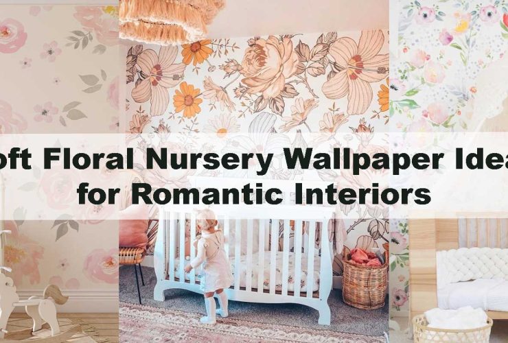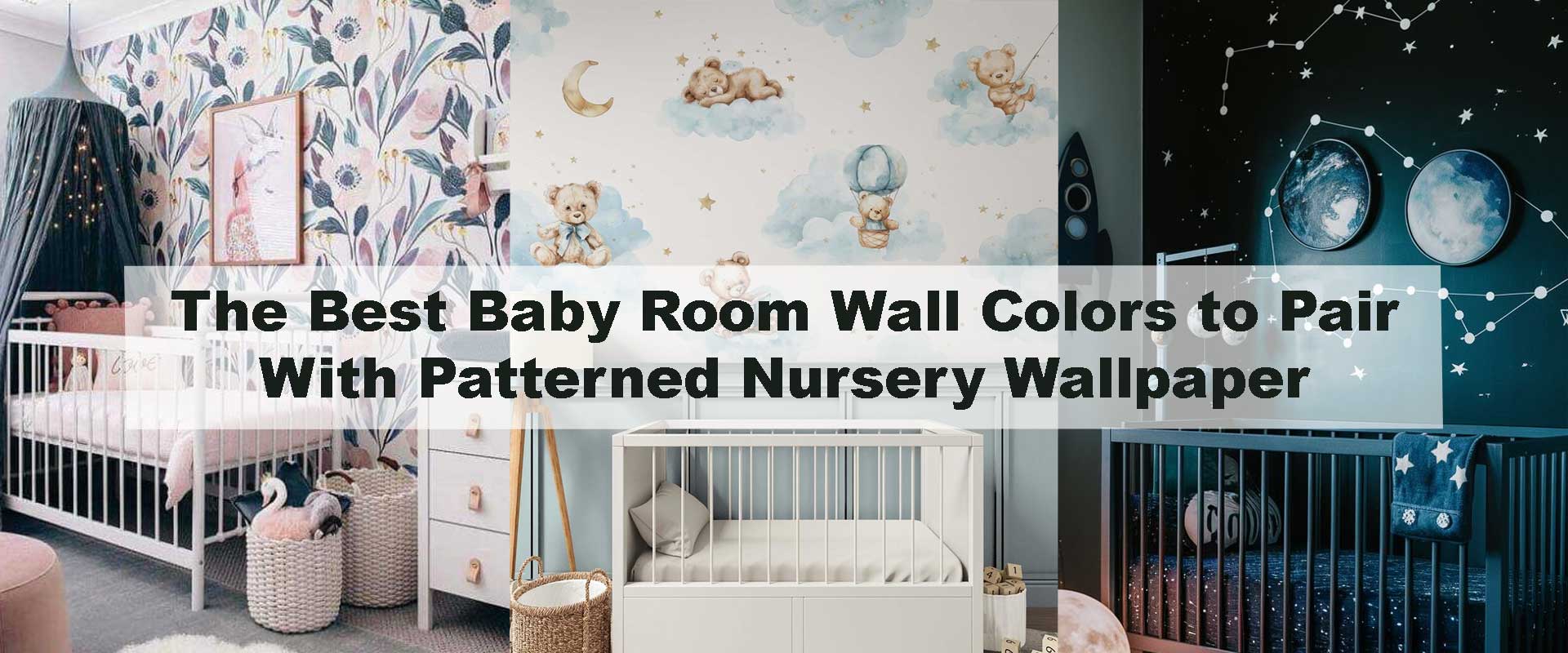
The Best Baby Room Wall Colors to Pair With Patterned Nursery Wallpaper
Designing a nursery is one of the most emotionally meaningful interior projects in a home. Wall color plays a quiet but powerful role in shaping how a baby room feels, especially when paired with patterned nursery wallpaper. The right color choice can soften visual movement, enhance pattern depth, and create a calming environment that supports rest, play, and early development.
Patterned nursery wallpaper adds storytelling, texture, and personality, but without the right surrounding tones, even the most beautiful design can feel overwhelming. From soft neutrals to muted pastels and grounded earthy shades, understanding how wall colors interact with patterns helps create a nursery that feels balanced, timeless, and soothing rather than visually busy.
Why Wall Color Matters More When Wallpaper Is Patterned
Patterned nursery wallpaper naturally establishes itself as the visual anchor of the room. Whether the design features animals, botanicals, stars, or gentle geometrics, pattern introduces movement and rhythm that immediately captures attention. Wall color plays a crucial supporting role, shaping how that visual energy is perceived and ensuring the wallpaper feels purposeful rather than overpowering.
Soft, thoughtfully chosen wall colors create breathing space around the pattern. They ease visual tension, help light travel more evenly across the room, and prevent the nursery from feeling overstimulating during rest periods. This balance is especially important when using a feature wall, a design approach explored in How to Avoid Overstimulation When Designing a Nursery Feature Wall, where restraint and softness help patterned designs feel calming rather than dominant.
Understanding Color Balance in Nursery Design
Color balance in a nursery is less about matching shades and more about creating harmony between visual elements. Pattern scale, color intensity, and the amount of open wall space all influence how comfortable and settled a room feels. Because patterned nursery wallpaper already carries visual weight, surrounding wall colors should gently soften the composition instead of competing with it.
Muted tones tend to be the most effective. They absorb excess visual energy and allow patterns to feel naturally embedded within the space rather than layered on top of it. This approach supports emotional calm and smooth visual flow, becoming even more important as furniture, lighting, and textiles are introduced. When wall color acts as a quiet backdrop, the nursery feels cohesive, nurturing, and easy to experience over time.
Earth-Inspired Wall Colors for Natural Nursery Themes
Soft Sage and Muted Green
Soft sage and muted green tones have become standout choices for patterned nurseries because they feel instinctively calming and emotionally grounding. These shades echo the colors found in leaves, moss, and gentle forest canopies, helping patterned wallpaper feel integrated rather than visually dominant. When paired with botanical, woodland, or animal motifs, sage walls support the theme without competing for attention, allowing patterns to unfold softly across the space.
Combined with Woodland Nursery Wallpaper, sage walls amplify the storybook quality of the room. The wallpaper feels immersive yet peaceful, while the wall color provides a steady visual backdrop that keeps the nursery nurturing, balanced, and easy on developing senses.
Sand, Clay, and Warm Earth Tones
Sand, clay, and softly warmed earth tones introduce a comforting sense of depth to nurseries with patterned wallpaper. These hues feel familiar and reassuring, helping playful designs settle into the room rather than stand out too boldly. Their warmth softens illustrated details and adds a sense of coziness that feels especially welcoming during quiet moments and rest periods.
Earth-inspired wall colors also help visually anchor patterned wallpaper, creating continuity between walls, furnishings, and flooring. Instead of the design feeling scattered or fragmented, the space reads as cohesive and thoughtfully layered.
Using Muted Gray in Modern Patterned Nurseries
Warm gray wall colors offer a refined, contemporary option for pairing with patterned nursery wallpaper. Unlike cooler gray tones that can feel stark, warmer variations introduce subtle softness that keeps the room inviting and child-friendly. This makes gray an excellent choice for modern nurseries that still prioritize comfort and calm.
Muted gray walls allow colorful wallpaper elements to stand out naturally, giving patterns clarity without overwhelming the space. The result is a clean, balanced aesthetic where wallpaper provides personality while wall color maintains visual order.
How Pattern Scale Influences Wall Color Choice
Pattern scale has a direct impact on how comfortable and balanced a nursery feels. Large-scale wallpaper patterns naturally command attention, which means they benefit most from very soft, light wall colors that give the eye space to rest. Pale creams, warm whites, or gentle greige tones help bold motifs feel intentional rather than overwhelming, allowing the design to remain calming even as it makes a visual statement.
Smaller, repeating patterns offer greater flexibility with wall color depth. Because the visual rhythm is more evenly distributed, slightly deeper tones—such as muted sage, warm gray, or soft clay—can be introduced without creating visual strain. This balance becomes especially important when deciding between feature walls and full-room wallpaper coverage, an approach thoughtfully explored in How to Style a Nursery Wall Around a Single Feature Wallpaper.
Best Wall Colors for Patterned Nursery Wallpaper
| Wallpaper Pattern Style | Best Wall Color Options | Visual Effect | Ideal Nursery Mood |
|---|---|---|---|
| Animal & Safari Prints | Warm white, sage, beige | Softens playful detail | Cozy, nurturing |
| Floral & Botanical | Cream, blush, muted green | Enhances organic flow | Calm, gentle |
| Space & Star Themes | Soft gray, pale blue | Balances dark accents | Dreamy, expansive |
| Geometric Patterns | Greige, warm gray | Grounds visual movement | Modern, balanced |
| Neutral Storybook | Cream, sand, taupe | Maintains timeless appeal | Serene, adaptable |
FAQ: Baby Room Wall Colors and Patterned Nursery Wallpaper
What wall color works best with busy nursery wallpaper?
Soft neutrals like cream, warm white, or greige work best because they calm visual movement and allow patterns to remain the focal point.
Can I use color on all walls with patterned wallpaper?
Yes, but muted tones are recommended. Bold colors should be used sparingly, especially when wallpaper features large or detailed patterns.
Is gray too cold for a baby room?
Warm gray tones work well when paired with patterned wallpaper and soft lighting, creating a modern yet comfortable nursery atmosphere.
Do pastels overstimulate babies?
Muted pastels such as blush or powder blue are gentle and calming, especially when balanced with patterned wallpaper and neutral furnishings.
Should wall color match the wallpaper exactly?
Exact matching isn’t necessary and can flatten the design. Slight contrast through lighter or softer tones creates better depth and visual harmony.
Conclusion
Choosing the best baby room wall colors to pair with patterned nursery wallpaper is ultimately about balance, softness, and long-term comfort. Neutral tones, muted pastels, and gentle earth-inspired shades allow wallpaper patterns to shine without overwhelming the senses, helping the room feel calm, cohesive, and emotionally supportive. When wall color and pattern work together thoughtfully, the nursery becomes a space that encourages rest, imagination, and emotional well-being from the very beginning.
This sense of harmony is easiest to achieve when wallpaper is treated as the visual storyteller and wall color as its quiet companion. Exploring thoughtfully curated Nursery Wallpaper helps make this balance feel effortless, offering designs that pair naturally with soft, calming wall colors and support a nursery environment designed to grow alongside your child.