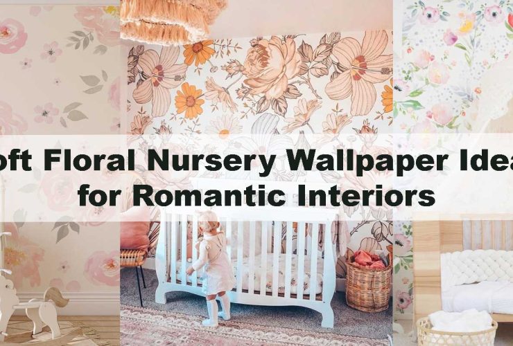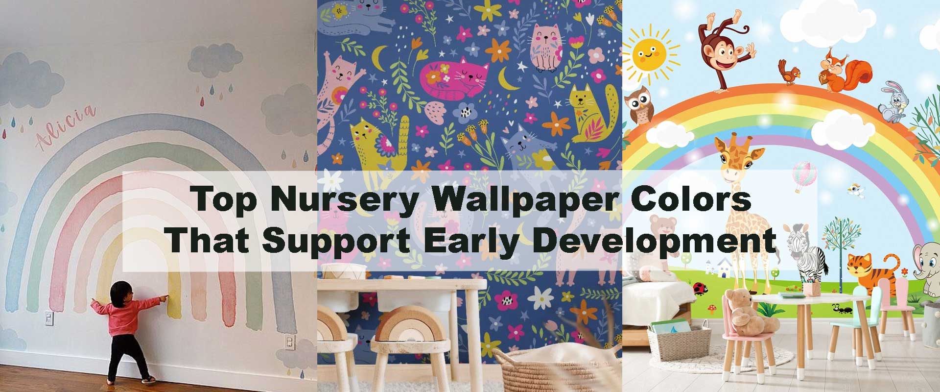
Top Nursery Wallpaper Colors That Support Early Development
Choosing the right nursery wallpaper does far more than shape a room’s aesthetic; it quietly influences how infants perceive, learn, and emotionally respond to their environment. Parents often look for hues that feel gentle and timeless, yet the best nursery wallpaper colors that support early development go deeper—they help newborns build visual awareness, encourage early focus, and create a secure sense of space from day one. When thoughtful colors are paired with safe materials and soothing themes, the nursery becomes a supportive backdrop for cognitive, emotional, and sensory growth. Even expressive designs like Nursery Wallpaper can positively reinforce early developmental patterns when chosen with balance in mind.
Why Early Development Responds Strongly to Wall Colors
Research shows that color exposure in infancy shapes the way babies track contrast, respond to visual cues, and regulate emotional states. Soft hues calm overstimulation, while gentle contrasts help strengthen early focus. When wallpapers incorporate repeatable shapes—like botanicals, clouds, or softly illustrated animals—infants benefit from predictable visual stimulation. Parents using gentle palettes often discover insights similar to Best Nursery Wall Murals for Gentle Bedtime Routines, where soft tone transitions create a supportive bedtime rhythm that reinforces security and comfort.
Understanding Color Psychology in Nursery Design
Color influences how infants feel long before they can speak. While bright primary colors are exciting, they may overstimulate babies during early months. Newborn eyes respond best to low saturation and moderate contrast. This is why muted greens, pastels, neutrals, and soft space-inspired blues often become foundational choices in nursery design. Parents who lean toward subtle palettes often appreciate how tone and rhythm behave similarly to the insights shared in Calming Nursery Wallpaper Themes That Help Babies Sleep Better, where soft gradients and delicate motifs naturally help calm infant attention.
Soft Neutrals: The Foundation of Early Sensory Balance
Soft neutrals—creamy beige, warm ivory, gentle sand, and muted taupe—form one of the most dependable foundations for newborn environments. These tones create a light, breathable backdrop that feels calm from morning to night, giving babies a sense of visual ease as they begin interpreting shapes, movement, and familiar faces around them. Neutral palettes act almost like a soft whisper within the room: present, supportive, and never distracting, which is why so many early developmental specialists gravitate toward them when designing infant spaces.
Why Neutrals Work So Well for Infants
Unlike high-contrast or saturated hues, neutrals stay quietly in the background, allowing babies’ still-developing eyes to relax. Newborns naturally respond better to gentle contrast, which is why placing a soft neutral wallpaper behind the crib reduces sensory tension and avoids visual overwhelm. Parents often choose designs similar to Neutral Nursery Wallpaper because these palettes create a grounded environment where a baby can observe the world with clarity and comfort.
How Neutrals Support Early Cognitive Growth
A well-chosen neutral backdrop strengthens several early developmental behaviors:
- Face recognition, helping babies lock onto expressions and build connection
- Eye tracking, supported by a clear background free from visual clutter
- Early focus, allowing infants to shift attention more smoothly
- Calm regulation, essential for stable sleep and predictable routines
These tones eliminate unnecessary stimulation so infants can focus on the presence of caregivers—a core component of emotional security.
Popular Neutral Styles That Parents Love
Neutral wallpapers shine when paired with subtle detail. Gentle dotted patterns encourage early visual exploration without commanding attention. Watercolor washes add depth that feels soft and flowing. Airy herringbone textures introduce organization and rhythm, while faint botanical outlines mimic nature’s tranquillity. For families who want calmness with a touch of charm, woodland-inspired neutrals—much like those in Woodland Nursery Wallpaper—offer a lovely balance between simplicity and story-like imagination.
Pastel Colors: Encouraging Gentle Curiosity and Emotional Comfort
Pastel colors are beloved in nurseries because they feel tender and visually soothing—two qualities newborns need in abundance. Their low saturation makes them gentle on developing eyes, helping babies transition from the very limited newborn color range to a more nuanced palette as they grow. Pastels create a positive emotional tone within the room, making everyday interactions feel softer and more comforting.
The Developmental Benefits of Pastel Shades
Pastels sit at an ideal sensory midpoint: noticeably colored but never overwhelming. Research in developmental psychology suggests that these gentle hues enhance emotional comfort and promote early curiosity by offering soft stimulation that infants can process without strain. Bright colors may capture attention instantly, but pastels encourage lingering attention, which supports learning.
Best Pastel Colors for Early Development
- Soft mint → Clears visual tension, helping babies relax and explore
- Dusty peach → Nurturing, warm, and emotionally welcoming
- Sky blue → Encourages gentle spatial awareness and calm curiosity
- Lavender → Helps regulate mood as babies transition toward rest
Parents who value subtlety often appreciate pastel palettes similar to those referenced in How to Choose Nursery Wallpaper That Is Safe for Newborns, where health-conscious design overlaps beautifully with sensory balance.
When Pastels Create the Perfect Visual Rhythm
Pastels achieve their fullest impact when paired with soft repetition—clouds, delicate shapes, small botanicals, or watercolor transitions. These motifs allow infants to trace shapes visually at a comfortable pace, strengthening early recognition patterns. Designs such as Pastel Nursery Wallpaper offer just enough storytelling to spark curiosity while maintaining calm, predictable flow throughout the room.
Nature-Inspired Greens: Boosting Calmness and Early Focus
Green is one of the most beneficial colors for early development because it mirrors the natural world—forests, leaves, grass, and quiet garden spaces. Humans instinctively associate green with safety and softness, and babies respond the same way. Bringing nature-inspired greens into the nursery creates a serene, grounded atmosphere where infants can explore their environment at their own gentle pace.
Why Green Works for Infant Development
Green occupies the center of the visible light spectrum, making it one of the most restful colors for the human eye. This natural harmony reduces visual fatigue and supports early concentration during active wake windows. For babies who become easily overstimulated by bright colors, soft greens offer a refreshing sense of balance and stability.
Shades of Green That Work Best for Babies
- Sage green → Earthy and calming for bedtime rituals
- Watercolor mint → Encourages curiosity with soft visual movement
- Light olive → Warm, inviting, and ideal for creating emotional comfort
- Soft woodland green → Perfect for story-driven spaces and sensory calm
These shades are especially effective when layered with illustrations that mimic nature’s slow, organic rhythm—leaves, branches, animals, or gentle forest silhouettes.
Botanical Themes That Strengthen Engagement
Botanical patterns offer infants more than visual beauty. They create a natural learning landscape where repetition, spacing, and gentle movement help babies understand shape, depth, and flow. Nature-inspired motifs encourage:
- Slow, predictable repetition, ideal for newborn eyes
- Harmonious imagery, which supports emotional regulation
- Depth cues, helping infants begin interpreting space
Designs similar to Botanical Nursery Wallpaper are particularly effective because they blend calming color psychology with soft storytelling—two developmental advantages in one.
Soft Blues: Supporting Emotional Stability and Spatial Awareness
Soft blue tones have long been a favorite in nurseries because of the way they naturally calm both babies and parents. Blue gently echoes the open sky and quiet water—two of the most universally soothing environmental cues—making it a powerful foundation for emotional balance during early development.
Why Blue Works for Early Development
Soft blues help babies settle into routines by supporting:
- Emotional regulation, reducing visual overstimulation during bedtime
- Visual clarity, thanks to blue’s naturally low visual weight
- Early depth and spatial perception, allowing infants to understand distance and shape with gentle guidance
Because blue mirrors expansive and peaceful natural elements, infants instinctively respond with slower eye movements and more relaxed breathing, creating an ideal emotional foundation for sleep and early learning.
Blue Tones Recommended for Baby Rooms
- Baby blue → A universal classic that softly brightens the room
- Powder blue → Dreamy and feather-light, perfect for tall walls or ceiling murals
- Silvery blue → Reflective and airy, offering subtle depth without creating shadows
- Soft navy (used sparingly) → Stimulates early detail recognition while keeping the palette grounded
Parents seeking quiet imagination often choose soft blue wallpapers that feature celestial rhythms or drifting night skies—motifs similar to those in Space Nursery Wallpaper. These designs inspire peaceful attention without overwhelming delicate newborn senses.
Blue Wallpapers That Babies Love
Gentle watercolor skies, small drifting clouds, soft ocean waves, and blended horizon gradients introduce infants to predictable movement and pattern repetition. These visuals strengthen early recognition skills and create a restful rhythm babies instinctively follow during nap time and play.
Muted Pinks: Supporting Comfort, Warmth, and Newborn Bonding
Muted pinks bring immediate warmth to a nursery, creating an atmosphere that feels nurturing from the moment a baby enters the room. These tones wrap the space in softness, encouraging emotional closeness and a natural sense of safety—elements deeply connected to newborn bonding and early attachment.
Why Muted Pink Supports Early Growth
Soft pink hues reflect the gentle warmth associated with human touch and caregiving. They help babies feel protected and emotionally anchored, which is essential in the first months when infants depend heavily on their environment for cues of comfort and stability. Muted pinks also soften harsh contrasts, allowing babies to rest their gaze without strain.
Best Pink Shades for Nurseries
- Dusty blush → Warm and grounding for bedtime routines
- Champagne rose → Subtle glow that brightens low-light corners
- Soft mauve → Adds emotional depth without overpowering the palette
- Muted petal pink → Ideal for day-to-night nursery atmospheres
Parents who prefer an imaginative, tender environment often explore designs like Girl Baby Nursery Wallpaper, though muted pinks blend beautifully into gender-neutral themes when paired with natural textures or minimalist patterns.
Patterns That Complement Muted Pinks
Watercolor florals, hand-drawn petals, soft dotted rhythms, and abstract brushstroke motifs pair effortlessly with muted pink palettes. These patterns encourage gentle eye tracking and introduce repetition without overstimulating the newborn’s developing vision.
Gentle Yellows: Encouraging Joy and Cognitive Curiosity
Yellow is naturally uplifting, and when softened, it becomes a beautiful tool for inspiring early curiosity and positive emotional engagement in the nursery. Gentle yellow tones illuminate a room with softness, making daytime play and interaction feel bright yet controlled.
Why Soft Yellow Helps Early Development
Muted yellow enhances:
- Early curiosity, inviting babies to interact visually with their surroundings
- Cognitive engagement, as infants tend to linger longer on soft warm hues
- Visual alertness, without the overstimulation caused by bold primary yellow
Because newborns respond strongly to warm, welcoming tones, soft shades of yellow become an ideal companion for early learning moments—such as recognizing shapes, tracking motion, or exploring storybook illustrations.
Shades of Yellow That Work Best
- Buttercream → Soft, creamy warmth that feels timeless
- Pale marigold → Gently energizing without brightness
- Soft sunflower → Captures natural warmth with reduced intensity
- Warm linen yellow → Perfect for blending with neutral or botanical decor
When layered with sunbeams, tiny stars, soft geometry, or playful character motifs, yellow becomes a joyful anchor in the nursery—inviting exploration while still maintaining the serenity essential for rest.
Earthy Browns and Taupes: Creating Security and Visual Stability
Earth-inspired hues bring natural warmth to a nursery, creating a cocoon-like sense of grounding that supports early emotional development. Babies respond well to environments that feel steady and predictable, and earthy palettes help achieve that effect by echoing the tones of soil, wood, and natural fibers—the visual elements our brains instinctively associate with safety and belonging.
Why Earth Tones Improve Emotional Grounding
Browns and taupes mirror the organic materials found in nature, allowing the nursery to feel stable and quietly nurturing. These tones reduce visual noise, making it easier for newborns to focus on comforting shapes and gentle movement within the room. They pair beautifully with soft animal illustrations, much like the warm, grounded expression seen in Animal Nursery Wallpaper, where earthy hues and friendly motifs build a secure emotional environment.
Best Earth Tones for Nurseries
- Light cocoa → Warm yet soft enough for newborn eyes
- Warm chestnut → Adds depth without overwhelming small spaces
- Soft clay → Grounding tone that enhances sensory security
- Mushroom taupe → Creates a gentle, neutral foundation
These hues help babies develop stable early visual associations—an important element in forming emotional security. When paired with natural textures, wooden furniture, or softly illustrated wildlife, earth tones create a balanced visual rhythm that grows beautifully with your child.
Soft Grays: Building Calm, Sleep-Ready Nursery Atmospheres
Soft gray tones remain one of the strongest choices for creating a peaceful, sleep-supportive nursery. Their neutral nature removes visual tension, allowing babies to settle quickly during nap cycles and nighttime routines. Because gray mimics the quiet softness of early evening light, it naturally signals a transition into restfulness—something newborns respond to more strongly than many parents realize.
Why Gray Supports Infant Sleep Routines
Gray gently embraces the room without adding visual weight. It creates a dimming effect that helps infants wind down by lowering sensory stimulation. When blended with illustrations—such as cloud shapes, mountain silhouettes, or soft animals—gray supports visual development while remaining calm enough for uninterrupted sleep. Parents who prefer subtle themes often lean toward designs found in Boy Baby Nursery Wallpaper, where controlled contrasts and soft shapes keep the room emotionally balanced.
Shades of Gray That Work Beautifully
- Misty silver → Light-reflective and calming
- Warm heather gray → Adds gentle depth for serene crib areas
- Soft fog → Ideal for rooms needing airy softness
- Dove gray → A timeless foundation for both minimal and illustrated walls
These tones allow the nursery to grow with your child, shifting seamlessly from newborn calmness to toddler-friendly spaces without feeling too busy or visually demanding.
Choosing Colors Based on Development Stage
Selecting wallpaper colors based on your baby’s developmental stage ensures the nursery supports both sensory comfort and emotional well-being.
Newborn Stage (0–3 Months)
Newborns see best in low contrast, which is why neutrals and soft, predictable tones work beautifully. These colors prevent overstimulation and allow babies to focus on parent faces, soothing movements, and simple shapes.
Infant Stage (3–6 Months)
As color recognition expands, pastels, soft greens, and gentle blues support early curiosity. These tones allow infants to begin identifying new hues without overwhelming their emerging visual pathways.
Active Baby Stage (6–12 Months)
As babies explore more actively, earth tones, muted yellows, and softly illustrated scenes encourage safe curiosity. These palettes support visual tracking, early storytelling, and emotional grounding as they interact more with their surroundings.
Popular Nursery Color Palettes
| Color Palette | Development Benefits | Best Use Case | Perfect Pairing |
|---|---|---|---|
| Soft Neutrals | Calmness, clarity | Behind crib | Woodland themes |
| Pastels | Curiosity, comfort | Accent walls | Clouds & stars |
| Greens | Focus, grounding | Reading areas | Botanical scenes |
| Blues | Sleep, spatial perception | Above crib | Sky motifs |
| Pinks | Emotional bonding | Cot walls | Florals |
| Yellows | Joy, curiosity | Play zones | Geometrics |
Conclusion
Selecting nursery wallpaper colors that support early development is a powerful way to create a nurturing, growth-ready environment for your baby. Soft neutrals support early sensory balance, pastels encourage comfort and curiosity, greens and blues promote focus and emotional calmness, and muted pinks or yellows add warmth to everyday routines. When matched with safe materials and gentle artwork, wallpapers such as Peel-and-Stick Nursery Wallpaper help create a soothing foundation for your baby’s earliest discoveries. With thoughtful color choices, every moment in the nursery becomes part of a supportive developmental journey.
FAQ: Nursery Wallpaper Colors That Support Early Development
1. What wallpaper color is best for a newborn’s room?
Soft neutrals are often recommended for newborns because they create a calm visual environment that supports early sensory development. These colors help reduce overstimulation and make it easier for babies to focus on faces, shapes, and movement within the room.
2. Do bright colors overstimulate infants?
Yes. Bright, highly saturated colors can be overwhelming for newborns whose visual systems are still developing. Softer tones—like pastels, muted greens, and gentle blues—offer stimulation without causing stress or visual fatigue.
3. Are pastel wallpapers good for baby development?
Absolutely. Pastels promote emotional comfort and encourage gentle curiosity as babies begin to recognize more colors. Their softness makes them ideal for soothing nursery environments.
4. Does green help babies focus better?
Green is one of the most restful colors for the human eye and supports early focus. Nature-inspired greens help infants relax, making them ideal for nurseries meant to encourage calm alertness or quiet play.
5. Which colors help babies sleep better?
Soft blues, muted pinks, gentle grays, and warm neutrals are excellent choices for sleep-focused nurseries. These tones mimic calming natural cues and help babies wind down during nighttime routines.
6. Can wallpaper colors affect cognitive development?
Yes. Soft, consistent colors help babies process visual information steadily, while gentle contrast aids pattern recognition. Color plays a meaningful role in shaping emotional responses, early focus, and comfort during developmental milestones.
7. Should I avoid dark colors in a baby’s room?
Dark colors aren’t harmful, but they can feel heavy or overstimulating when used in large areas. If you prefer deeper tones, use them sparingly or blend them with soft motifs—such as stars, clouds, or nature scenes—to keep the space visually balanced.
8. What colors work best for a gender-neutral nursery?
Sage green, soft taupe, beige, muted terracotta, warm gray, and sky blue are excellent gender-neutral choices. These palettes feel timeless and support a range of developmental benefits without leaning toward traditional boy/girl themes.